


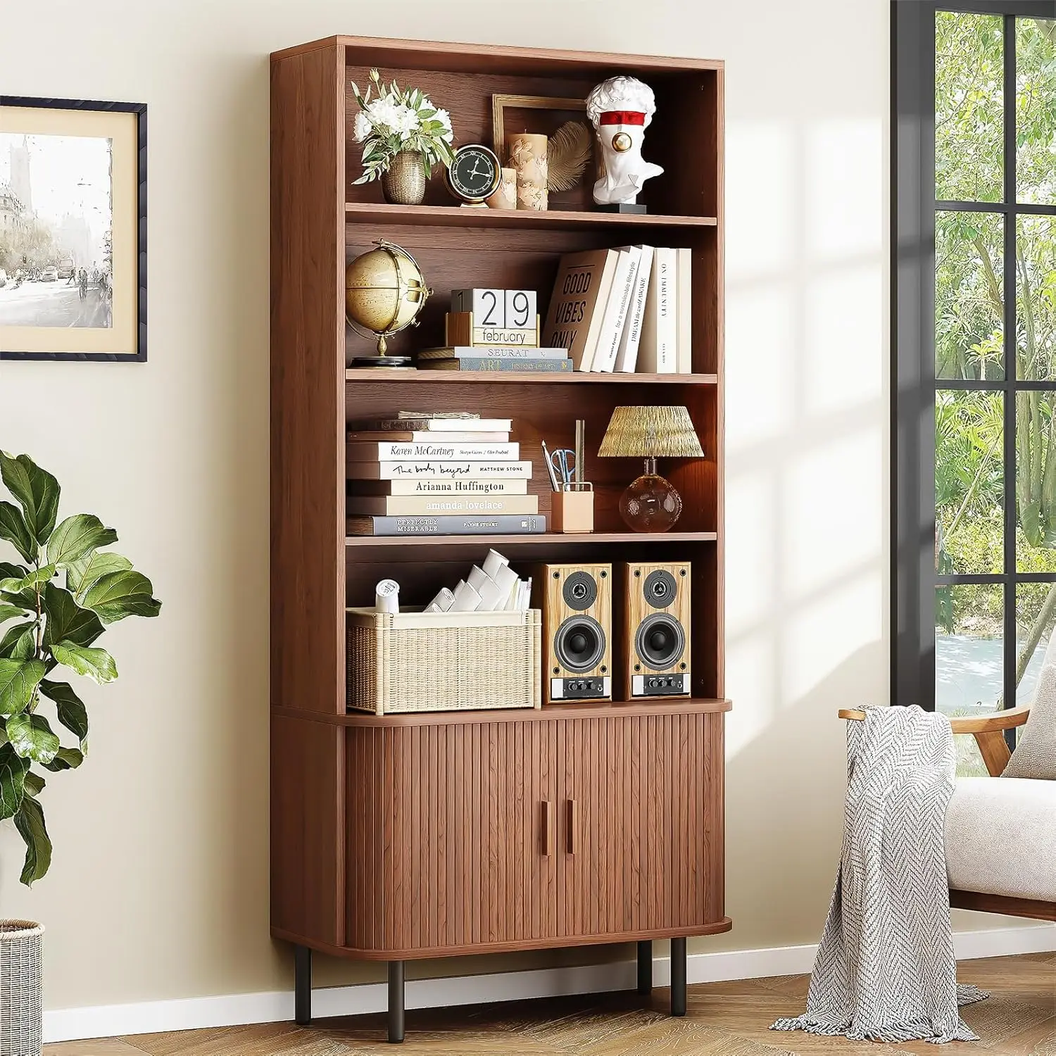
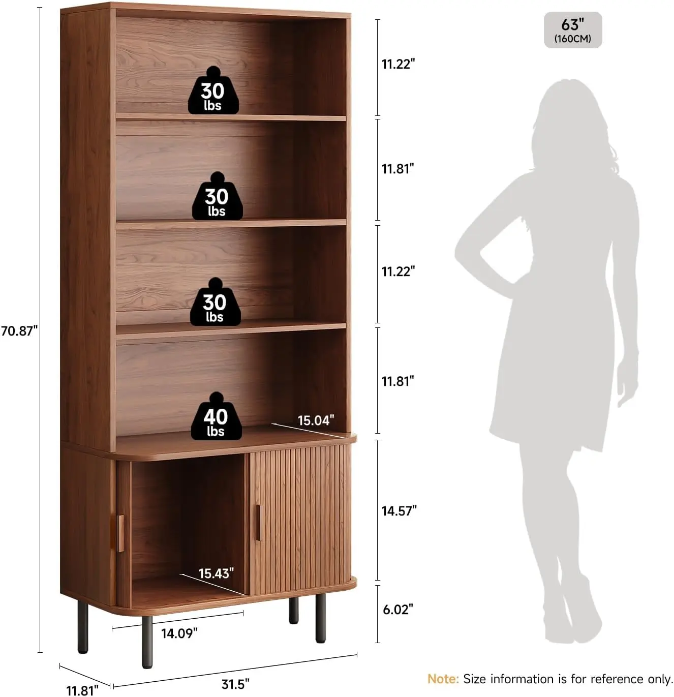
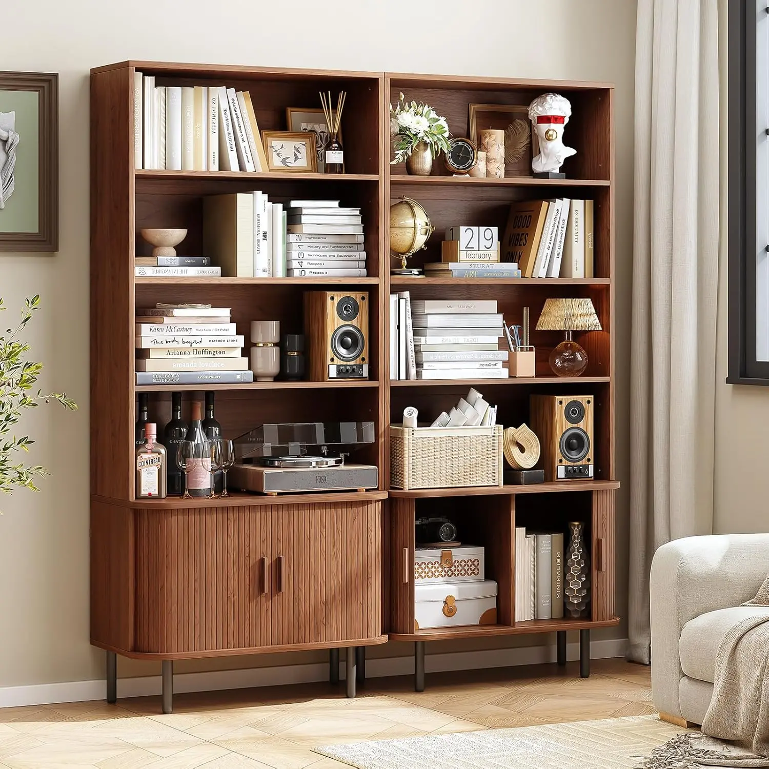
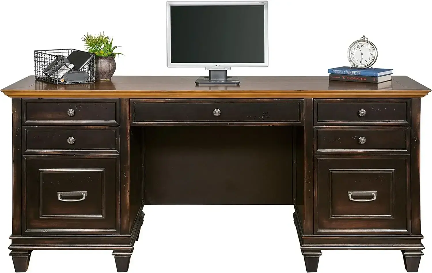
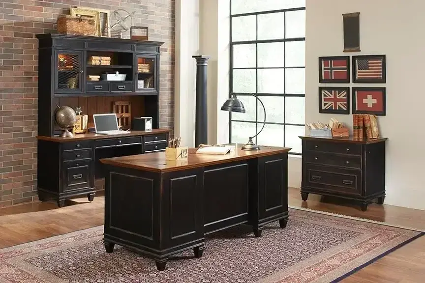
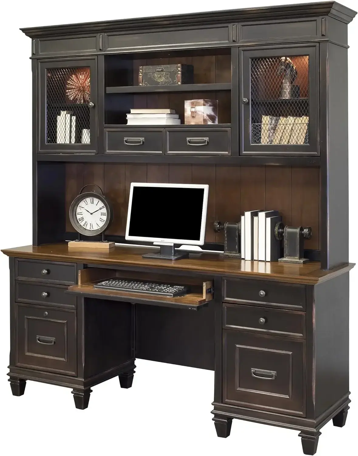
14341 18 Deep 2-Drawer File Cabinet, Black
<div class="detailmodule_html"><div class="detail-desc-decorate-richtext"><div class="a-section a-spacing-large bucket" id="aplus">
<ul class="a-unordered-list a-vertical a-spacing-mini" style="box-sizing: border-box; margin: 0px 0px 0px 18px; color: rgb(15, 17, 17); padding: 0px; font-family: "Amazon Ember", Arial, sans-serif; font-size: 14px; font-style: normal; font-variant-ligatures: normal; font-variant-caps: normal; font-weight: 400; letter-spacing: normal; orphans: 2; text-align: start; text-indent: 0px; text-transform: none; widows: 2; word-spacing: 0px; -webkit-text-stroke-width: 0px; white-space: normal; background-color: rgb(255, 255, 255); text-decoration-thickness: initial; text-decoration-style: initial; text-decoration-color: initial;">
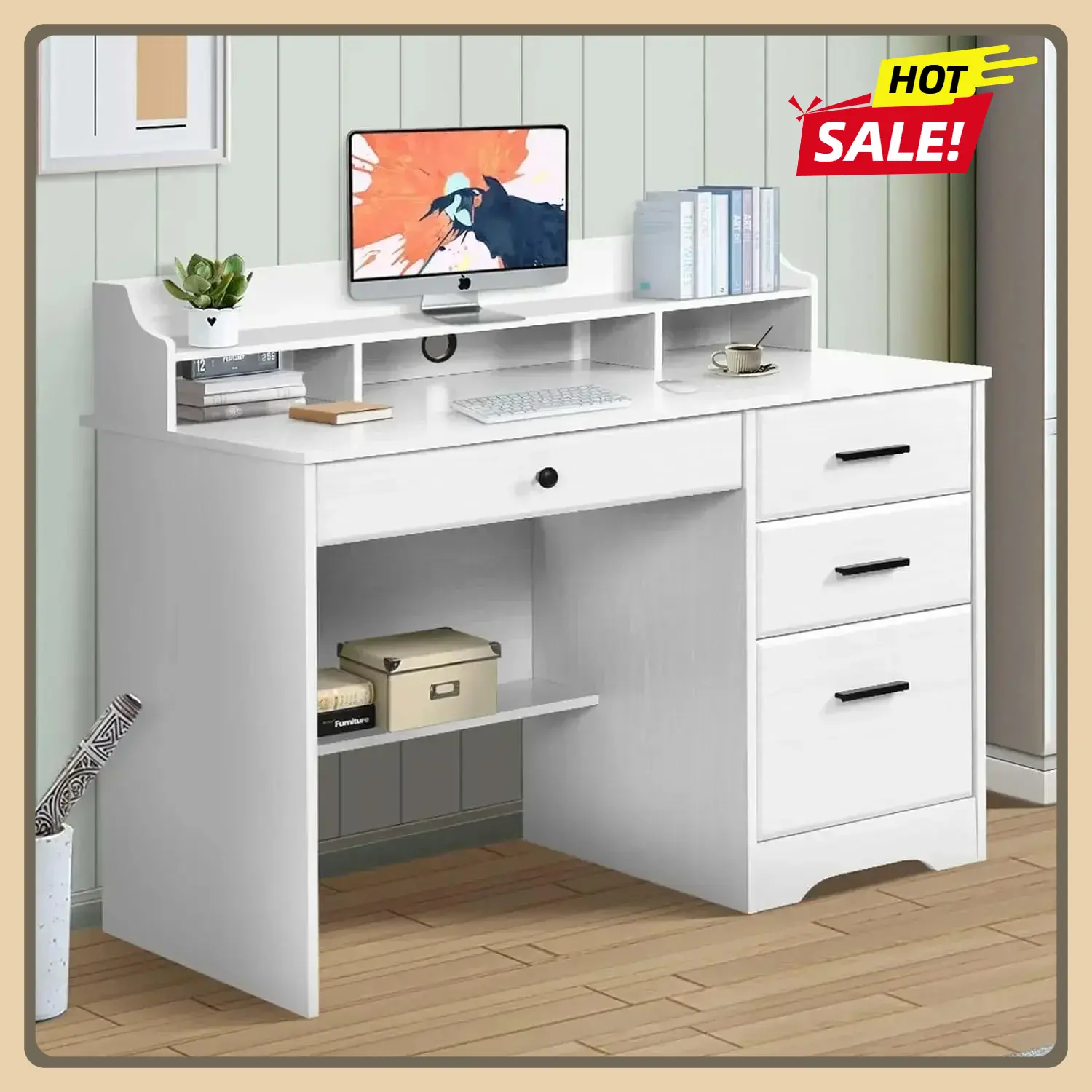
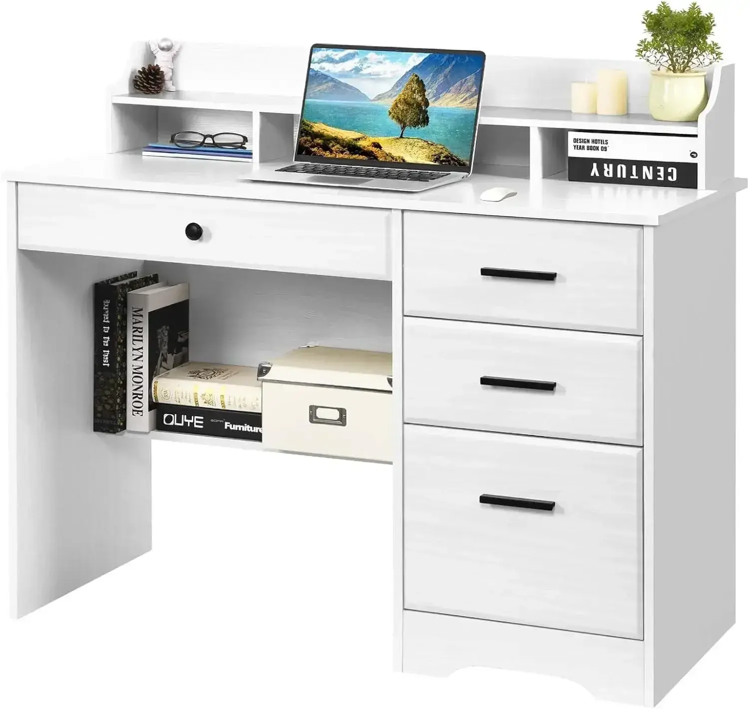
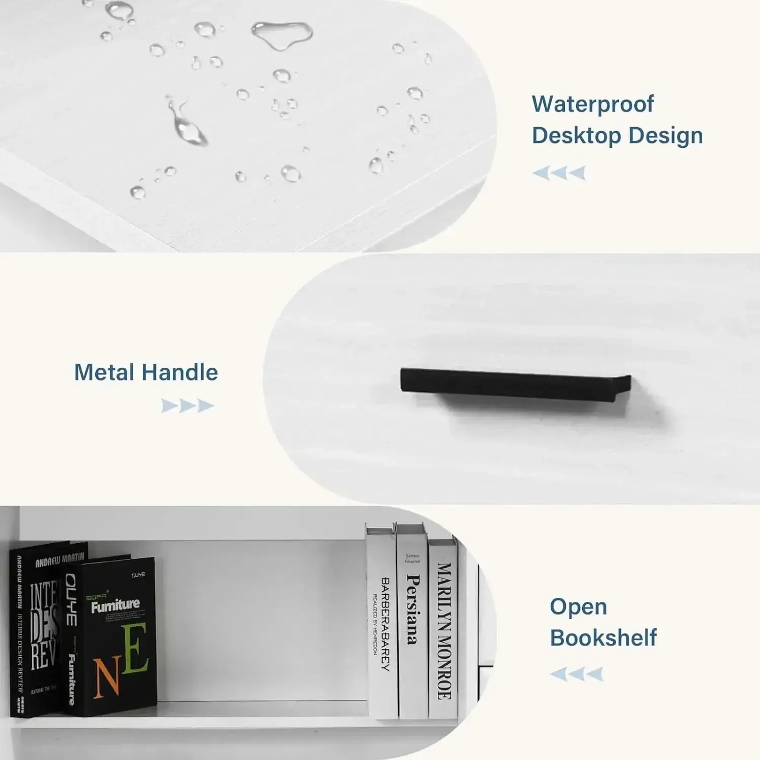
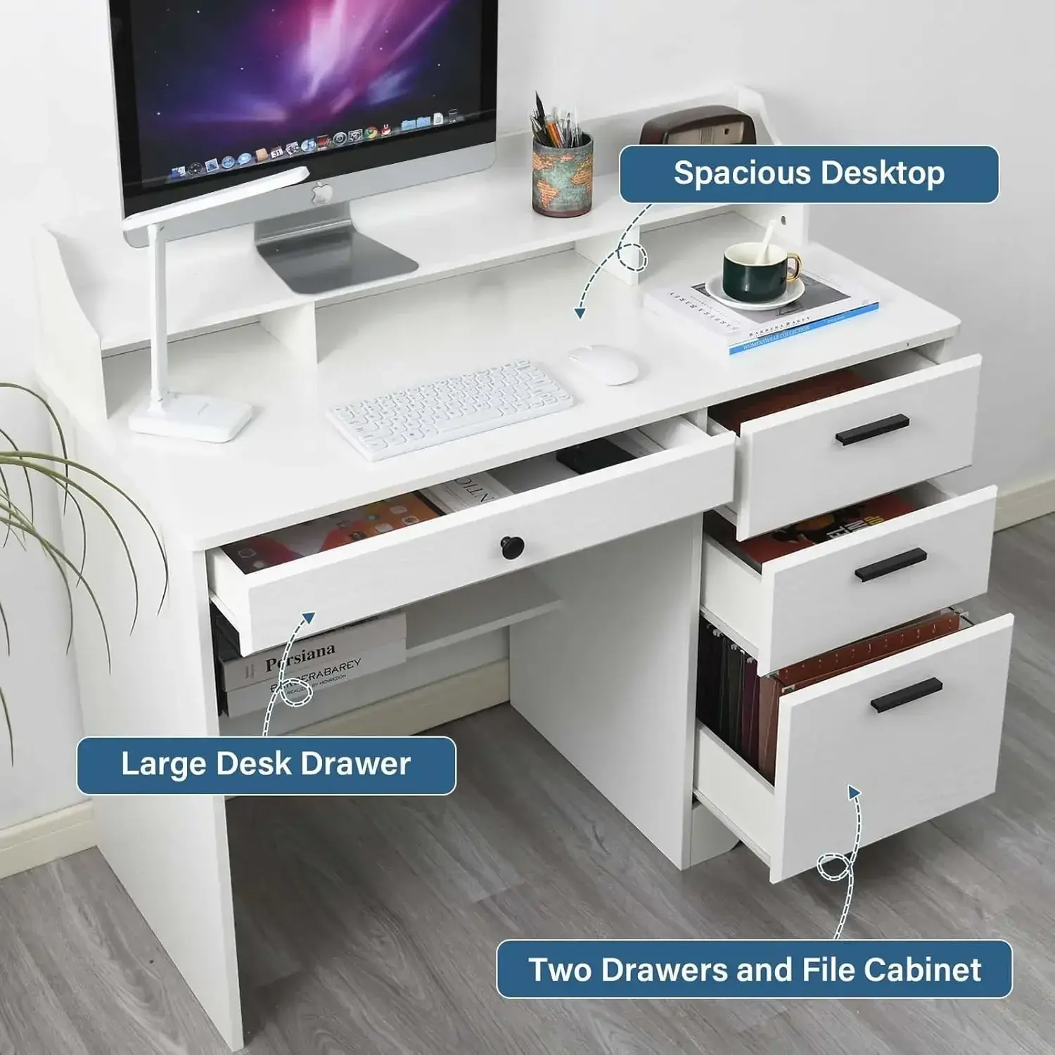
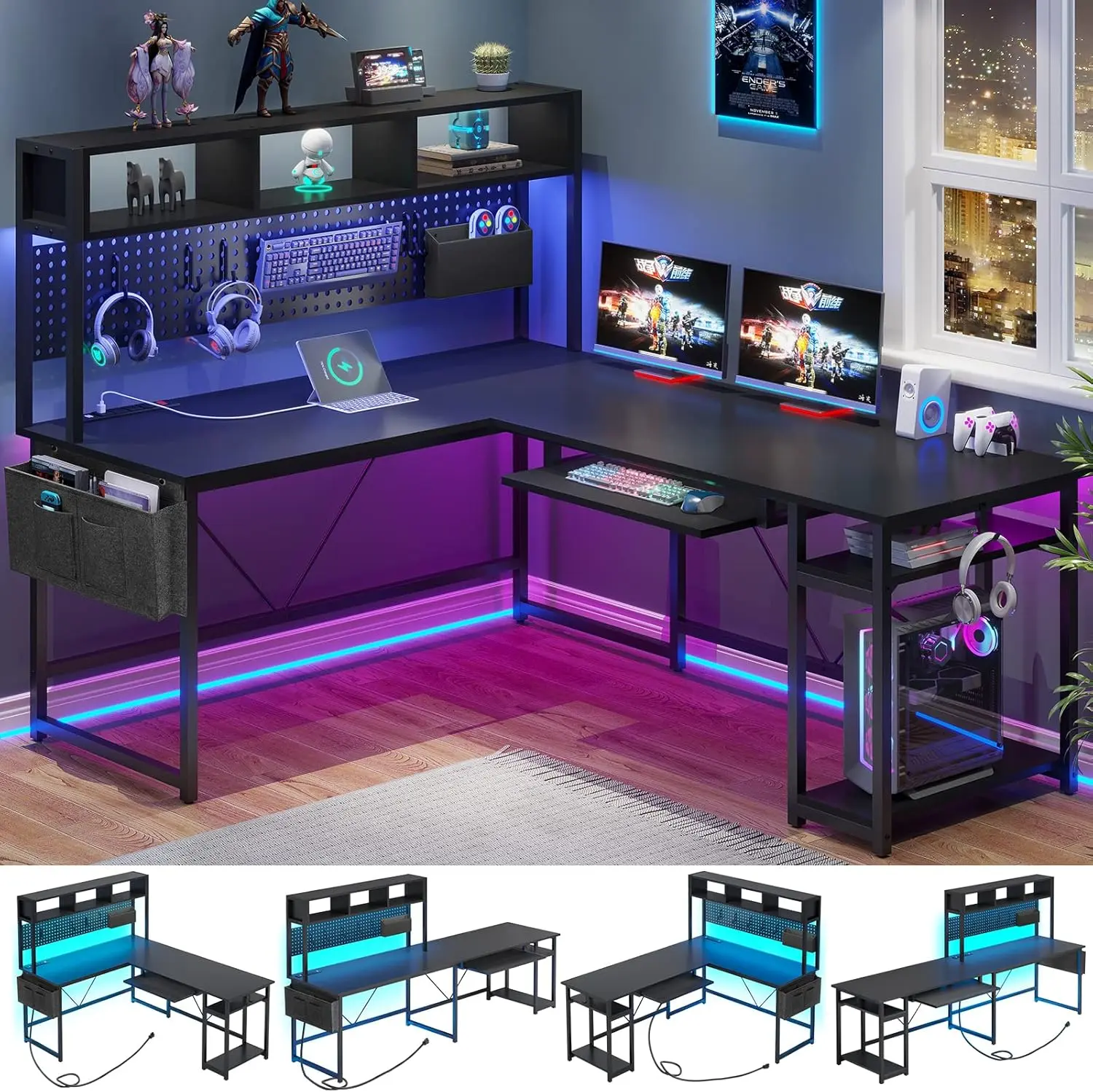
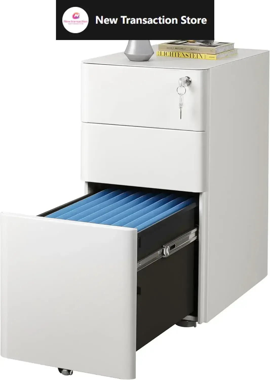
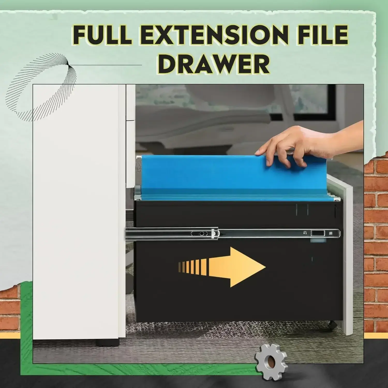
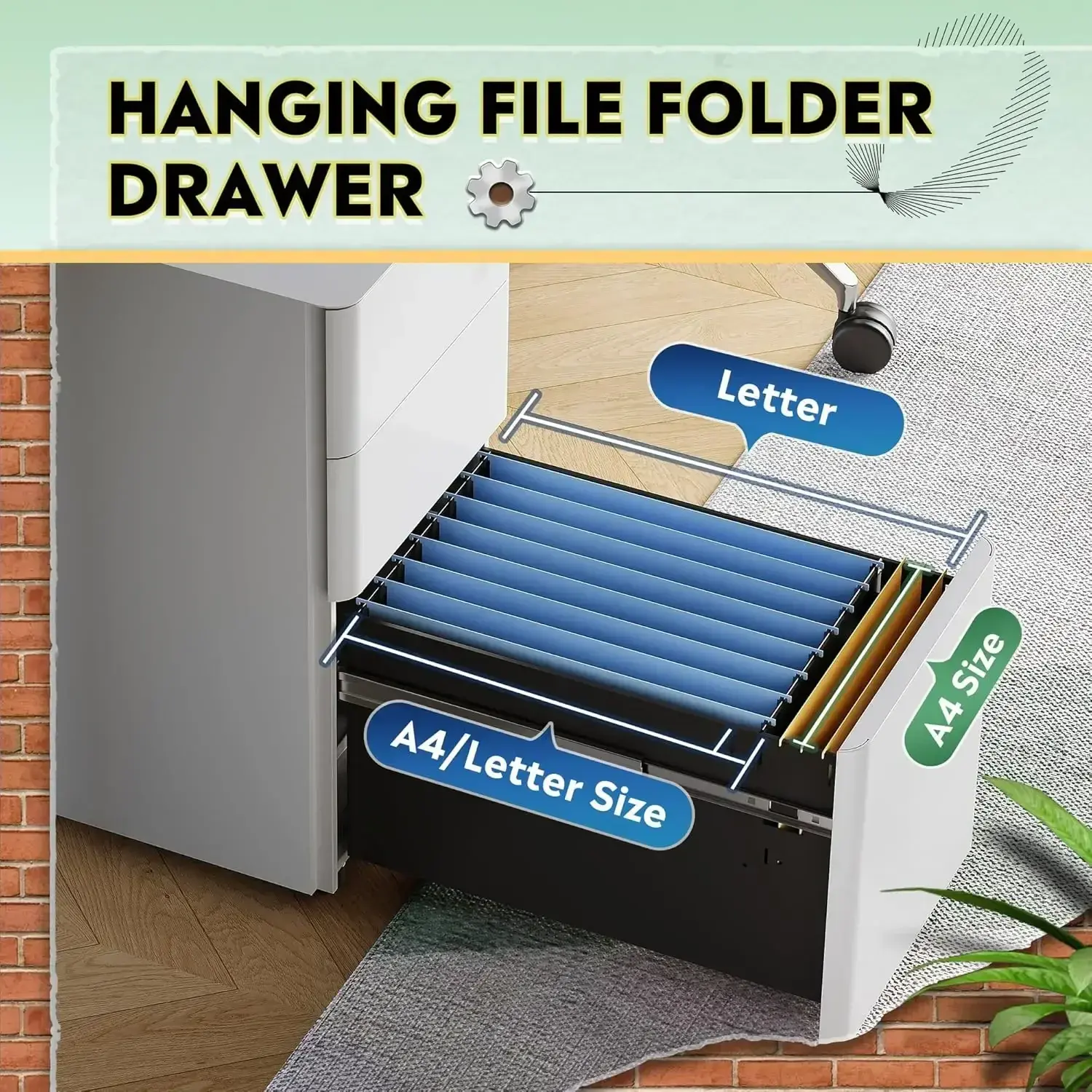
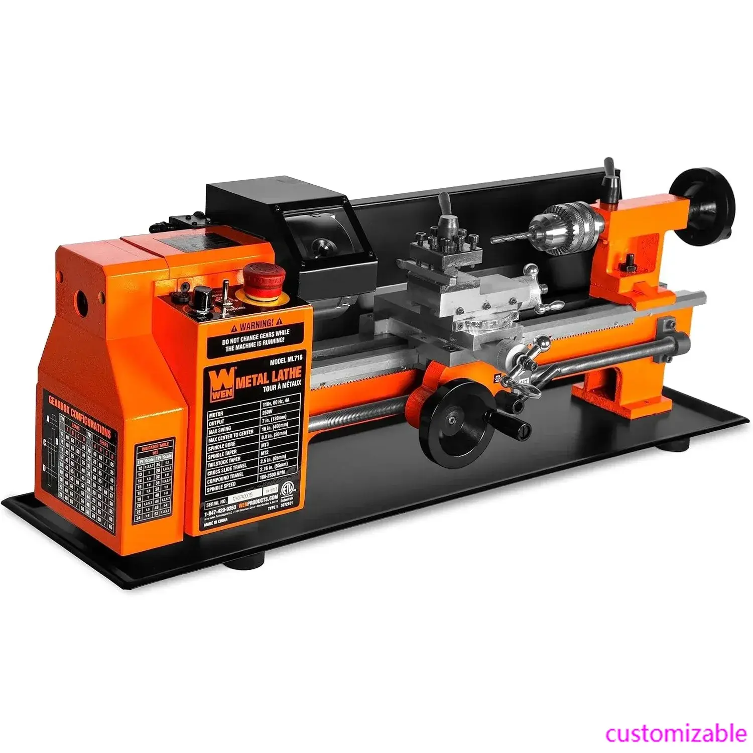
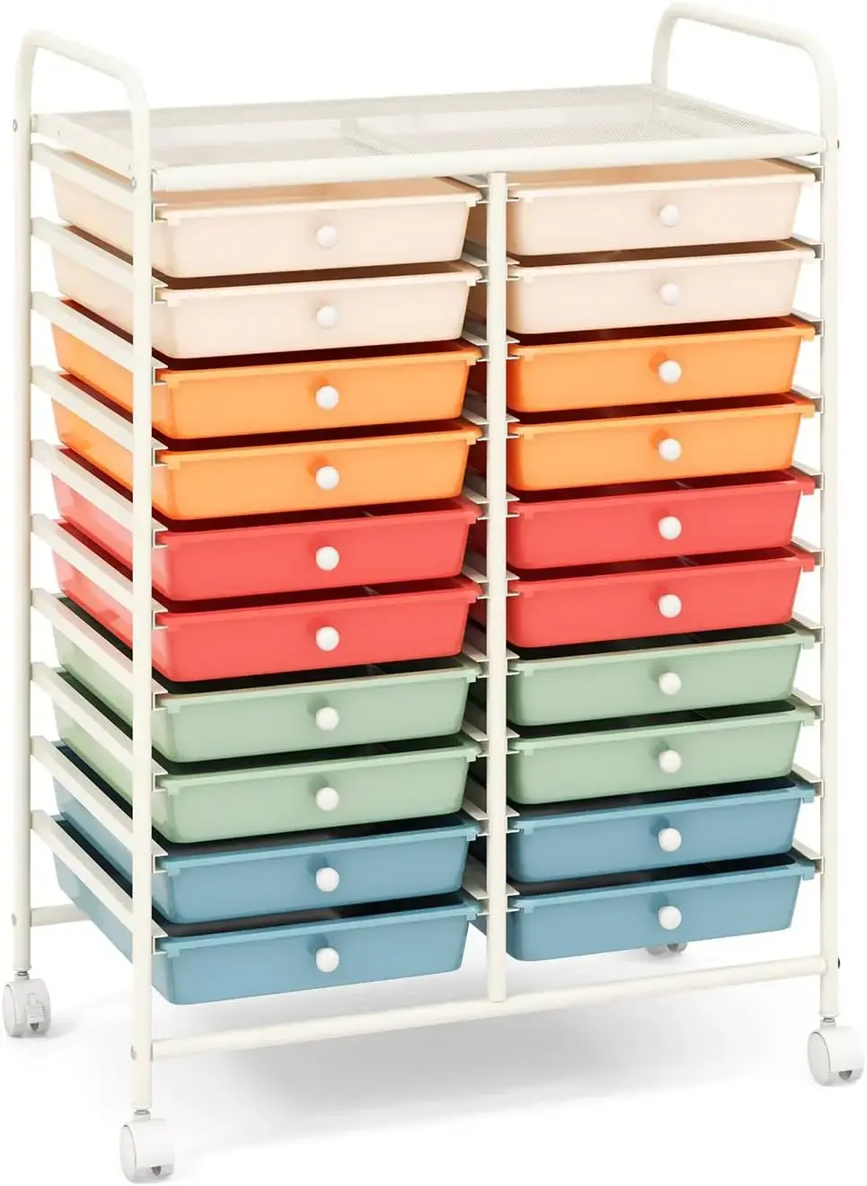
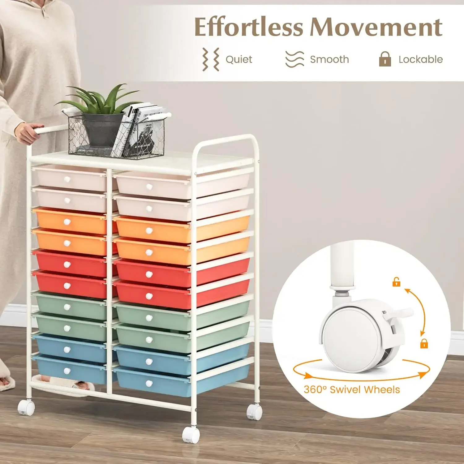
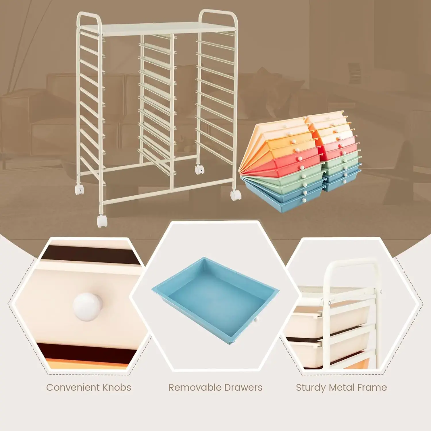
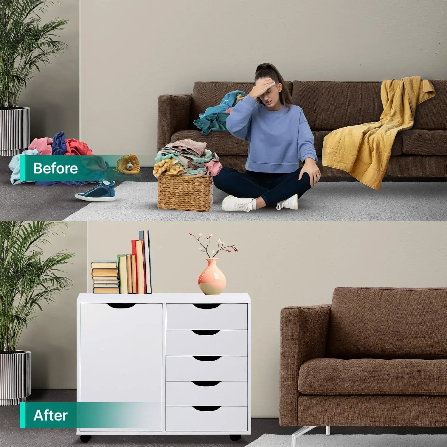
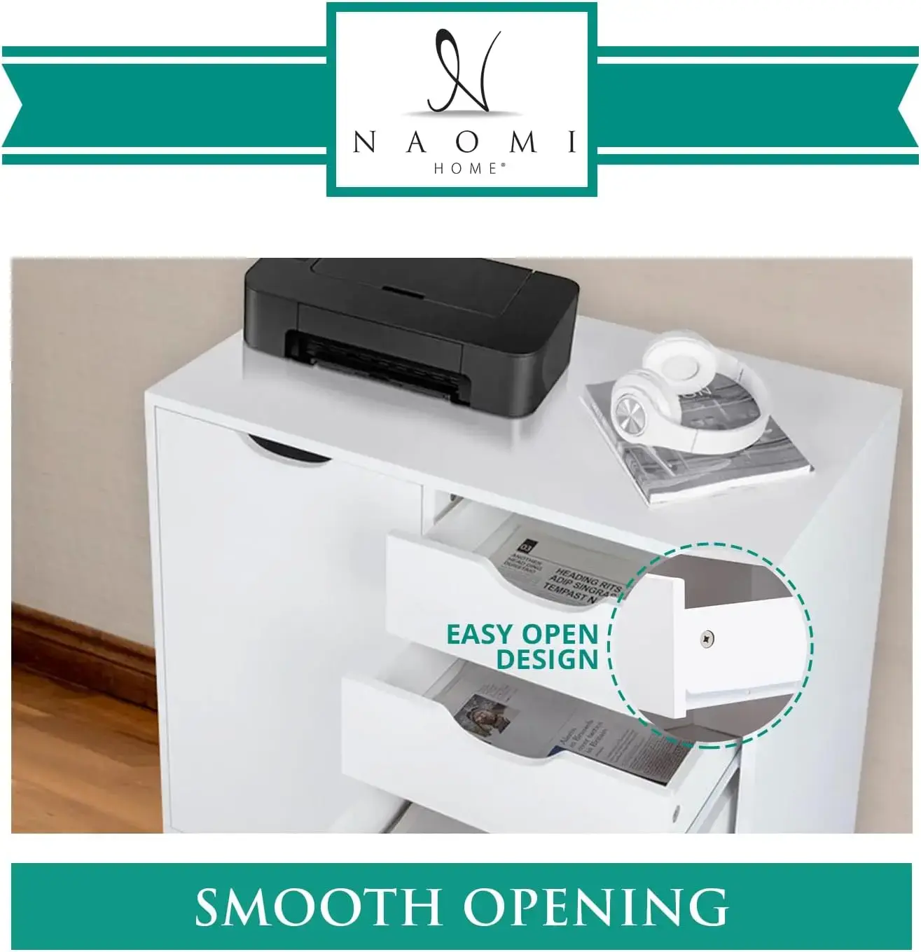
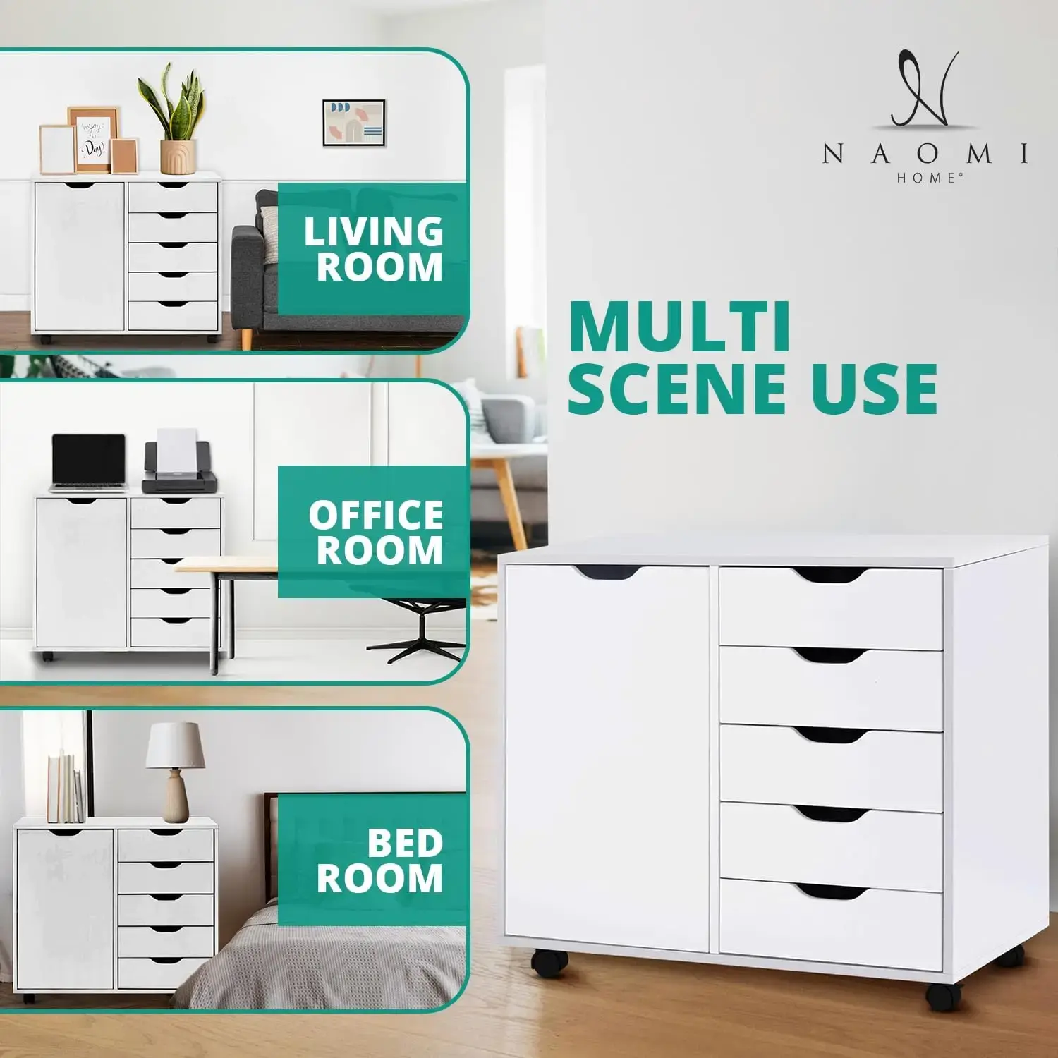
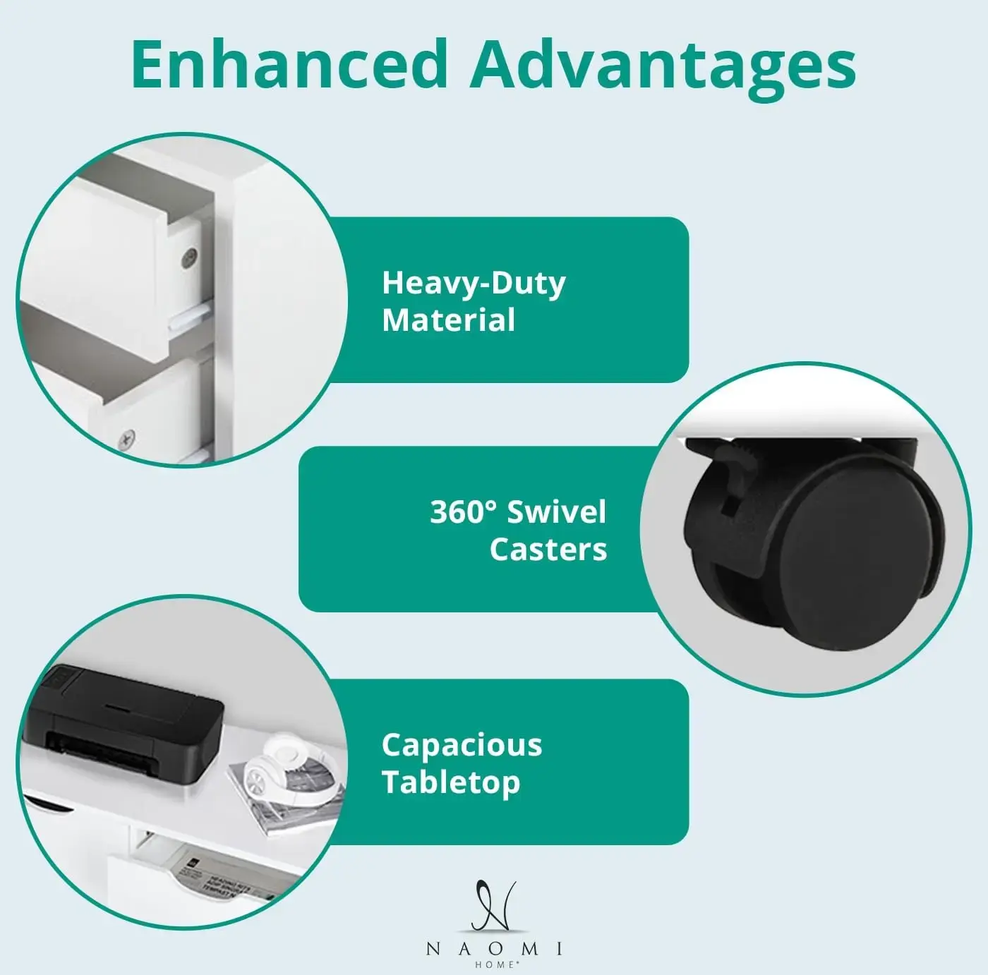
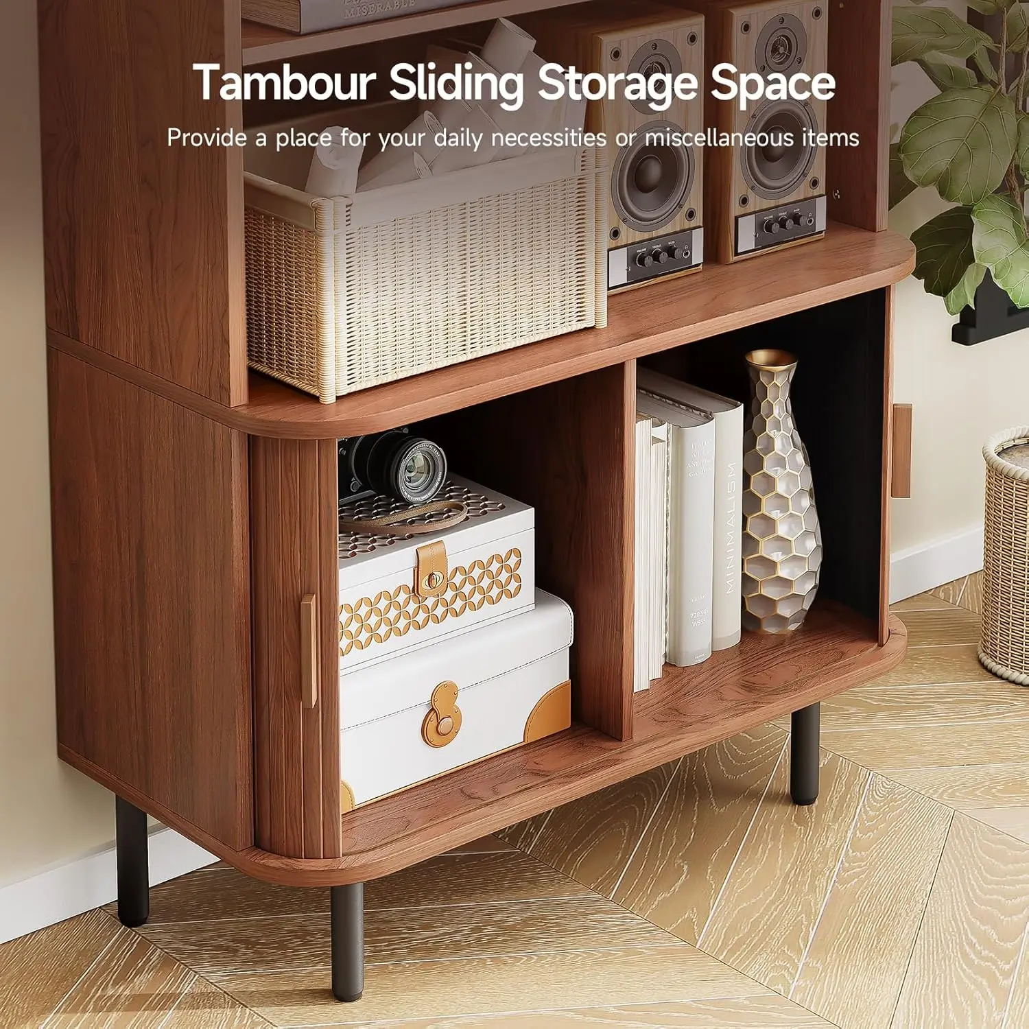
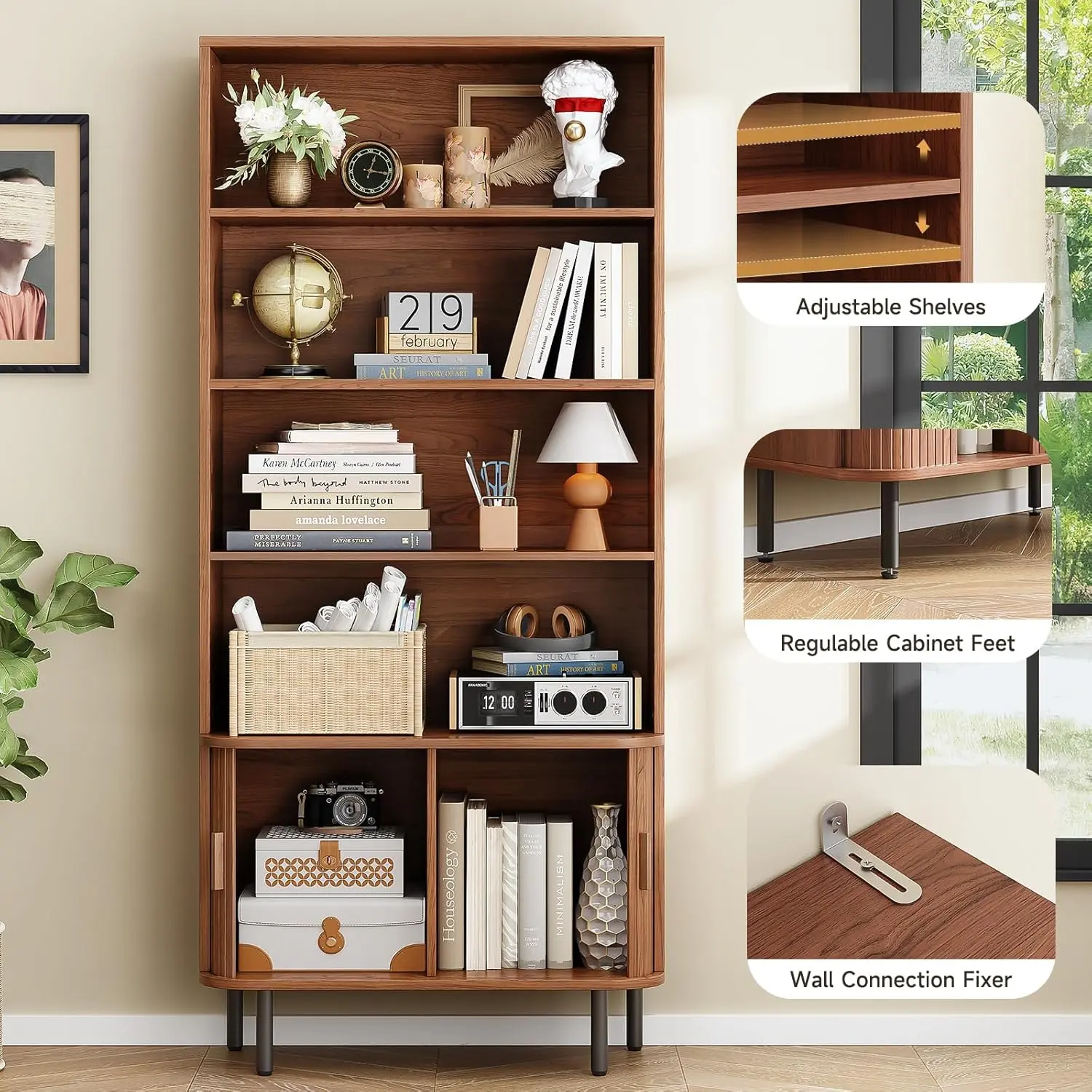
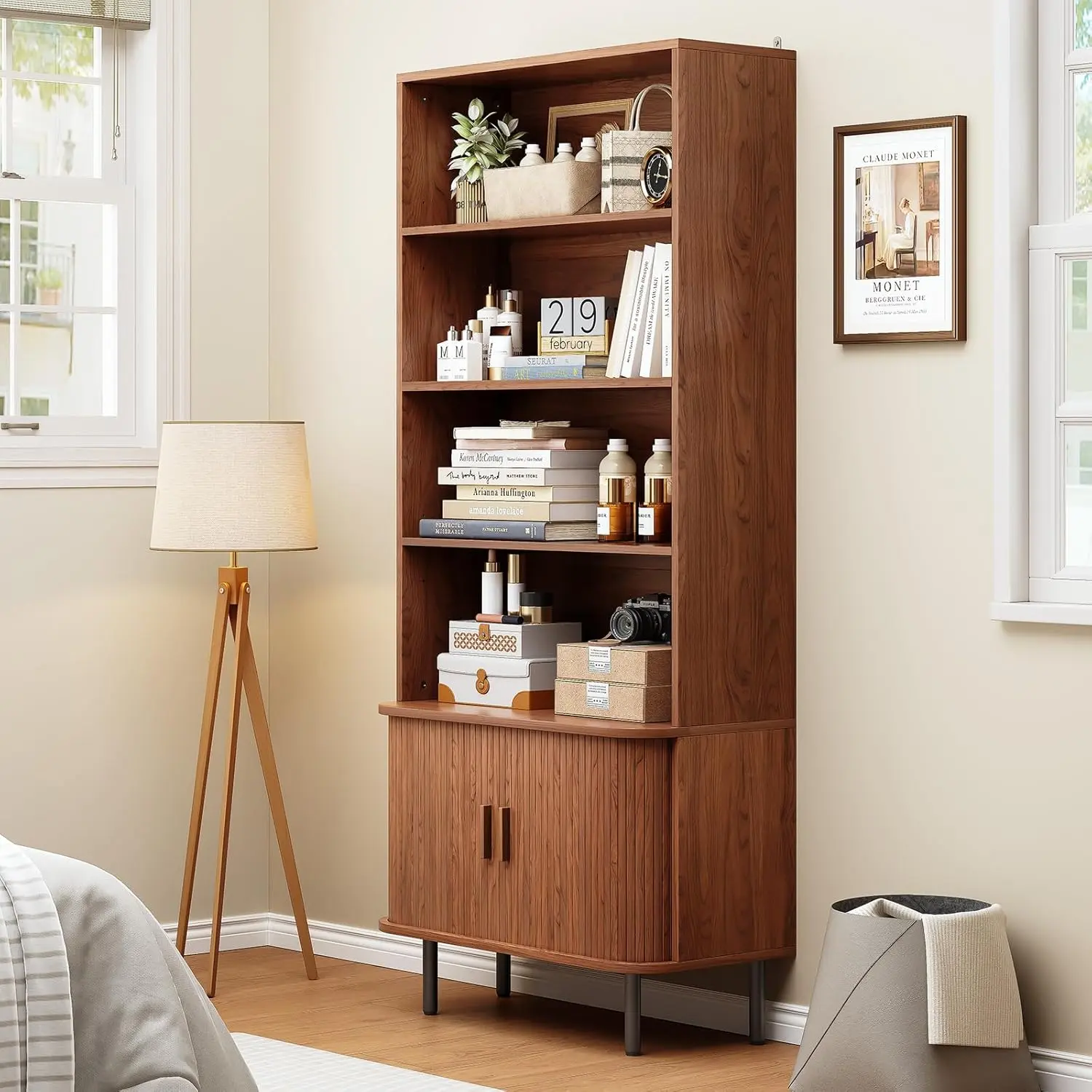
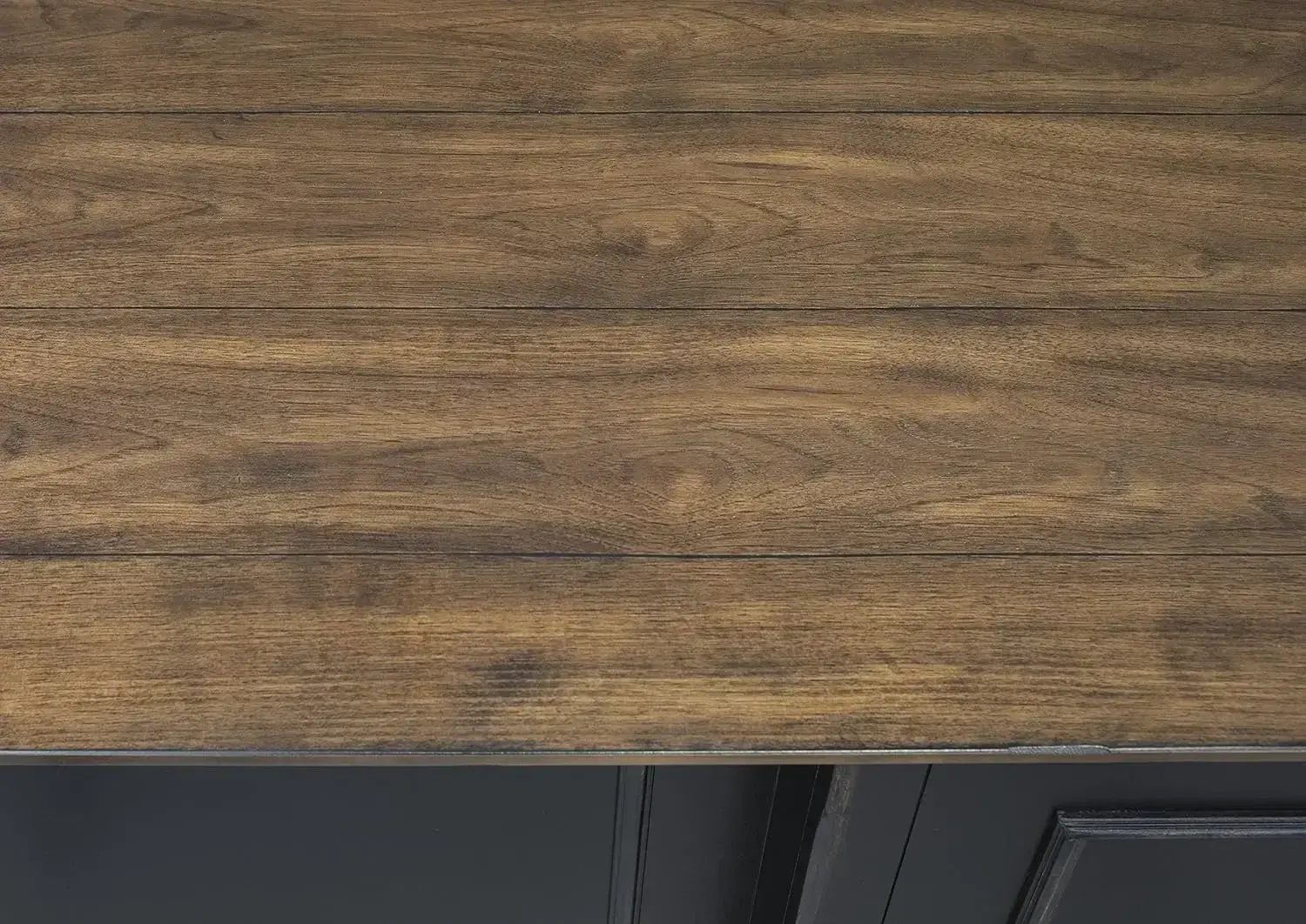
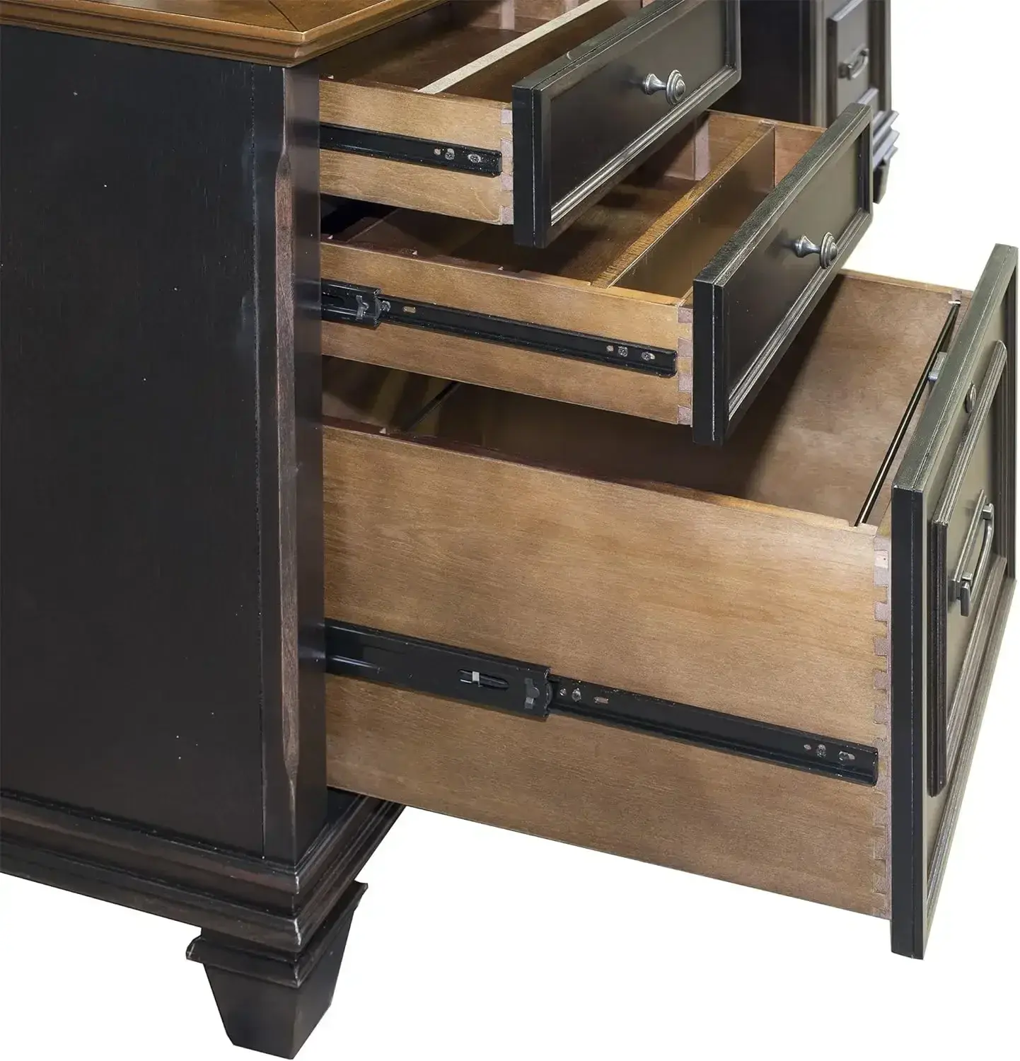
<li class="a-spacing-mini" style="box-sizing: border-box; list-style: disc; overflow-wrap: break-word; margin: 0px;"><span class="a-list-item" style="box-sizing: border-box; color: var(--__dChNmAmGoMXsw4B,#0f1111);">Two drawer vertical file cabinet</span></li>
<li class="a-spacing-mini" style="box-sizing: border-box; list-style: disc; overflow-wrap: break-word; margin: 0px;"><span class="a-list-item" style="box-sizing: border-box; color: var(--__dChNmAmGoMXsw4B,#0f1111);">Steel construction</span></li>
<li class="a-spacing-mini" style="box-sizing: border-box; list-style: disc; overflow-wrap: break-word; margin: 0px;"><span class="a-list-item" style="box-sizing: border-box; color: var(--__dChNmAmGoMXsw4B,#0f1111);">Letter size- -High-side drawers</span></li>
<li class="a-spacing-mini" style="box-sizing: border-box; list-style: disc; overflow-wrap: break-word; margin: 0px;"><span class="a-list-item" style="box-sizing: border-box; color: var(--__dChNmAmGoMXsw4B,#0f1111);">Glide suspension</span></li>
</ul>
</div>
<div class="a-row feature" data-feature-name="productDescription" data-template-name="productDescription" id="productDescription_feature_div"><!-- Used to set table width because AUI is overriding the width attribute of the tables coming in description -->
<style type="text/css">#productDescription h3 {
margin: 0.75em 0px 0.375em -1px;
}
</style>
</div>
<style type="text/css">.aplus-v2 .container-with-background-image {
width: 100%;
height: 100%;
background-repeat: no-repeat;
background-size: cover;
}
</style>
<style type="text/css">.aplus-v2 .apm-brand-story-carousel-container {
position: relative;
}
.aplus-v2 .apm-brand-story-carousel-hero-container,
.aplus-v2 .apm-brand-story-carousel-hero-container > div {
position: absolute;
width: 100%;
}
</style>
<style type="text/css">/*
Ensuring the carousel takes only the space it needs.
The sizes need to be set again on the absolutely positioned elements so they can take up space.
*/
.aplus-v2 .apm-brand-story-carousel-container,
.aplus-v2 .apm-brand-story-carousel-hero-container {
height: 625px;
width: 100%;
max-width: 1464px;
margin-left: auto;
margin-right: auto;
overflow: hidden;
}
.aplus-v2 .apm-brand-story-carousel-hero-container,
.aplus-v2 .apm-brand-story-carousel-hero-container > div {
height: 625px;
}
</style>
<style type="text/css">.aplus-v2 .apm-brand-story-carousel.a-carousel-container {
padding: 0px;
}
/*
This centers the carousel vertically on top of the hero image container and after the logo area (125px).
Margin-top = (heroHeight - cardHeight - logoAreaHeight) / 2 + logoAreaHeight
*/
.aplus-v2 .apm-brand-story-carousel .a-carousel-row-inner {
margin-top: 149px;
}
/*
Cards need to have a width set, otherwise they default to 50px or so.
All cards must have the same width. The carousel will resize itself so all cards take the width of the largest card.
The left margin is for leaving a space between each card.
*/
.aplus-v2 .apm-brand-story-carousel .a-carousel-card {
width: 362px;
margin-left: 30px !important;
}
/* styling the navigation buttons so they are taller, flush with the sides, and have a clean white background */
.aplus-v2 .apm-brand-story-carousel .a-carousel-col.a-carousel-left,
.aplus-v2 .apm-brand-story-carousel .a-carousel-col.a-carousel-right {
padding: 0px;
}
.aplus-v2 .apm-brand-story-carousel .a-carousel-col.a-carousel-left .a-button-image,
.aplus-v2 .apm-brand-story-carousel .a-carousel-col.a-carousel-right .a-button-image {
border: none;
margin: 0px;
}
.aplus-v2 .apm-brand-story-carousel .a-carousel-col.a-carousel-left .a-button-image .a-button-inner,
.aplus-v2 .apm-brand-story-carousel .a-carousel-col.a-carousel-right .a-button-image .a-button-inner {
background: #fff;
padding: 20px 6px;
}
.aplus-v2 .apm-brand-story-carousel .a-carousel-col.a-carousel-left .a-button-image .a-button-inner {
border-radius: 0px 4px 4px 0px;
}
.aplus-v2 .apm-brand-story-carousel .a-carousel-col.a-carousel-right .a-button-image .a-button-inner {
border-radius: 4px 0px 0px 4px;
}
</style>
<style type="text/css">.aplus-v2 .container-with-background-image {
width: 100%;
height: 100%;
background-repeat: no-repeat;
background-size: cover;
}
</style>
</div></div>
$262.406
$126.984
- Category : Furniture
- Brand : ecochic_furniture_store EcoChic Furniture Store
Colors
Sizes
-
+
<div class="detailmodule_html"><div class="detail-desc-decorate-richtext"><div class="a-section a-spacing-large bucket" id="aplus">
<ul class="a-unordered-list a-vertical a-spacing-mini" style="box-sizing: border-box; margin: 0px 0px 0px 18px; color: rgb(15, 17, 17); padding: 0px; font-family: "Amazon Ember", Arial, sans-serif; font-size: 14px; font-style: normal; font-variant-ligatures: normal; font-variant-caps: normal; font-weight: 400; letter-spacing: normal; orphans: 2; text-align: start; text-indent: 0px; text-transform: none; widows: 2; word-spacing: 0px; -webkit-text-stroke-width: 0px; white-space: normal; background-color: rgb(255, 255, 255); text-decoration-thickness: initial; text-decoration-style: initial; text-decoration-color: initial;">
<li class="a-spacing-mini" style="box-sizing: border-box; list-style: disc; overflow-wrap: break-word; margin: 0px;"><span class="a-list-item" style="box-sizing: border-box; color: var(--__dChNmAmGoMXsw4B,#0f1111);">Two drawer vertical file cabinet</span></li>
<li class="a-spacing-mini" style="box-sizing: border-box; list-style: disc; overflow-wrap: break-word; margin: 0px;"><span class="a-list-item" style="box-sizing: border-box; color: var(--__dChNmAmGoMXsw4B,#0f1111);">Steel construction</span></li>
<li class="a-spacing-mini" style="box-sizing: border-box; list-style: disc; overflow-wrap: break-word; margin: 0px;"><span class="a-list-item" style="box-sizing: border-box; color: var(--__dChNmAmGoMXsw4B,#0f1111);">Letter size- -High-side drawers</span></li>
<li class="a-spacing-mini" style="box-sizing: border-box; list-style: disc; overflow-wrap: break-word; margin: 0px;"><span class="a-list-item" style="box-sizing: border-box; color: var(--__dChNmAmGoMXsw4B,#0f1111);">Glide suspension</span></li>
</ul>
</div>
<div class="a-row feature" data-feature-name="productDescription" data-template-name="productDescription" id="productDescription_feature_div"><!-- Used to set table width because AUI is overriding the width attribute of the tables coming in description -->
<style type="text/css">#productDescription h3 {
margin: 0.75em 0px 0.375em -1px;
}
</style>
</div>
<style type="text/css">.aplus-v2 .container-with-background-image {
width: 100%;
height: 100%;
background-repeat: no-repeat;
background-size: cover;
}
</style>
<style type="text/css">.aplus-v2 .apm-brand-story-carousel-container {
position: relative;
}
.aplus-v2 .apm-brand-story-carousel-hero-container,
.aplus-v2 .apm-brand-story-carousel-hero-container > div {
position: absolute;
width: 100%;
}
</style>
<style type="text/css">/*
Ensuring the carousel takes only the space it needs.
The sizes need to be set again on the absolutely positioned elements so they can take up space.
*/
.aplus-v2 .apm-brand-story-carousel-container,
.aplus-v2 .apm-brand-story-carousel-hero-container {
height: 625px;
width: 100%;
max-width: 1464px;
margin-left: auto;
margin-right: auto;
overflow: hidden;
}
.aplus-v2 .apm-brand-story-carousel-hero-container,
.aplus-v2 .apm-brand-story-carousel-hero-container > div {
height: 625px;
}
</style>
<style type="text/css">.aplus-v2 .apm-brand-story-carousel.a-carousel-container {
padding: 0px;
}
/*
This centers the carousel vertically on top of the hero image container and after the logo area (125px).
Margin-top = (heroHeight - cardHeight - logoAreaHeight) / 2 + logoAreaHeight
*/
.aplus-v2 .apm-brand-story-carousel .a-carousel-row-inner {
margin-top: 149px;
}
/*
Cards need to have a width set, otherwise they default to 50px or so.
All cards must have the same width. The carousel will resize itself so all cards take the width of the largest card.
The left margin is for leaving a space between each card.
*/
.aplus-v2 .apm-brand-story-carousel .a-carousel-card {
width: 362px;
margin-left: 30px !important;
}
/* styling the navigation buttons so they are taller, flush with the sides, and have a clean white background */
.aplus-v2 .apm-brand-story-carousel .a-carousel-col.a-carousel-left,
.aplus-v2 .apm-brand-story-carousel .a-carousel-col.a-carousel-right {
padding: 0px;
}
.aplus-v2 .apm-brand-story-carousel .a-carousel-col.a-carousel-left .a-button-image,
.aplus-v2 .apm-brand-story-carousel .a-carousel-col.a-carousel-right .a-button-image {
border: none;
margin: 0px;
}
.aplus-v2 .apm-brand-story-carousel .a-carousel-col.a-carousel-left .a-button-image .a-button-inner,
.aplus-v2 .apm-brand-story-carousel .a-carousel-col.a-carousel-right .a-button-image .a-button-inner {
background: #fff;
padding: 20px 6px;
}
.aplus-v2 .apm-brand-story-carousel .a-carousel-col.a-carousel-left .a-button-image .a-button-inner {
border-radius: 0px 4px 4px 0px;
}
.aplus-v2 .apm-brand-story-carousel .a-carousel-col.a-carousel-right .a-button-image .a-button-inner {
border-radius: 4px 0px 0px 4px;
}
</style>
<style type="text/css">.aplus-v2 .container-with-background-image {
width: 100%;
height: 100%;
background-repeat: no-repeat;
background-size: cover;
}
</style>
</div></div>
Related Product
Browse The Collection of Top Products.
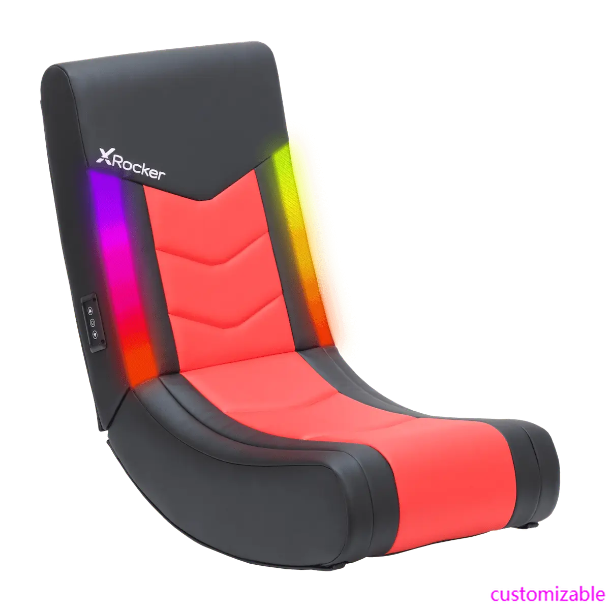
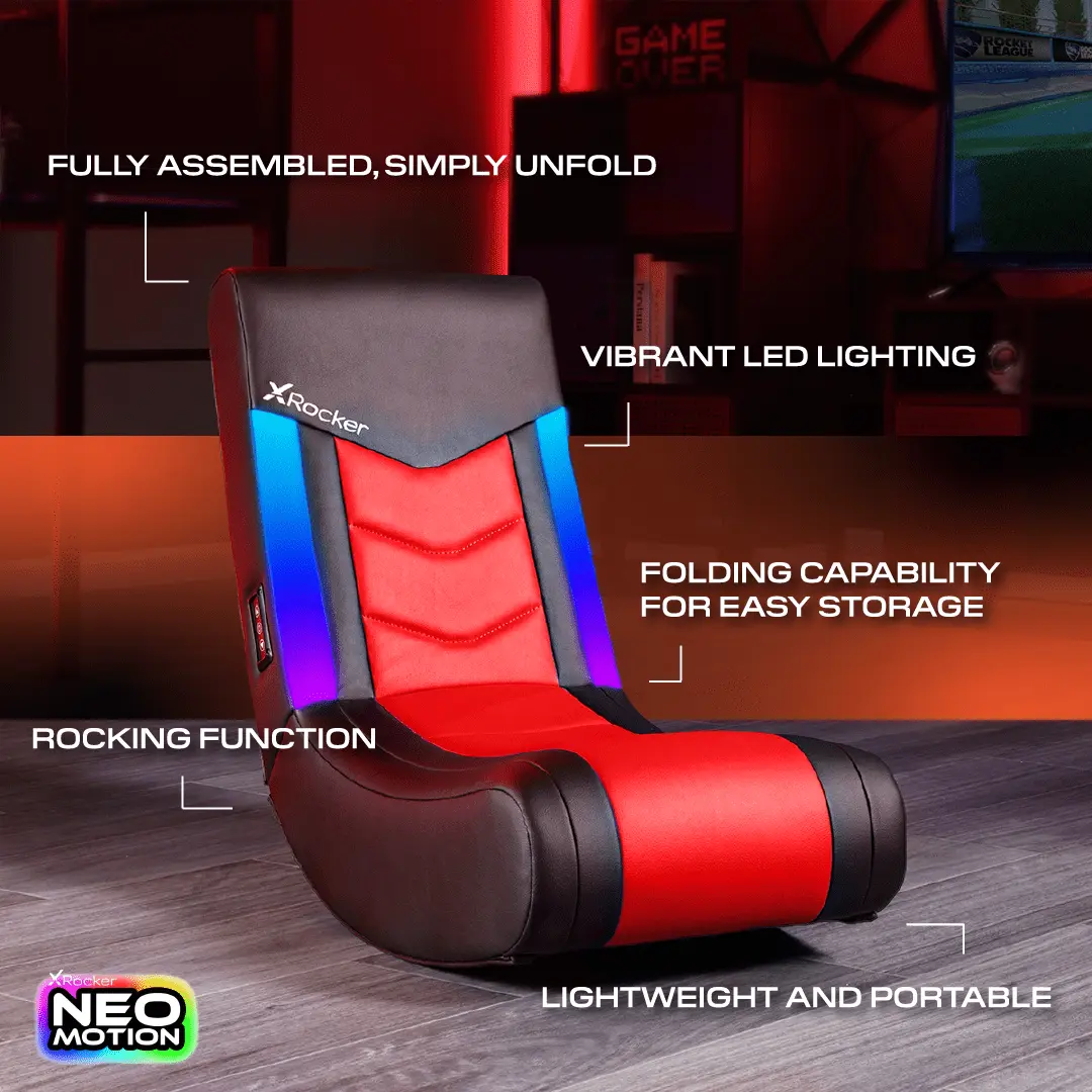
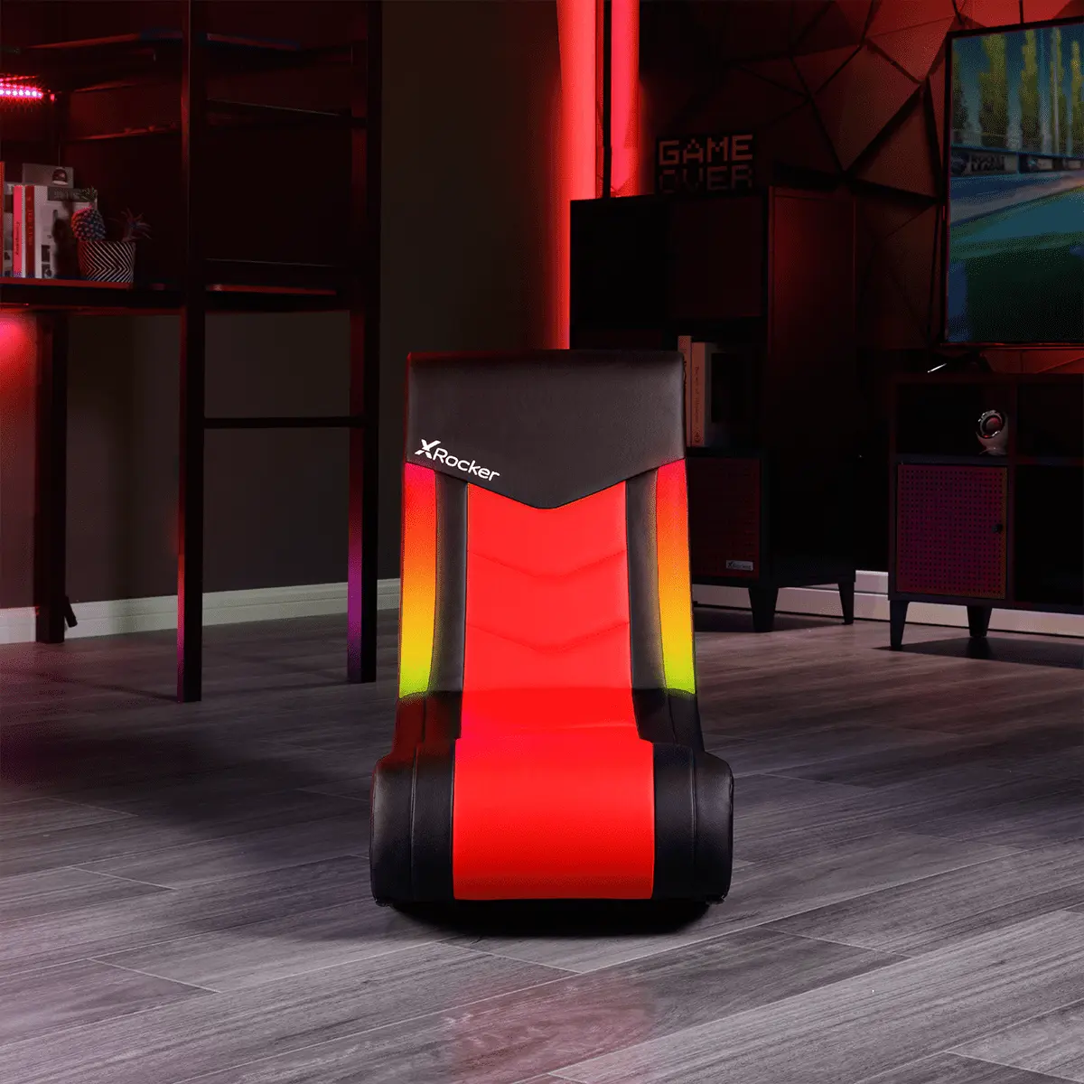
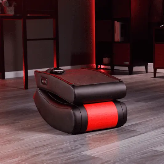
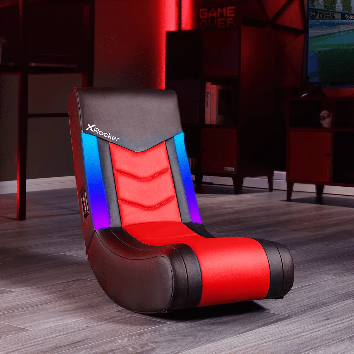
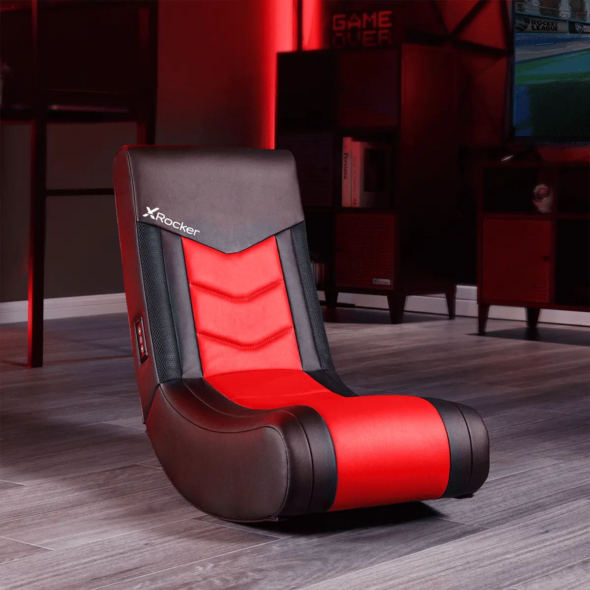
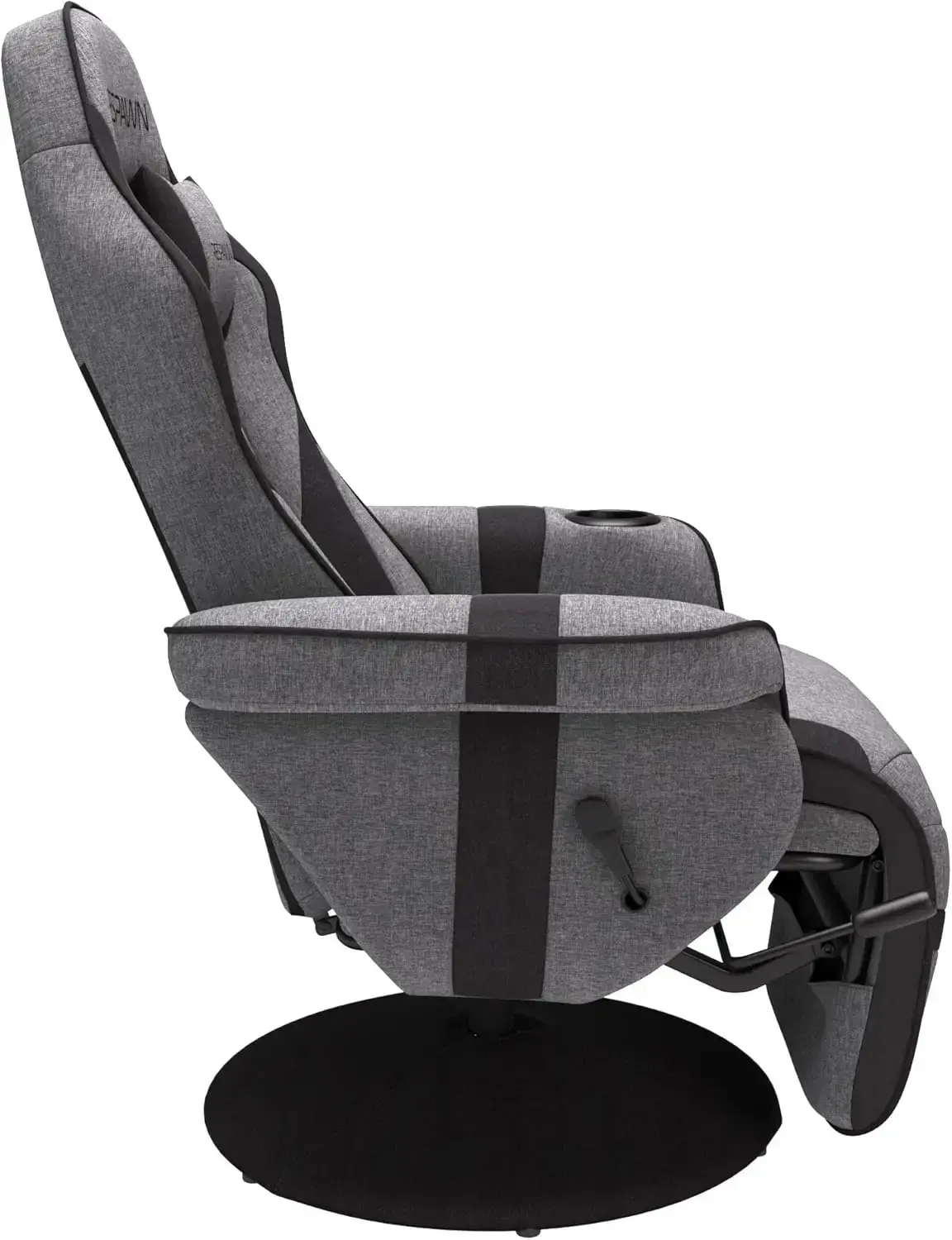
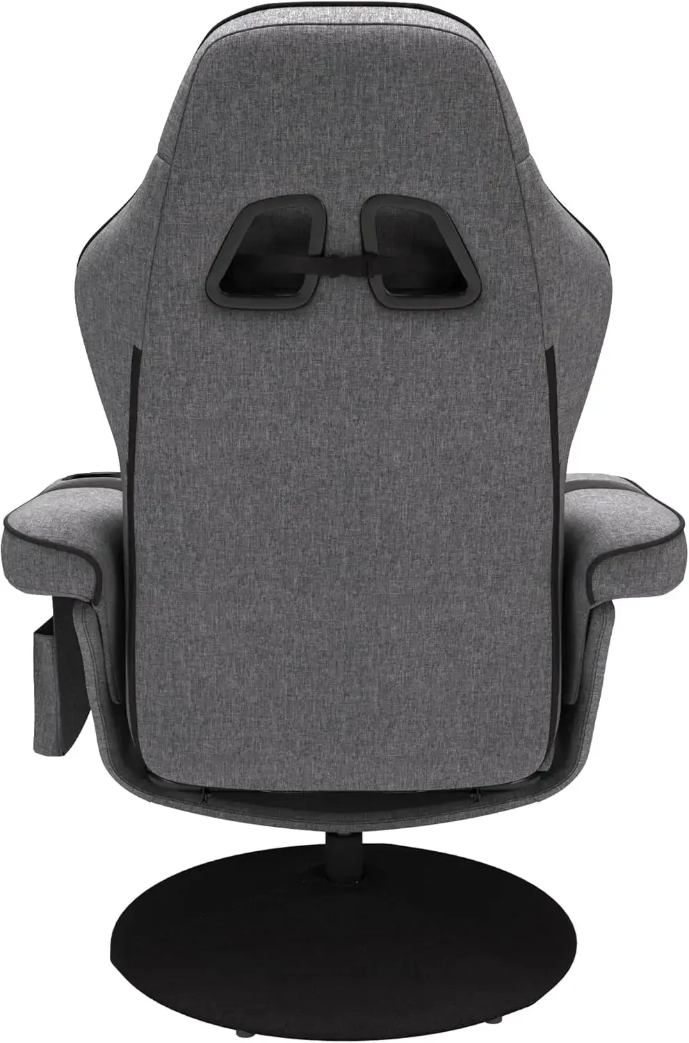
Solo Floor Rocker Gaming Chair with RGB Lighting, Red
$80.675
$145.04
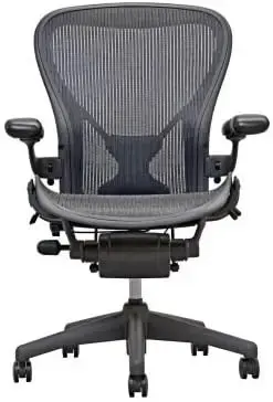
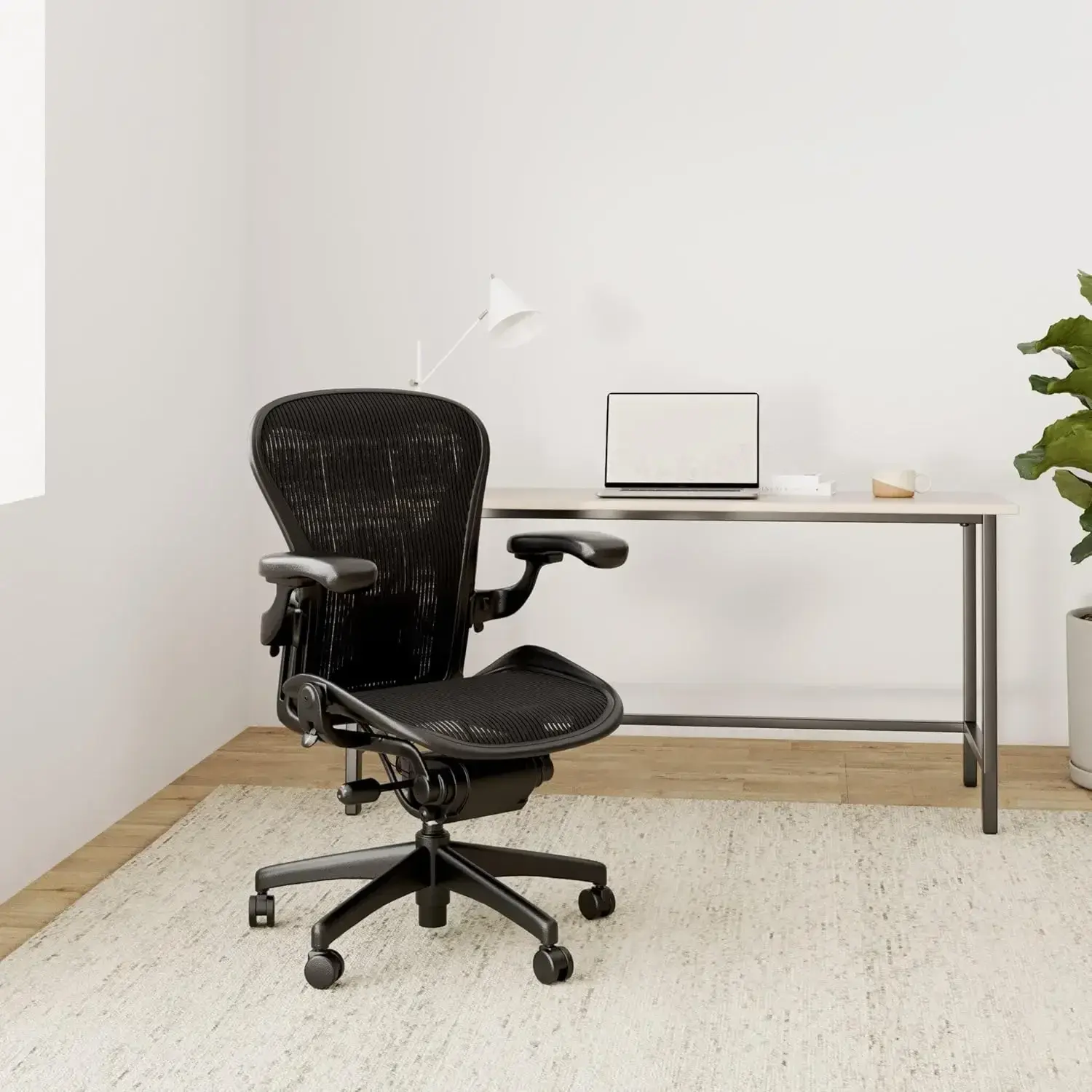
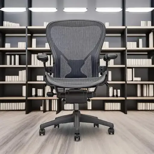
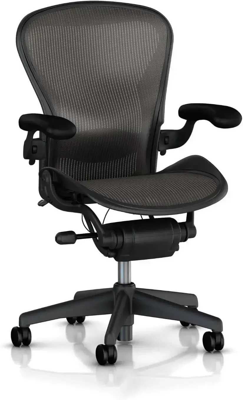
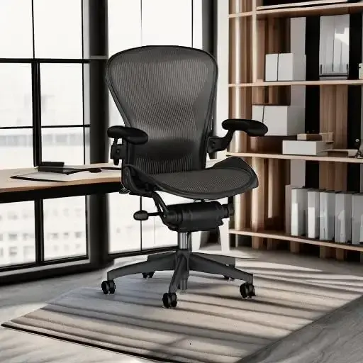
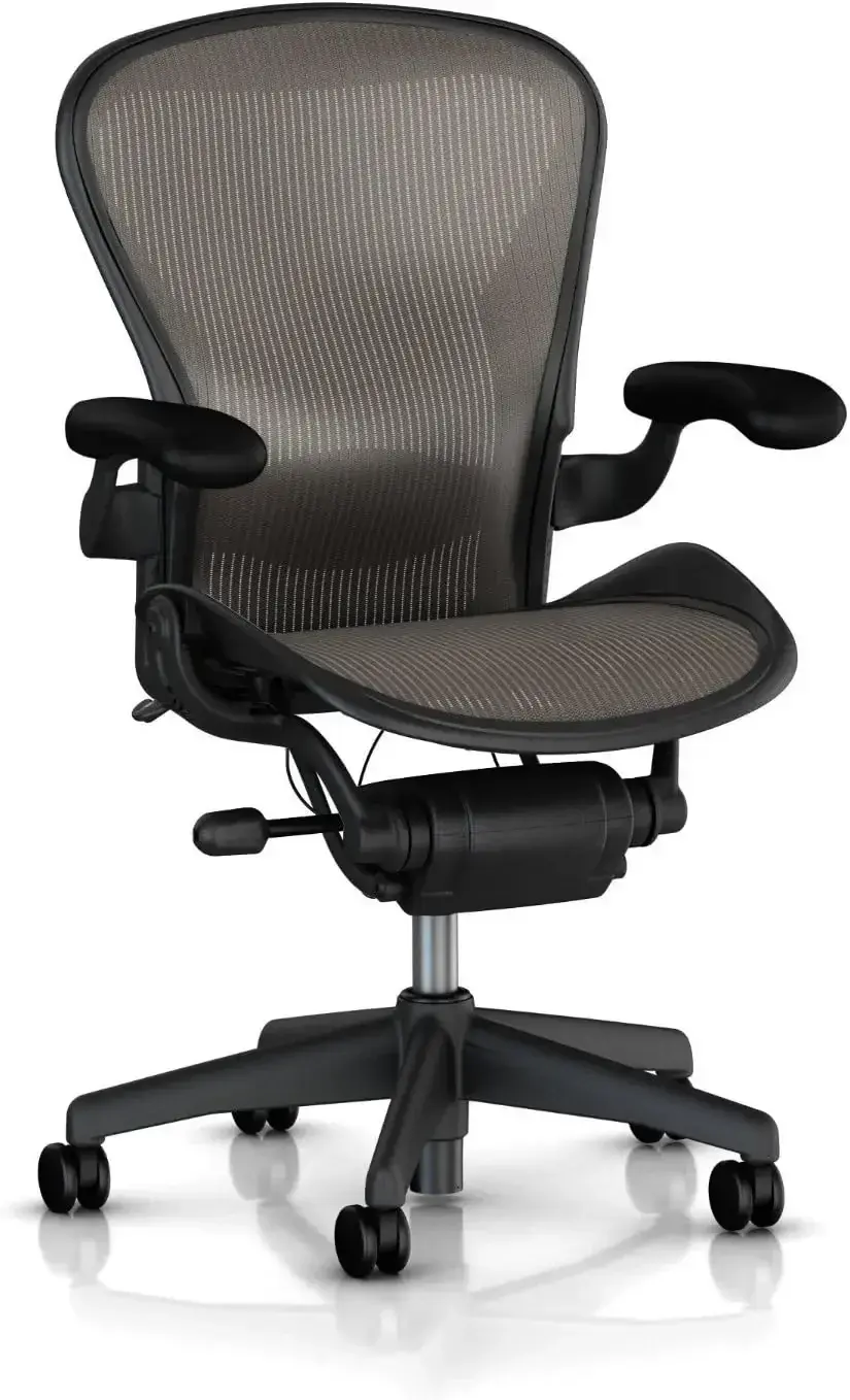
Aeron Chair Size B Fully Loaded Posture Fit
$742.7
$2059.52
Hartford Credenza, Brown - Fully Assembled
$1154.075
$3115.715