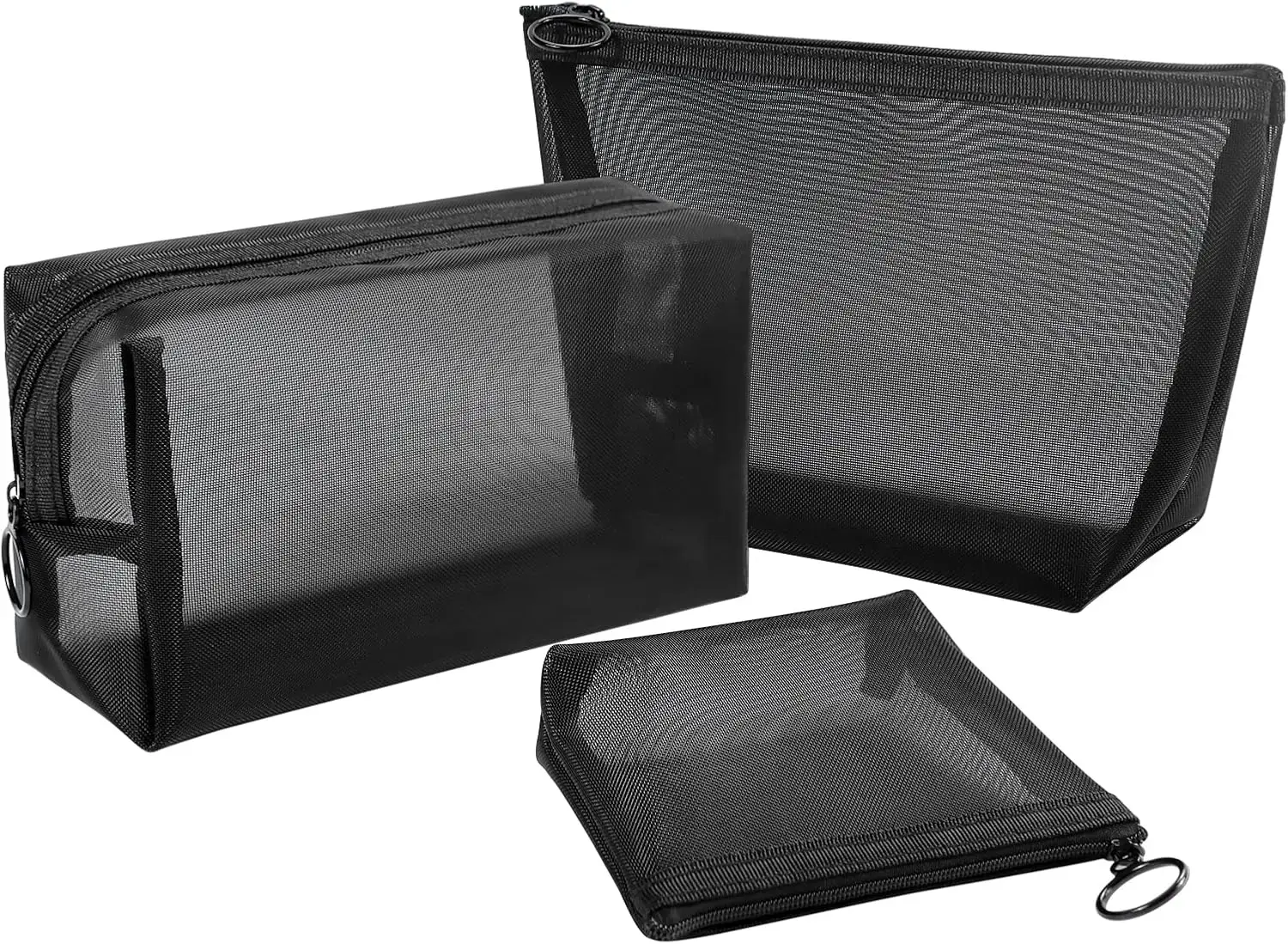
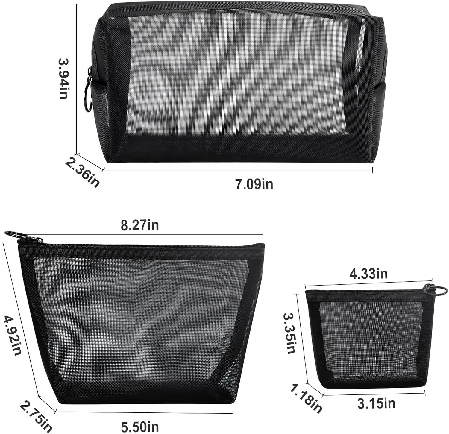
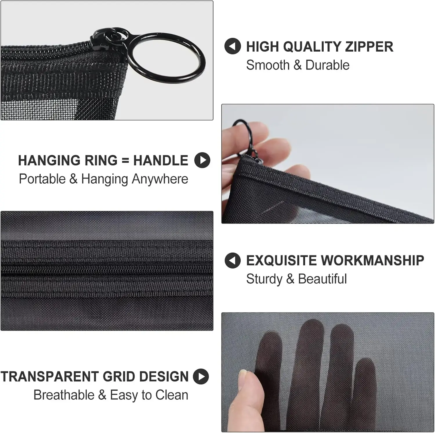
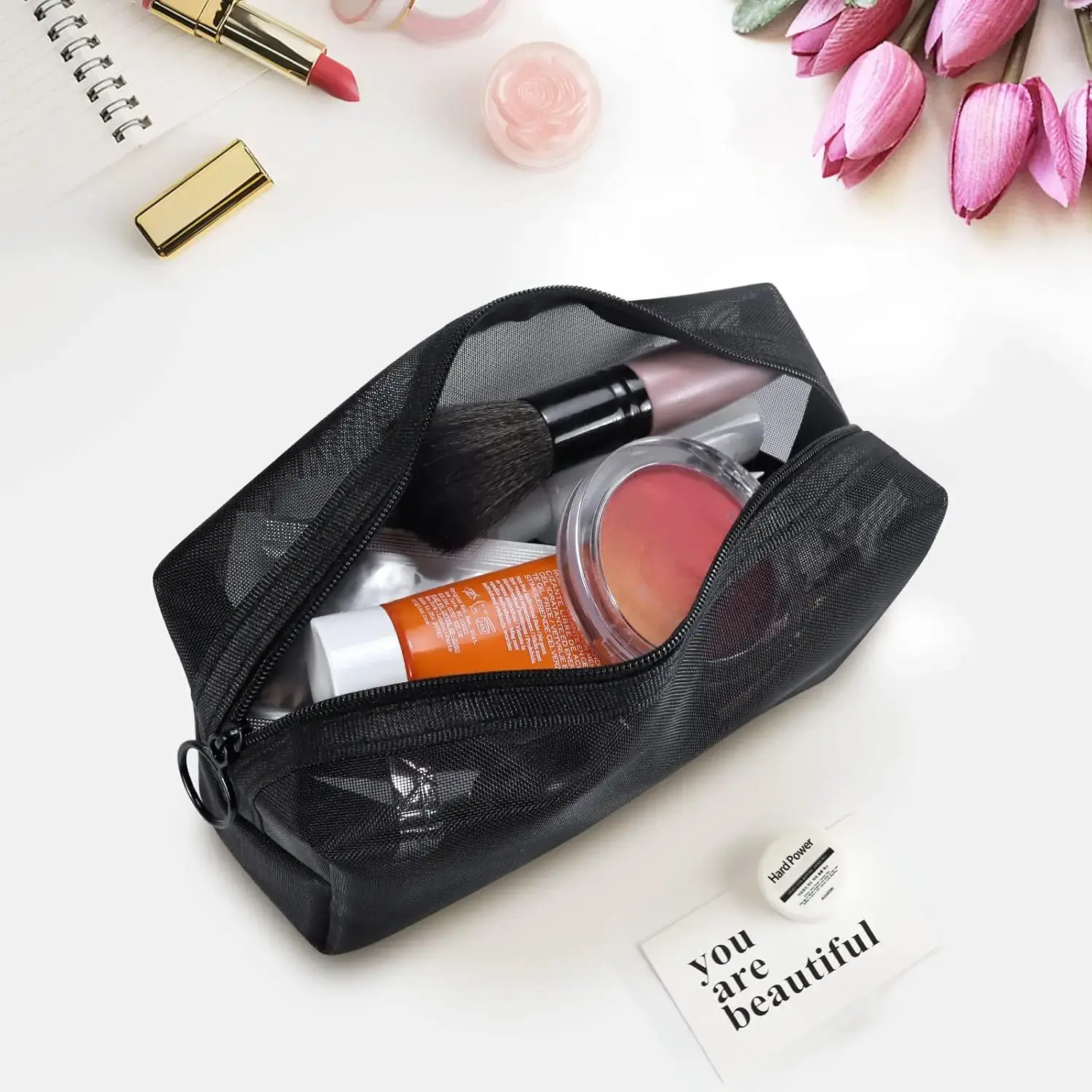
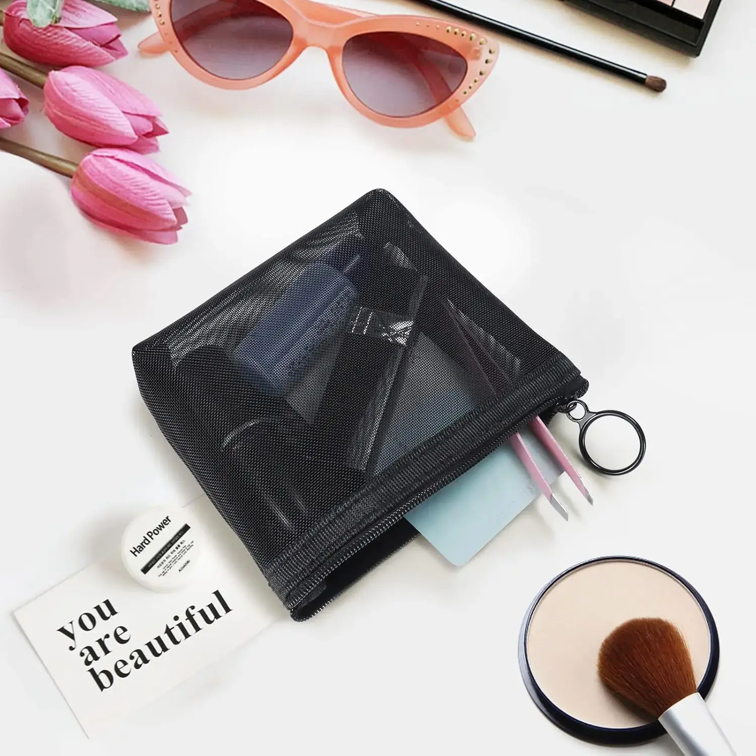
1PC Travel Black Mesh Cosmetic Bag Zipper Makeup Bag For Women Wash Toiletry Bag Makeup Organizer Portable Storage Pouch
<div class="detailmodule_html"><div class="detail-desc-decorate-richtext"> <div id="aplus">
<hr class="bucketDivider" noshade="true" size="1" />
<h2>Product Description</h2>
<style type="text/css">.aplus-v2 .container-with-background-image {
width: 100%;
height: 100%;
background-repeat: no-repeat;
background-size: cover;
}
</style>
<div cel_widget_id="aplus">
<div cel_widget_id="aplus-launchpad-company-logo">
<div>
</div>
</div>
<div cel_widget_id="aplus-3p-module-b">
<div>
</div>
</div>
<div cel_widget_id="aplus-3p-module-b">
<div>
</div>
</div>
<div cel_widget_id="aplus-3p-module-b">
<div>
</div>
</div>
<div cel_widget_id="aplus-module-12">
<div>
<div>
<div>
</div>
</div>
</div>
</div>
</div>
</div> <div data-feature-name="productDescription" data-template-name="productDescription" id="productDescription_feature_div">
<h2 class="softlines">Product Description</h2>
<div id="productDescription">
<!-- show up to 2 reviews by default -->
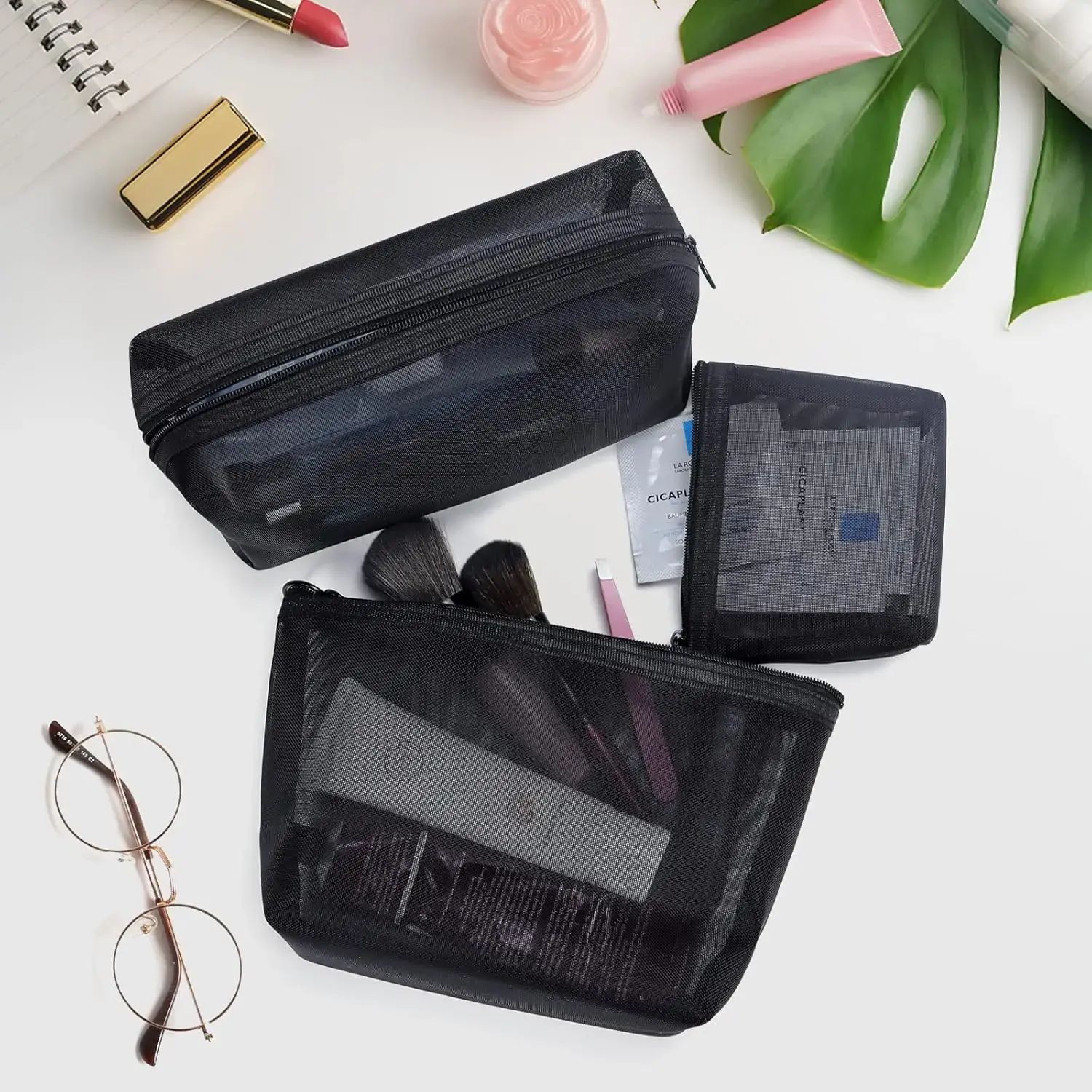
<p><span>Aosbos 3-Pack Mesh Cosmetic Bag Set - Travel/On-The-Go Makeup Storage, Zipper Closure</span></p>
</div>
<!-- Used to set table width because AUI is overriding the width attribute of the tables coming in description -->
<style type="text/css">#productDescription h3 {
margin: 0.75em 0px 0.375em -1px;
}
</style>
</div> <div id="aplus">
<hr class="bucketDivider" noshade="true" size="1" />
<h2>From the brand</h2>
<style type="text/css">.aplus-v2 .container-with-background-image {
width: 100%;
height: 100%;
background-repeat: no-repeat;
background-size: cover;
}
</style>
<div cel_widget_id="aplus">
<style type="text/css">.aplus-v2 .apm-brand-story-carousel-container {
position: relative;
}
.aplus-v2 .apm-brand-story-carousel-hero-container,
.aplus-v2 .apm-brand-story-carousel-hero-container > div {
position: absolute;
width: 100%;
}
</style>
<style type="text/css">/*
Ensuring the carousel takes only the space it needs.
The sizes need to be set again on the absolutely positioned elements so they can take up space.
*/
.aplus-v2 .apm-brand-story-carousel-container,
.aplus-v2 .apm-brand-story-carousel-hero-container {
height: 625px;
width: 100%;
max-width: 1464px;
margin-left: auto;
margin-right: auto;
overflow: hidden;
}
.aplus-v2 .apm-brand-story-carousel-hero-container,
.aplus-v2 .apm-brand-story-carousel-hero-container > div {
height: 625px;
}
</style>
<style type="text/css">.aplus-v2 .apm-brand-story-carousel.a-carousel-container {
padding: 0px;
}
/*
This centers the carousel vertically on top of the hero image container and after the logo area (125px).
Margin-top = (heroHeight - cardHeight - logoAreaHeight) / 2 + logoAreaHeight
*/
.aplus-v2 .apm-brand-story-carousel .a-carousel-row-inner {
margin-top: 149px;
}
/*
Cards need to have a width set, otherwise they default to 50px or so.
All cards must have the same width. The carousel will resize itself so all cards take the width of the largest card.
The left margin is for leaving a space between each card.
*/
.aplus-v2 .apm-brand-story-carousel .a-carousel-card {
width: 362px;
margin-left: 30px !important;
}
/* styling the navigation buttons so they are taller, flush with the sides, and have a clean white background */
.aplus-v2 .apm-brand-story-carousel .a-carousel-col.a-carousel-left,
.aplus-v2 .apm-brand-story-carousel .a-carousel-col.a-carousel-right {
padding: 0px;
}
.aplus-v2 .apm-brand-story-carousel .a-carousel-col.a-carousel-left .a-button-image,
.aplus-v2 .apm-brand-story-carousel .a-carousel-col.a-carousel-right .a-button-image {
border: none;
margin: 0px;
}
.aplus-v2 .apm-brand-story-carousel .a-carousel-col.a-carousel-left .a-button-image .a-button-inner,
.aplus-v2 .apm-brand-story-carousel .a-carousel-col.a-carousel-right .a-button-image .a-button-inner {
background: #fff;
padding: 20px 6px;
}
.aplus-v2 .apm-brand-story-carousel .a-carousel-col.a-carousel-left .a-button-image .a-button-inner {
border-radius: 0px 4px 4px 0px;
}
.aplus-v2 .apm-brand-story-carousel .a-carousel-col.a-carousel-right .a-button-image .a-button-inner {
border-radius: 4px 0px 0px 4px;
}
</style>
<div>
<div>
<div>
<div cel_widget_id="aplus-brand-story-hero-1-image-logo">
<div>
<div>
</div>
<div>
<h3>Enjoy Healthy and Refined Life</h3>
</div>
</div>
<div style="clear:both">
</div>
</div>
</div>
<div aria-label="Featured content carousel" aria-roledescription="carousel" data-a-carousel-options="{"minimum_gutter_width":10,"show_partial_next":true,"name":"brand-story-carousel","single_page_align":"left","circular":false,"carousel_display_strategy":"single","currentGutter":10}" id="apm-brand-story-carousel" role="group">
<input autocomplete="on" class="a-carousel-firstvisibleitem" type="hidden" />
<div>
<div>
<div>
</div>
<div>
<div aria-roledescription="slide" role="group">
<ol class="a-carousel">
<li class="a-carousel-card apm-brand-story-carousel-card-0"> </li>
<li class="a-carousel-card apm-brand-story-carousel-card-1">
<div cel_widget_id="aplus-brand-story-card-3-about">
<div>
<div>
</div>
<div>
<p>Healthy food is essential, but most people in life tend to be busy with work or study, thus neglecting this problem.We are saddened by this and want to provide a healthy lifestyle for everyone who runs for life. So Aosbos was founded in 1999 and began to produce healthy and portable lunch bags.</p>
</div>
</div>
<div style="clear:both">
</div>
</div> </li>
<li class="a-carousel-card apm-brand-story-carousel-card-2">
<div cel_widget_id="aplus-brand-story-card-1-four-asin">
<div>
<div role="list">
<div role="listitem">
</div>
<div role="listitem">
</div>
<div role="listitem">
</div>
<div role="listitem">
</div>
</div>
<div>
<h3>Large Lunch Tote Bag</h3>
</div>
</div>
<div style="clear:both">
</div>
</div> </li>
<li class="a-carousel-card apm-brand-story-carousel-card-3">
<div cel_widget_id="aplus-brand-story-card-1-four-asin">
<div>
<div role="list">
<div role="listitem">
</div>
<div role="listitem">
</div>
<div role="listitem">
</div>
<div role="listitem">
</div>
</div>
<div>
<h3>Lunch Bag Women</h3>
</div>
</div>
<div style="clear:both">
</div>
</div> </li>
<li class="a-carousel-card apm-brand-story-carousel-card-4">
<div cel_widget_id="aplus-brand-story-card-1-four-asin">
<div>
<div role="list">
<div role="listitem">
Lunch Box for Men
</div>
</div>
</div>
<div style="clear:both">
</div>
</div> </li>
<li class="a-carousel-card apm-brand-story-carousel-card-5">
<div cel_widget_id="aplus-brand-story-card-1-four-asin">
<div>
<div role="list">
<div role="listitem">
Flatware Set Carrying Case
</div>
</div>
</div>
<div style="clear:both">
</div>
</div> </li>
</ol>
</div>
</div>
<div>
</div>
</div>
</div>
<span class="a-end aok-hidden"></span>
</div>
</div>
<div>
</div>
</div>
</div>
</div> <style type="text/css">.aplus-v2 .aplus-review-right-padding {
padding-right: 0.1rem;
}
</style> <style type="text/css">.aplus-v2 .aplus-review-right-padding {
padding-right: 0.1rem;
}
</style> <style type="text/css">.aplus-v2 .aplus-review-right-padding {
padding-right: 0.1rem;
}
</style> <style type="text/css">.aplus-v2 .aplus-review-right-padding {
padding-right: 0.1rem;
}
</style> </div></div>
$8.525
$4.805
- Category : Luggage & Bags
- Brand : stones_store Stone's Store
Colors
Sizes
-
+
<div class="detailmodule_html"><div class="detail-desc-decorate-richtext"> <div id="aplus">
<hr class="bucketDivider" noshade="true" size="1" />
<h2>Product Description</h2>
<style type="text/css">.aplus-v2 .container-with-background-image {
width: 100%;
height: 100%;
background-repeat: no-repeat;
background-size: cover;
}
</style>
<div cel_widget_id="aplus">
<div cel_widget_id="aplus-launchpad-company-logo">
<div>
</div>
</div>
<div cel_widget_id="aplus-3p-module-b">
<div>
</div>
</div>
<div cel_widget_id="aplus-3p-module-b">
<div>
</div>
</div>
<div cel_widget_id="aplus-3p-module-b">
<div>
</div>
</div>
<div cel_widget_id="aplus-module-12">
<div>
<div>
<div>
</div>
</div>
</div>
</div>
</div>
</div> <div data-feature-name="productDescription" data-template-name="productDescription" id="productDescription_feature_div">
<h2 class="softlines">Product Description</h2>
<div id="productDescription">
<!-- show up to 2 reviews by default -->
<p><span>Aosbos 3-Pack Mesh Cosmetic Bag Set - Travel/On-The-Go Makeup Storage, Zipper Closure</span></p>
</div>
<!-- Used to set table width because AUI is overriding the width attribute of the tables coming in description -->
<style type="text/css">#productDescription h3 {
margin: 0.75em 0px 0.375em -1px;
}
</style>
</div> <div id="aplus">
<hr class="bucketDivider" noshade="true" size="1" />
<h2>From the brand</h2>
<style type="text/css">.aplus-v2 .container-with-background-image {
width: 100%;
height: 100%;
background-repeat: no-repeat;
background-size: cover;
}
</style>
<div cel_widget_id="aplus">
<style type="text/css">.aplus-v2 .apm-brand-story-carousel-container {
position: relative;
}
.aplus-v2 .apm-brand-story-carousel-hero-container,
.aplus-v2 .apm-brand-story-carousel-hero-container > div {
position: absolute;
width: 100%;
}
</style>
<style type="text/css">/*
Ensuring the carousel takes only the space it needs.
The sizes need to be set again on the absolutely positioned elements so they can take up space.
*/
.aplus-v2 .apm-brand-story-carousel-container,
.aplus-v2 .apm-brand-story-carousel-hero-container {
height: 625px;
width: 100%;
max-width: 1464px;
margin-left: auto;
margin-right: auto;
overflow: hidden;
}
.aplus-v2 .apm-brand-story-carousel-hero-container,
.aplus-v2 .apm-brand-story-carousel-hero-container > div {
height: 625px;
}
</style>
<style type="text/css">.aplus-v2 .apm-brand-story-carousel.a-carousel-container {
padding: 0px;
}
/*
This centers the carousel vertically on top of the hero image container and after the logo area (125px).
Margin-top = (heroHeight - cardHeight - logoAreaHeight) / 2 + logoAreaHeight
*/
.aplus-v2 .apm-brand-story-carousel .a-carousel-row-inner {
margin-top: 149px;
}
/*
Cards need to have a width set, otherwise they default to 50px or so.
All cards must have the same width. The carousel will resize itself so all cards take the width of the largest card.
The left margin is for leaving a space between each card.
*/
.aplus-v2 .apm-brand-story-carousel .a-carousel-card {
width: 362px;
margin-left: 30px !important;
}
/* styling the navigation buttons so they are taller, flush with the sides, and have a clean white background */
.aplus-v2 .apm-brand-story-carousel .a-carousel-col.a-carousel-left,
.aplus-v2 .apm-brand-story-carousel .a-carousel-col.a-carousel-right {
padding: 0px;
}
.aplus-v2 .apm-brand-story-carousel .a-carousel-col.a-carousel-left .a-button-image,
.aplus-v2 .apm-brand-story-carousel .a-carousel-col.a-carousel-right .a-button-image {
border: none;
margin: 0px;
}
.aplus-v2 .apm-brand-story-carousel .a-carousel-col.a-carousel-left .a-button-image .a-button-inner,
.aplus-v2 .apm-brand-story-carousel .a-carousel-col.a-carousel-right .a-button-image .a-button-inner {
background: #fff;
padding: 20px 6px;
}
.aplus-v2 .apm-brand-story-carousel .a-carousel-col.a-carousel-left .a-button-image .a-button-inner {
border-radius: 0px 4px 4px 0px;
}
.aplus-v2 .apm-brand-story-carousel .a-carousel-col.a-carousel-right .a-button-image .a-button-inner {
border-radius: 4px 0px 0px 4px;
}
</style>
<div>
<div>
<div>
<div cel_widget_id="aplus-brand-story-hero-1-image-logo">
<div>
<div>
</div>
<div>
<h3>Enjoy Healthy and Refined Life</h3>
</div>
</div>
<div style="clear:both">
</div>
</div>
</div>
<div aria-label="Featured content carousel" aria-roledescription="carousel" data-a-carousel-options="{"minimum_gutter_width":10,"show_partial_next":true,"name":"brand-story-carousel","single_page_align":"left","circular":false,"carousel_display_strategy":"single","currentGutter":10}" id="apm-brand-story-carousel" role="group">
<input autocomplete="on" class="a-carousel-firstvisibleitem" type="hidden" />
<div>
<div>
<div>
</div>
<div>
<div aria-roledescription="slide" role="group">
<ol class="a-carousel">
<li class="a-carousel-card apm-brand-story-carousel-card-0"> </li>
<li class="a-carousel-card apm-brand-story-carousel-card-1">
<div cel_widget_id="aplus-brand-story-card-3-about">
<div>
<div>
</div>
<div>
<p>Healthy food is essential, but most people in life tend to be busy with work or study, thus neglecting this problem.We are saddened by this and want to provide a healthy lifestyle for everyone who runs for life. So Aosbos was founded in 1999 and began to produce healthy and portable lunch bags.</p>
</div>
</div>
<div style="clear:both">
</div>
</div> </li>
<li class="a-carousel-card apm-brand-story-carousel-card-2">
<div cel_widget_id="aplus-brand-story-card-1-four-asin">
<div>
<div role="list">
<div role="listitem">
</div>
<div role="listitem">
</div>
<div role="listitem">
</div>
<div role="listitem">
</div>
</div>
<div>
<h3>Large Lunch Tote Bag</h3>
</div>
</div>
<div style="clear:both">
</div>
</div> </li>
<li class="a-carousel-card apm-brand-story-carousel-card-3">
<div cel_widget_id="aplus-brand-story-card-1-four-asin">
<div>
<div role="list">
<div role="listitem">
</div>
<div role="listitem">
</div>
<div role="listitem">
</div>
<div role="listitem">
</div>
</div>
<div>
<h3>Lunch Bag Women</h3>
</div>
</div>
<div style="clear:both">
</div>
</div> </li>
<li class="a-carousel-card apm-brand-story-carousel-card-4">
<div cel_widget_id="aplus-brand-story-card-1-four-asin">
<div>
<div role="list">
<div role="listitem">
Lunch Box for Men
</div>
</div>
</div>
<div style="clear:both">
</div>
</div> </li>
<li class="a-carousel-card apm-brand-story-carousel-card-5">
<div cel_widget_id="aplus-brand-story-card-1-four-asin">
<div>
<div role="list">
<div role="listitem">
Flatware Set Carrying Case
</div>
</div>
</div>
<div style="clear:both">
</div>
</div> </li>
</ol>
</div>
</div>
<div>
</div>
</div>
</div>
<span class="a-end aok-hidden"></span>
</div>
</div>
<div>
</div>
</div>
</div>
</div> <style type="text/css">.aplus-v2 .aplus-review-right-padding {
padding-right: 0.1rem;
}
</style> <style type="text/css">.aplus-v2 .aplus-review-right-padding {
padding-right: 0.1rem;
}
</style> <style type="text/css">.aplus-v2 .aplus-review-right-padding {
padding-right: 0.1rem;
}
</style> <style type="text/css">.aplus-v2 .aplus-review-right-padding {
padding-right: 0.1rem;
}
</style> </div></div>