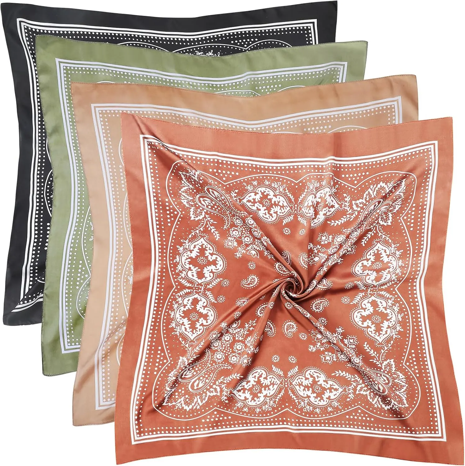
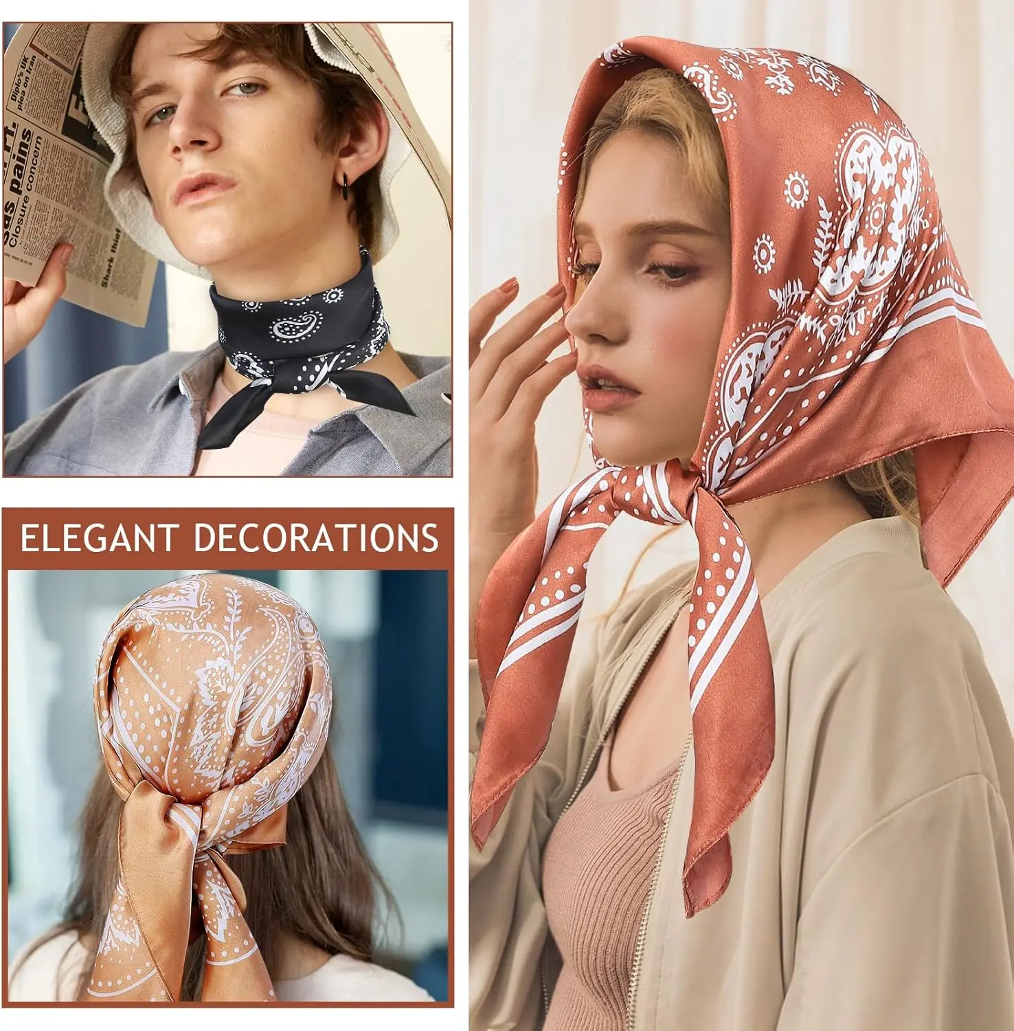
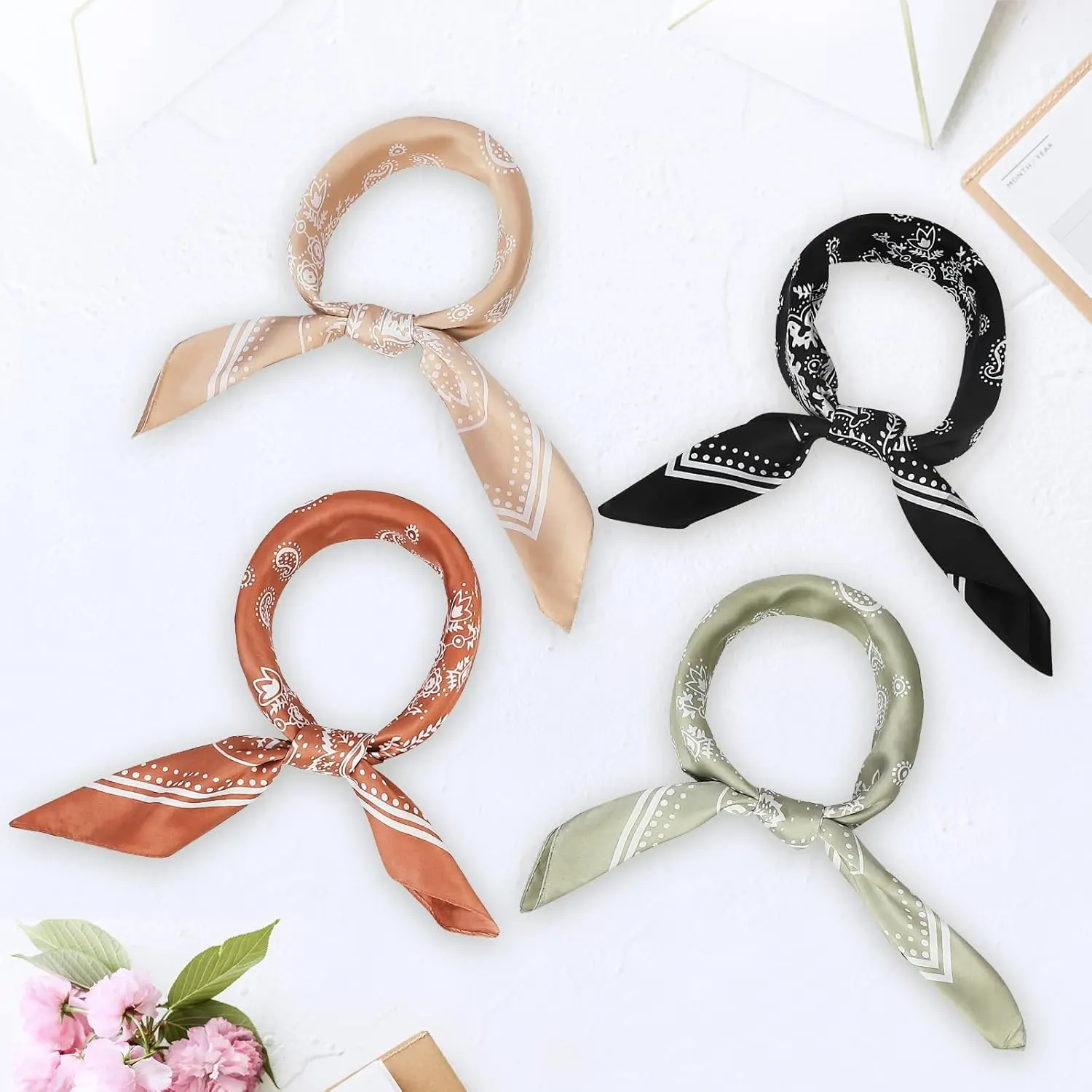
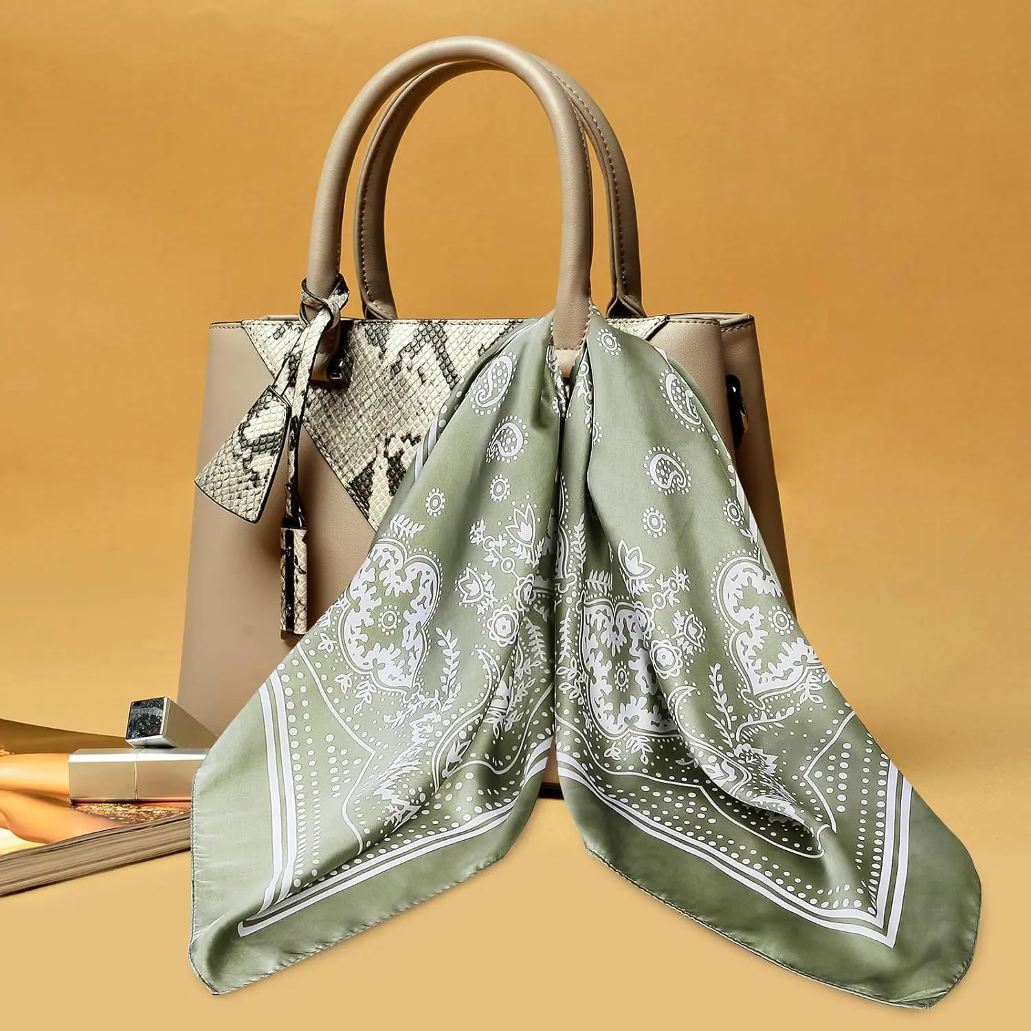
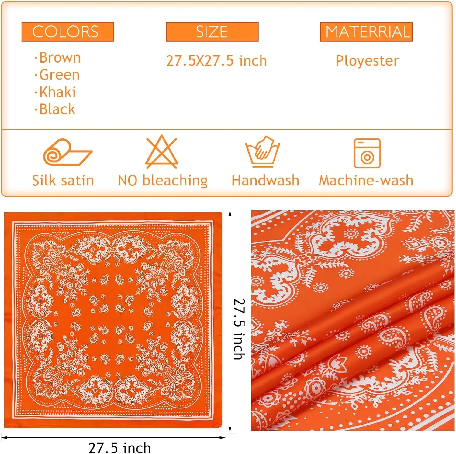

4 Pcs Large Bandanas Silk Square Head Scarfs Scarves Bandanas Neck Scarf Bandana for Women Girls
<div class="detailmodule_html"><div class="detail-desc-decorate-richtext"><div id="aplus">
<hr class="bucketDivider" noshade="true" size="1">
<h2>Product Description</h2>
<div cel_widget_id="aplus">
<div cel_widget_id="aplus-3p-module-b">
<div></div>
</div>
<div cel_widget_id="aplus-3p-module-b">
<div></div>
</div>
<div cel_widget_id="aplus-3p-module-b">
<div></div>
</div>
<div cel_widget_id="aplus-3p-module-b">
<div></div>
</div>
<div cel_widget_id="aplus-module-9">
<div>
<div>
<div>
<p class="apm-text-center"></p>
</div>
<div>
<p class="apm-text-center"></p>
</div>
<div>
<p class="apm-text-center"></p>
</div>
</div>
</div>
<div style="clear:both"> </div>
</div>
</div>
</div>
<div id="aplus">
<hr class="bucketDivider" noshade="true" size="1">
<h2>From the brand</h2>
<div cel_widget_id="aplus">
<style type="text/css">.aplus-v2 .apm-brand-story-carousel-container {
position: relative;
}
.aplus-v2 .apm-brand-story-carousel-hero-container,
.aplus-v2 .apm-brand-story-carousel-hero-container > div {
position: absolute;
width: 100%;
}
</style>
<style type="text/css">/*
Ensuring the carousel takes only the space it needs.
The sizes need to be set again on the absolutely positioned elements so they can take up space.
*/
.aplus-v2 .apm-brand-story-carousel-container,
.aplus-v2 .apm-brand-story-carousel-hero-container {
height: 625px;
width: 100%;
max-width: 1464px;
margin-left: auto;
margin-right: auto;
overflow: hidden;
}
.aplus-v2 .apm-brand-story-carousel-hero-container,
.aplus-v2 .apm-brand-story-carousel-hero-container > div {
height: 625px;
}
</style>
<style type="text/css">.aplus-v2 .apm-brand-story-carousel.a-carousel-container {
padding: 0px;
}
/*
This centers the carousel vertically on top of the hero image container and after the logo area (125px).
Margin-top = (heroHeight - cardHeight - logoAreaHeight) / 2 + logoAreaHeight
*/
.aplus-v2 .apm-brand-story-carousel .a-carousel-row-inner {
margin-top: 149px;
}
/*
Cards need to have a width set, otherwise they default to 50px or so.
All cards must have the same width. The carousel will resize itself so all cards take the width of the largest card.
The left margin is for leaving a space between each card.
*/
.aplus-v2 .apm-brand-story-carousel .a-carousel-card {
width: 362px;
margin-left: 30px !important;
}
/* styling the navigation buttons so they are taller, flush with the sides, and have a clean white background */
.aplus-v2 .apm-brand-story-carousel .a-carousel-col.a-carousel-left,
.aplus-v2 .apm-brand-story-carousel .a-carousel-col.a-carousel-right {
padding: 0px;
}
.aplus-v2 .apm-brand-story-carousel .a-carousel-col.a-carousel-left .a-button-image,
.aplus-v2 .apm-brand-story-carousel .a-carousel-col.a-carousel-right .a-button-image {
border: none;
margin: 0px;
}
.aplus-v2 .apm-brand-story-carousel .a-carousel-col.a-carousel-left .a-button-image .a-button-inner,
.aplus-v2 .apm-brand-story-carousel .a-carousel-col.a-carousel-right .a-button-image .a-button-inner {
background: #fff;
padding: 20px 6px;
}
.aplus-v2 .apm-brand-story-carousel .a-carousel-col.a-carousel-left .a-button-image .a-button-inner {
border-radius: 0px 4px 4px 0px;
}
.aplus-v2 .apm-brand-story-carousel .a-carousel-col.a-carousel-right .a-button-image .a-button-inner {
border-radius: 4px 0px 0px 4px;
}
</style>
<div>
<div>
<div>
<div cel_widget_id="aplus-brand-story-hero-1-image-logo">
<div>
<div> </div>
</div>
<div style="clear:both"> </div>
</div>
</div>
<div aria-label="Featured content carousel" aria-roledescription="carousel" data-a-carousel-options="{"minimum_gutter_width":10,"show_partial_next":true,"name":"brand-story-carousel","single_page_align":"left","circular":false,"carousel_display_strategy":"single","currentGutter":10}" id="apm-brand-story-carousel" role="group"><input autocomplete="on" class="a-carousel-firstvisibleitem" type="hidden">
<div>
<div>
<div> </div>
<div>
<div aria-roledescription="slide" role="group">
<ol class="a-carousel">
<li class="a-carousel-card apm-brand-story-carousel-card-0"> </li>
<li class="a-carousel-card apm-brand-story-carousel-card-1">
<div cel_widget_id="aplus-brand-story-card-3-about">
<div>
<div></div>
<div>
<p><span class="a-text-bold">Our Story</span></p>
<p>Each item of Fishinsea is thoughtfully crafted to strike a balance between modern designs and timeless beauty, making it the ideal finishing touch.</p>
<p>As we continue to grow, we're dedicated to our mission of becoming a go-to destination for fashion-forward individuals seeking statement accessories.</p>
</div>
</div>
<div style="clear:both"> </div>
</div>
</li>
<li class="a-carousel-card apm-brand-story-carousel-card-2">
<div cel_widget_id="aplus-brand-story-card-1-four-asin">
<div>
<div role="list">
<div role="listitem"> </div>
<div role="listitem"> </div>
<div role="listitem"> </div>
<div role="listitem"> </div>
</div>
<div>
<h3>Sports Headbands</h3>
</div>
</div>
<div style="clear:both"> </div>
</div>
</li>
<li class="a-carousel-card apm-brand-story-carousel-card-3">
<div cel_widget_id="aplus-brand-story-card-1-four-asin">
<div>
<div role="list">
<div role="listitem"> </div>
<div role="listitem"> </div>
<div role="listitem"> </div>
<div role="listitem"> </div>
</div>
<div>
<h3>Large Bandanas</h3>
</div>
</div>
<div style="clear:both"> </div>
</div>
</li>
<li class="a-carousel-card apm-brand-story-carousel-card-4">
<div cel_widget_id="aplus-brand-story-card-1-four-asin">
<div>
<div role="list">
<div role="listitem"> </div>
<div role="listitem"> </div>
<div role="listitem"> </div>
<div role="listitem"> </div>
</div>
<div>
<h3>New Sports Headbands</h3>
</div>
</div>
<div style="clear:both"> </div>
</div>
</li>
</ol>
</div>
</div>
<div> </div>
</div>
</div>
<span class="a-end aok-hidden"></span></div>
</div>
<div> </div>
</div>
</div>
</div>
<div data-feature-name="productDescription" data-template-name="productDescription" id="productDescription_feature_div">
<div id="productDescription"><!-- show up to 2 reviews by default --></div>
<!-- Used to set table width because AUI is overriding the width attribute of the tables coming in description -->
<style type="text/css">#productDescription h3 {
margin: 0.75em 0px 0.375em -1px;
}
</style>
</div>
</div></div>
$29.57
$14.96
- Category : Apparel Accessories
- Brand : scarf_echarpe_store Scarf Echarpe Store
Colors
Sizes
-
+
<div class="detailmodule_html"><div class="detail-desc-decorate-richtext"><div id="aplus">
<hr class="bucketDivider" noshade="true" size="1">
<h2>Product Description</h2>
<div cel_widget_id="aplus">
<div cel_widget_id="aplus-3p-module-b">
<div></div>
</div>
<div cel_widget_id="aplus-3p-module-b">
<div></div>
</div>
<div cel_widget_id="aplus-3p-module-b">
<div></div>
</div>
<div cel_widget_id="aplus-3p-module-b">
<div></div>
</div>
<div cel_widget_id="aplus-module-9">
<div>
<div>
<div>
<p class="apm-text-center"></p>
</div>
<div>
<p class="apm-text-center"></p>
</div>
<div>
<p class="apm-text-center"></p>
</div>
</div>
</div>
<div style="clear:both"> </div>
</div>
</div>
</div>
<div id="aplus">
<hr class="bucketDivider" noshade="true" size="1">
<h2>From the brand</h2>
<div cel_widget_id="aplus">
<style type="text/css">.aplus-v2 .apm-brand-story-carousel-container {
position: relative;
}
.aplus-v2 .apm-brand-story-carousel-hero-container,
.aplus-v2 .apm-brand-story-carousel-hero-container > div {
position: absolute;
width: 100%;
}
</style>
<style type="text/css">/*
Ensuring the carousel takes only the space it needs.
The sizes need to be set again on the absolutely positioned elements so they can take up space.
*/
.aplus-v2 .apm-brand-story-carousel-container,
.aplus-v2 .apm-brand-story-carousel-hero-container {
height: 625px;
width: 100%;
max-width: 1464px;
margin-left: auto;
margin-right: auto;
overflow: hidden;
}
.aplus-v2 .apm-brand-story-carousel-hero-container,
.aplus-v2 .apm-brand-story-carousel-hero-container > div {
height: 625px;
}
</style>
<style type="text/css">.aplus-v2 .apm-brand-story-carousel.a-carousel-container {
padding: 0px;
}
/*
This centers the carousel vertically on top of the hero image container and after the logo area (125px).
Margin-top = (heroHeight - cardHeight - logoAreaHeight) / 2 + logoAreaHeight
*/
.aplus-v2 .apm-brand-story-carousel .a-carousel-row-inner {
margin-top: 149px;
}
/*
Cards need to have a width set, otherwise they default to 50px or so.
All cards must have the same width. The carousel will resize itself so all cards take the width of the largest card.
The left margin is for leaving a space between each card.
*/
.aplus-v2 .apm-brand-story-carousel .a-carousel-card {
width: 362px;
margin-left: 30px !important;
}
/* styling the navigation buttons so they are taller, flush with the sides, and have a clean white background */
.aplus-v2 .apm-brand-story-carousel .a-carousel-col.a-carousel-left,
.aplus-v2 .apm-brand-story-carousel .a-carousel-col.a-carousel-right {
padding: 0px;
}
.aplus-v2 .apm-brand-story-carousel .a-carousel-col.a-carousel-left .a-button-image,
.aplus-v2 .apm-brand-story-carousel .a-carousel-col.a-carousel-right .a-button-image {
border: none;
margin: 0px;
}
.aplus-v2 .apm-brand-story-carousel .a-carousel-col.a-carousel-left .a-button-image .a-button-inner,
.aplus-v2 .apm-brand-story-carousel .a-carousel-col.a-carousel-right .a-button-image .a-button-inner {
background: #fff;
padding: 20px 6px;
}
.aplus-v2 .apm-brand-story-carousel .a-carousel-col.a-carousel-left .a-button-image .a-button-inner {
border-radius: 0px 4px 4px 0px;
}
.aplus-v2 .apm-brand-story-carousel .a-carousel-col.a-carousel-right .a-button-image .a-button-inner {
border-radius: 4px 0px 0px 4px;
}
</style>
<div>
<div>
<div>
<div cel_widget_id="aplus-brand-story-hero-1-image-logo">
<div>
<div> </div>
</div>
<div style="clear:both"> </div>
</div>
</div>
<div aria-label="Featured content carousel" aria-roledescription="carousel" data-a-carousel-options="{"minimum_gutter_width":10,"show_partial_next":true,"name":"brand-story-carousel","single_page_align":"left","circular":false,"carousel_display_strategy":"single","currentGutter":10}" id="apm-brand-story-carousel" role="group"><input autocomplete="on" class="a-carousel-firstvisibleitem" type="hidden">
<div>
<div>
<div> </div>
<div>
<div aria-roledescription="slide" role="group">
<ol class="a-carousel">
<li class="a-carousel-card apm-brand-story-carousel-card-0"> </li>
<li class="a-carousel-card apm-brand-story-carousel-card-1">
<div cel_widget_id="aplus-brand-story-card-3-about">
<div>
<div></div>
<div>
<p><span class="a-text-bold">Our Story</span></p>
<p>Each item of Fishinsea is thoughtfully crafted to strike a balance between modern designs and timeless beauty, making it the ideal finishing touch.</p>
<p>As we continue to grow, we're dedicated to our mission of becoming a go-to destination for fashion-forward individuals seeking statement accessories.</p>
</div>
</div>
<div style="clear:both"> </div>
</div>
</li>
<li class="a-carousel-card apm-brand-story-carousel-card-2">
<div cel_widget_id="aplus-brand-story-card-1-four-asin">
<div>
<div role="list">
<div role="listitem"> </div>
<div role="listitem"> </div>
<div role="listitem"> </div>
<div role="listitem"> </div>
</div>
<div>
<h3>Sports Headbands</h3>
</div>
</div>
<div style="clear:both"> </div>
</div>
</li>
<li class="a-carousel-card apm-brand-story-carousel-card-3">
<div cel_widget_id="aplus-brand-story-card-1-four-asin">
<div>
<div role="list">
<div role="listitem"> </div>
<div role="listitem"> </div>
<div role="listitem"> </div>
<div role="listitem"> </div>
</div>
<div>
<h3>Large Bandanas</h3>
</div>
</div>
<div style="clear:both"> </div>
</div>
</li>
<li class="a-carousel-card apm-brand-story-carousel-card-4">
<div cel_widget_id="aplus-brand-story-card-1-four-asin">
<div>
<div role="list">
<div role="listitem"> </div>
<div role="listitem"> </div>
<div role="listitem"> </div>
<div role="listitem"> </div>
</div>
<div>
<h3>New Sports Headbands</h3>
</div>
</div>
<div style="clear:both"> </div>
</div>
</li>
</ol>
</div>
</div>
<div> </div>
</div>
</div>
<span class="a-end aok-hidden"></span></div>
</div>
<div> </div>
</div>
</div>
</div>
<div data-feature-name="productDescription" data-template-name="productDescription" id="productDescription_feature_div">
<div id="productDescription"><!-- show up to 2 reviews by default --></div>
<!-- Used to set table width because AUI is overriding the width attribute of the tables coming in description -->
<style type="text/css">#productDescription h3 {
margin: 0.75em 0px 0.375em -1px;
}
</style>
</div>
</div></div>