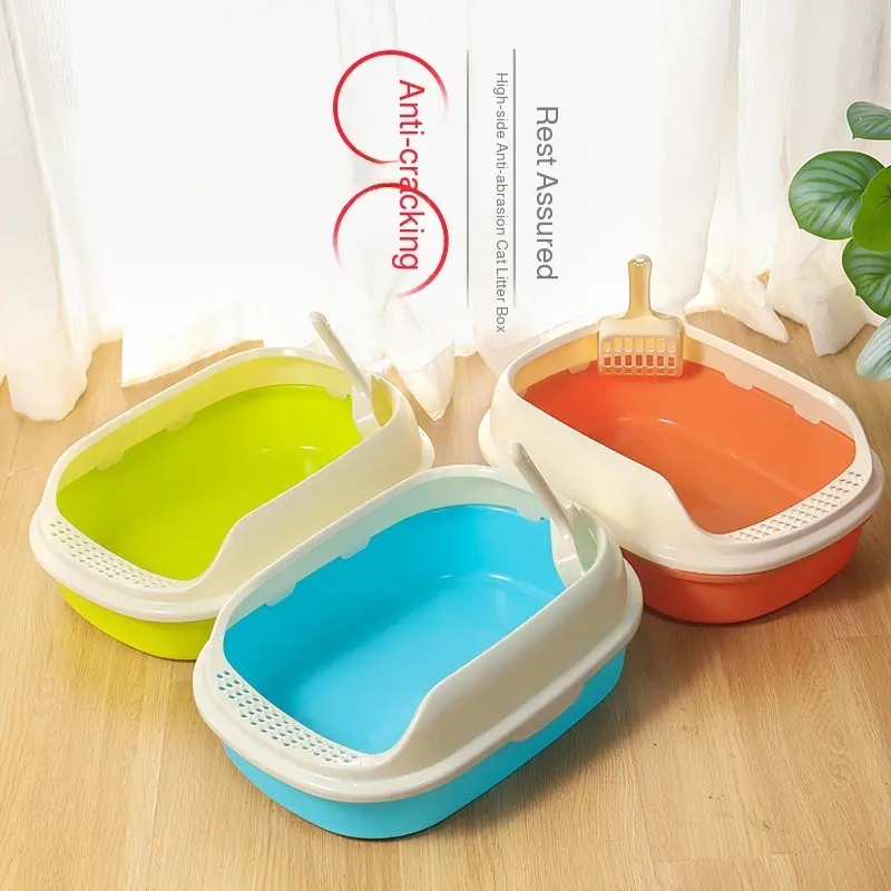
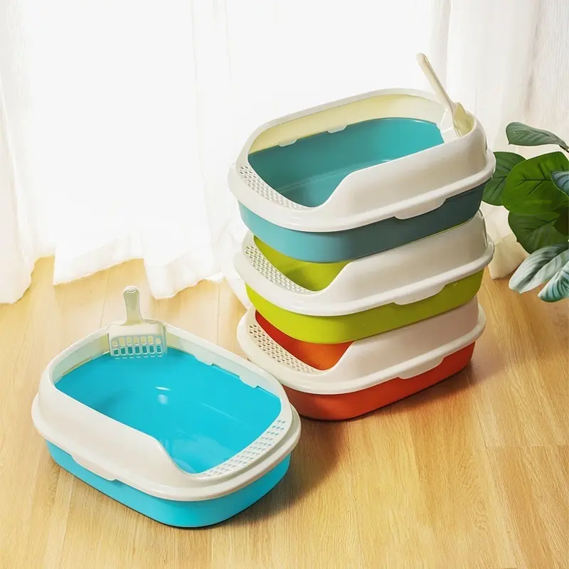
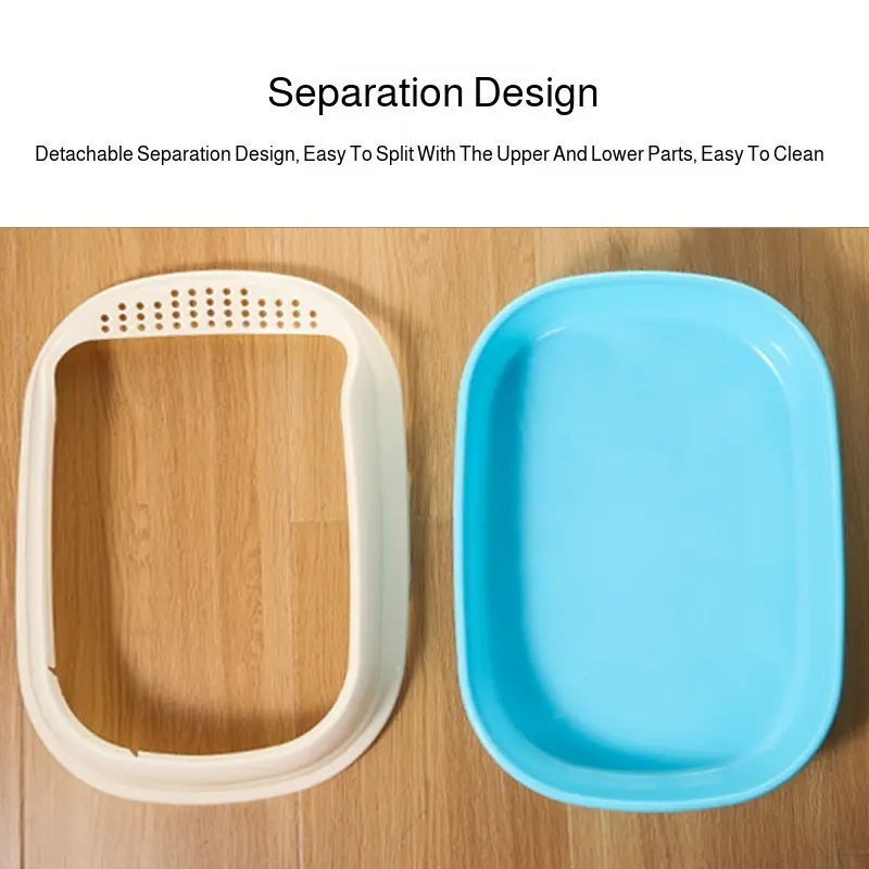
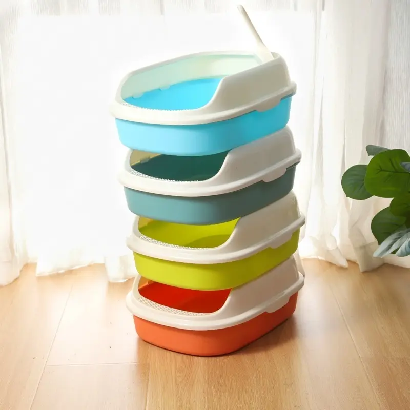
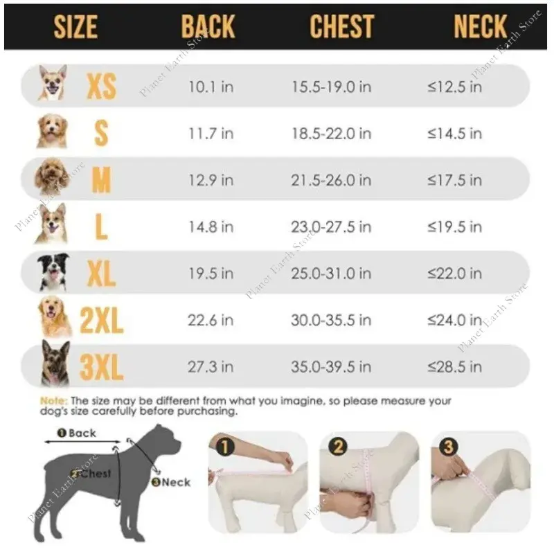
Handcrafted Poly Spindle Outdoor Post Mount Bird Feeder - Platform Bird Feeders for Outdoors Hanging with Tray, Mesh Tray
<div class="detailmodule_html"><div class="detail-desc-decorate-richtext"><div class="a-section a-spacing-large bucket" id="aplus">
<ul class="a-unordered-list a-vertical a-spacing-mini" style="box-sizing: border-box; margin: 0px 0px 0px 18px; color: rgb(15, 17, 17); padding: 0px; font-family: "Amazon Ember", Arial, sans-serif; font-size: 14px; font-style: normal; font-variant-ligatures: normal; font-variant-caps: normal; font-weight: 400; letter-spacing: normal; orphans: 2; text-align: start; text-indent: 0px; text-transform: none; widows: 2; word-spacing: 0px; -webkit-text-stroke-width: 0px; white-space: normal; background-color: rgb(255, 255, 255); text-decoration-thickness: initial; text-decoration-style: initial; text-decoration-color: initial;">
<li class="a-spacing-mini" style="box-sizing: border-box; list-style: disc; overflow-wrap: break-word; margin: 0px;"><span class="a-list-item" style="box-sizing: border-box; color: var(--__dChNmAmGoMXsw4B,#0f1111);">Enjoy Wild Birds at Close Range - Enjoy wild birds up close with our 20"W x 24"H post mount bird feeder. Crafted with premium quality, Amish made Poly Lumber allows you bird watching all day long.</span></li>
<li class="a-spacing-mini" style="box-sizing: border-box; list-style: disc; overflow-wrap: break-word; margin: 0px;"><span class="a-list-item" style="box-sizing: border-box; color: var(--__dChNmAmGoMXsw4B,#0f1111);">Easy, Mess-Free Refills - No need to worry refilling with our flat bird feeder for outdoors innovative design! It has a convenient knob on the roof which is perfect for refilling quickly and easily.</span></li>
<li class="a-spacing-mini" style="box-sizing: border-box; list-style: disc; overflow-wrap: break-word; margin: 0px;"><span class="a-list-item" style="box-sizing: border-box; color: var(--__dChNmAmGoMXsw4B,#0f1111);">Hours of Fun for Everyone - This bird feeder tray is great for anyone who loves animals and nature, and loves watching birds. With this bird feeder with tray, you can attract all kinds of birds with the right seed!</span></li>
<li class="a-spacing-mini" style="box-sizing: border-box; list-style: disc; overflow-wrap: break-word; margin: 0px;"><span class="a-list-item" style="box-sizing: border-box; color: var(--__dChNmAmGoMXsw4B,#0f1111);">Octagon Design - This hanging bird feeder tray has 8 detailed spindles to provide an easy accessibility for birds and is designed to fit any 4 by 4 post or planter.</span></li>
<li class="a-spacing-mini" style="box-sizing: border-box; list-style: disc; overflow-wrap: break-word; margin: 0px;"><span class="a-list-item" style="box-sizing: border-box; color: var(--__dChNmAmGoMXsw4B,#0f1111);">Built to Last - Hand painted in Lancaster, PA following the same methods used for hundreds of years. Our Amish Craftsmen are a testament to true quality and care- each piece of furniture is unique and stands the test of time.</span></li>
</ul>
</div>
<div class="a-row feature" data-feature-name="productDescription" data-template-name="productDescription" id="productDescription_feature_div"><!-- Used to set table width because AUI is overriding the width attribute of the tables coming in description -->
<style type="text/css">#productDescription h3 {
margin: 0.75em 0px 0.375em -1px;
}
</style>
</div>
<style type="text/css">.aplus-v2 .container-with-background-image {
width: 100%;
height: 100%;
background-repeat: no-repeat;
background-size: cover;
}
</style>
<style type="text/css">.aplus-v2 .apm-brand-story-carousel-container {
position: relative;
}
.aplus-v2 .apm-brand-story-carousel-hero-container,
.aplus-v2 .apm-brand-story-carousel-hero-container > div {
position: absolute;
width: 100%;
}
</style>
<style type="text/css">/*
Ensuring the carousel takes only the space it needs.
The sizes need to be set again on the absolutely positioned elements so they can take up space.
*/
.aplus-v2 .apm-brand-story-carousel-container,
.aplus-v2 .apm-brand-story-carousel-hero-container {
height: 625px;
width: 100%;
max-width: 1464px;
margin-left: auto;
margin-right: auto;
overflow: hidden;
}
.aplus-v2 .apm-brand-story-carousel-hero-container,
.aplus-v2 .apm-brand-story-carousel-hero-container > div {
height: 625px;
}
</style>
<style type="text/css">.aplus-v2 .apm-brand-story-carousel.a-carousel-container {
padding: 0px;
}
/*
This centers the carousel vertically on top of the hero image container and after the logo area (125px).
Margin-top = (heroHeight - cardHeight - logoAreaHeight) / 2 + logoAreaHeight
*/
.aplus-v2 .apm-brand-story-carousel .a-carousel-row-inner {
margin-top: 149px;
}
/*
Cards need to have a width set, otherwise they default to 50px or so.
All cards must have the same width. The carousel will resize itself so all cards take the width of the largest card.
The left margin is for leaving a space between each card.
*/
.aplus-v2 .apm-brand-story-carousel .a-carousel-card {
width: 362px;
margin-left: 30px !important;
}
/* styling the navigation buttons so they are taller, flush with the sides, and have a clean white background */
.aplus-v2 .apm-brand-story-carousel .a-carousel-col.a-carousel-left,
.aplus-v2 .apm-brand-story-carousel .a-carousel-col.a-carousel-right {
padding: 0px;
}
.aplus-v2 .apm-brand-story-carousel .a-carousel-col.a-carousel-left .a-button-image,
.aplus-v2 .apm-brand-story-carousel .a-carousel-col.a-carousel-right .a-button-image {
border: none;
margin: 0px;
}
.aplus-v2 .apm-brand-story-carousel .a-carousel-col.a-carousel-left .a-button-image .a-button-inner,
.aplus-v2 .apm-brand-story-carousel .a-carousel-col.a-carousel-right .a-button-image .a-button-inner {
background: #fff;
padding: 20px 6px;
}
.aplus-v2 .apm-brand-story-carousel .a-carousel-col.a-carousel-left .a-button-image .a-button-inner {
border-radius: 0px 4px 4px 0px;
}
.aplus-v2 .apm-brand-story-carousel .a-carousel-col.a-carousel-right .a-button-image .a-button-inner {
border-radius: 4px 0px 0px 4px;
}
</style>
</div></div>
$656.602
$316.211
- Category : Home & Garden
- Brand : ecochic_furniture_store EcoChic Furniture Store
Colors
Sizes
-
+
<div class="detailmodule_html"><div class="detail-desc-decorate-richtext"><div class="a-section a-spacing-large bucket" id="aplus">
<ul class="a-unordered-list a-vertical a-spacing-mini" style="box-sizing: border-box; margin: 0px 0px 0px 18px; color: rgb(15, 17, 17); padding: 0px; font-family: "Amazon Ember", Arial, sans-serif; font-size: 14px; font-style: normal; font-variant-ligatures: normal; font-variant-caps: normal; font-weight: 400; letter-spacing: normal; orphans: 2; text-align: start; text-indent: 0px; text-transform: none; widows: 2; word-spacing: 0px; -webkit-text-stroke-width: 0px; white-space: normal; background-color: rgb(255, 255, 255); text-decoration-thickness: initial; text-decoration-style: initial; text-decoration-color: initial;">
<li class="a-spacing-mini" style="box-sizing: border-box; list-style: disc; overflow-wrap: break-word; margin: 0px;"><span class="a-list-item" style="box-sizing: border-box; color: var(--__dChNmAmGoMXsw4B,#0f1111);">Enjoy Wild Birds at Close Range - Enjoy wild birds up close with our 20"W x 24"H post mount bird feeder. Crafted with premium quality, Amish made Poly Lumber allows you bird watching all day long.</span></li>
<li class="a-spacing-mini" style="box-sizing: border-box; list-style: disc; overflow-wrap: break-word; margin: 0px;"><span class="a-list-item" style="box-sizing: border-box; color: var(--__dChNmAmGoMXsw4B,#0f1111);">Easy, Mess-Free Refills - No need to worry refilling with our flat bird feeder for outdoors innovative design! It has a convenient knob on the roof which is perfect for refilling quickly and easily.</span></li>
<li class="a-spacing-mini" style="box-sizing: border-box; list-style: disc; overflow-wrap: break-word; margin: 0px;"><span class="a-list-item" style="box-sizing: border-box; color: var(--__dChNmAmGoMXsw4B,#0f1111);">Hours of Fun for Everyone - This bird feeder tray is great for anyone who loves animals and nature, and loves watching birds. With this bird feeder with tray, you can attract all kinds of birds with the right seed!</span></li>
<li class="a-spacing-mini" style="box-sizing: border-box; list-style: disc; overflow-wrap: break-word; margin: 0px;"><span class="a-list-item" style="box-sizing: border-box; color: var(--__dChNmAmGoMXsw4B,#0f1111);">Octagon Design - This hanging bird feeder tray has 8 detailed spindles to provide an easy accessibility for birds and is designed to fit any 4 by 4 post or planter.</span></li>
<li class="a-spacing-mini" style="box-sizing: border-box; list-style: disc; overflow-wrap: break-word; margin: 0px;"><span class="a-list-item" style="box-sizing: border-box; color: var(--__dChNmAmGoMXsw4B,#0f1111);">Built to Last - Hand painted in Lancaster, PA following the same methods used for hundreds of years. Our Amish Craftsmen are a testament to true quality and care- each piece of furniture is unique and stands the test of time.</span></li>
</ul>
</div>
<div class="a-row feature" data-feature-name="productDescription" data-template-name="productDescription" id="productDescription_feature_div"><!-- Used to set table width because AUI is overriding the width attribute of the tables coming in description -->
<style type="text/css">#productDescription h3 {
margin: 0.75em 0px 0.375em -1px;
}
</style>
</div>
<style type="text/css">.aplus-v2 .container-with-background-image {
width: 100%;
height: 100%;
background-repeat: no-repeat;
background-size: cover;
}
</style>
<style type="text/css">.aplus-v2 .apm-brand-story-carousel-container {
position: relative;
}
.aplus-v2 .apm-brand-story-carousel-hero-container,
.aplus-v2 .apm-brand-story-carousel-hero-container > div {
position: absolute;
width: 100%;
}
</style>
<style type="text/css">/*
Ensuring the carousel takes only the space it needs.
The sizes need to be set again on the absolutely positioned elements so they can take up space.
*/
.aplus-v2 .apm-brand-story-carousel-container,
.aplus-v2 .apm-brand-story-carousel-hero-container {
height: 625px;
width: 100%;
max-width: 1464px;
margin-left: auto;
margin-right: auto;
overflow: hidden;
}
.aplus-v2 .apm-brand-story-carousel-hero-container,
.aplus-v2 .apm-brand-story-carousel-hero-container > div {
height: 625px;
}
</style>
<style type="text/css">.aplus-v2 .apm-brand-story-carousel.a-carousel-container {
padding: 0px;
}
/*
This centers the carousel vertically on top of the hero image container and after the logo area (125px).
Margin-top = (heroHeight - cardHeight - logoAreaHeight) / 2 + logoAreaHeight
*/
.aplus-v2 .apm-brand-story-carousel .a-carousel-row-inner {
margin-top: 149px;
}
/*
Cards need to have a width set, otherwise they default to 50px or so.
All cards must have the same width. The carousel will resize itself so all cards take the width of the largest card.
The left margin is for leaving a space between each card.
*/
.aplus-v2 .apm-brand-story-carousel .a-carousel-card {
width: 362px;
margin-left: 30px !important;
}
/* styling the navigation buttons so they are taller, flush with the sides, and have a clean white background */
.aplus-v2 .apm-brand-story-carousel .a-carousel-col.a-carousel-left,
.aplus-v2 .apm-brand-story-carousel .a-carousel-col.a-carousel-right {
padding: 0px;
}
.aplus-v2 .apm-brand-story-carousel .a-carousel-col.a-carousel-left .a-button-image,
.aplus-v2 .apm-brand-story-carousel .a-carousel-col.a-carousel-right .a-button-image {
border: none;
margin: 0px;
}
.aplus-v2 .apm-brand-story-carousel .a-carousel-col.a-carousel-left .a-button-image .a-button-inner,
.aplus-v2 .apm-brand-story-carousel .a-carousel-col.a-carousel-right .a-button-image .a-button-inner {
background: #fff;
padding: 20px 6px;
}
.aplus-v2 .apm-brand-story-carousel .a-carousel-col.a-carousel-left .a-button-image .a-button-inner {
border-radius: 0px 4px 4px 0px;
}
.aplus-v2 .apm-brand-story-carousel .a-carousel-col.a-carousel-right .a-button-image .a-button-inner {
border-radius: 4px 0px 0px 4px;
}
</style>
</div></div>
Related Product
Browse The Collection of Top Products.

