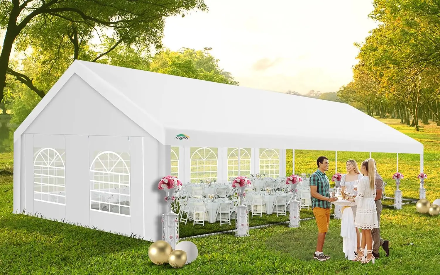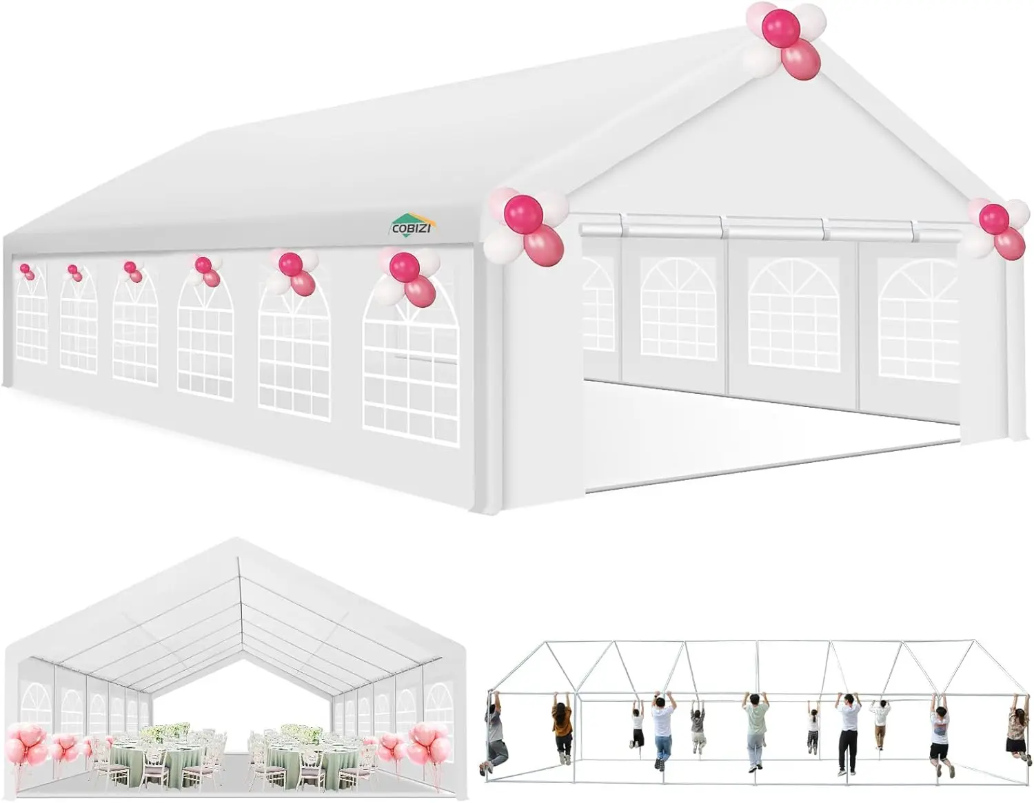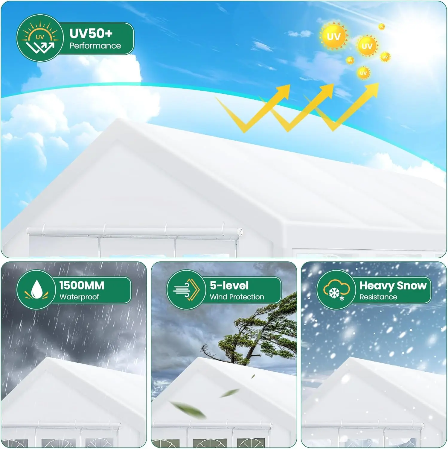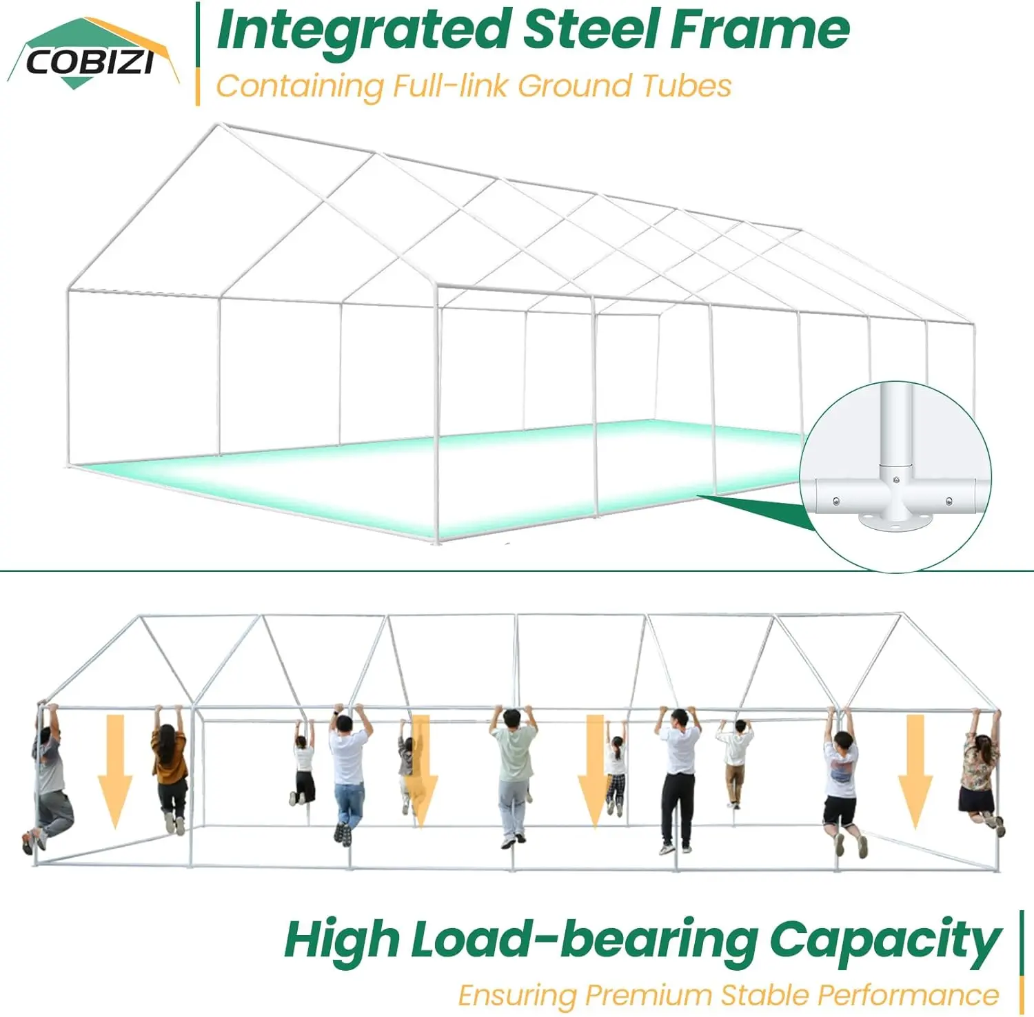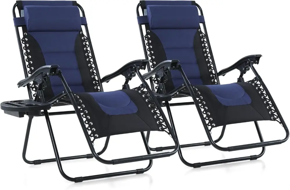
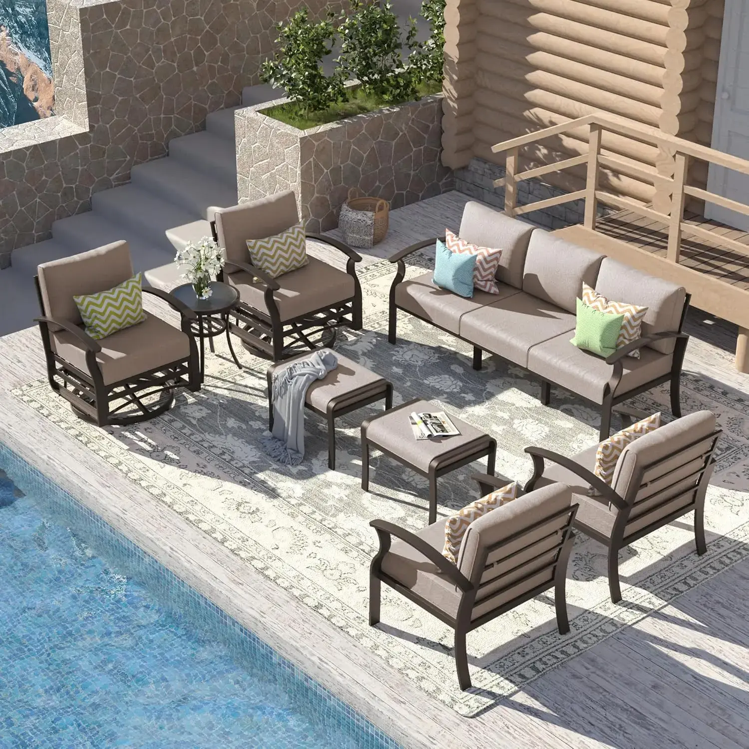
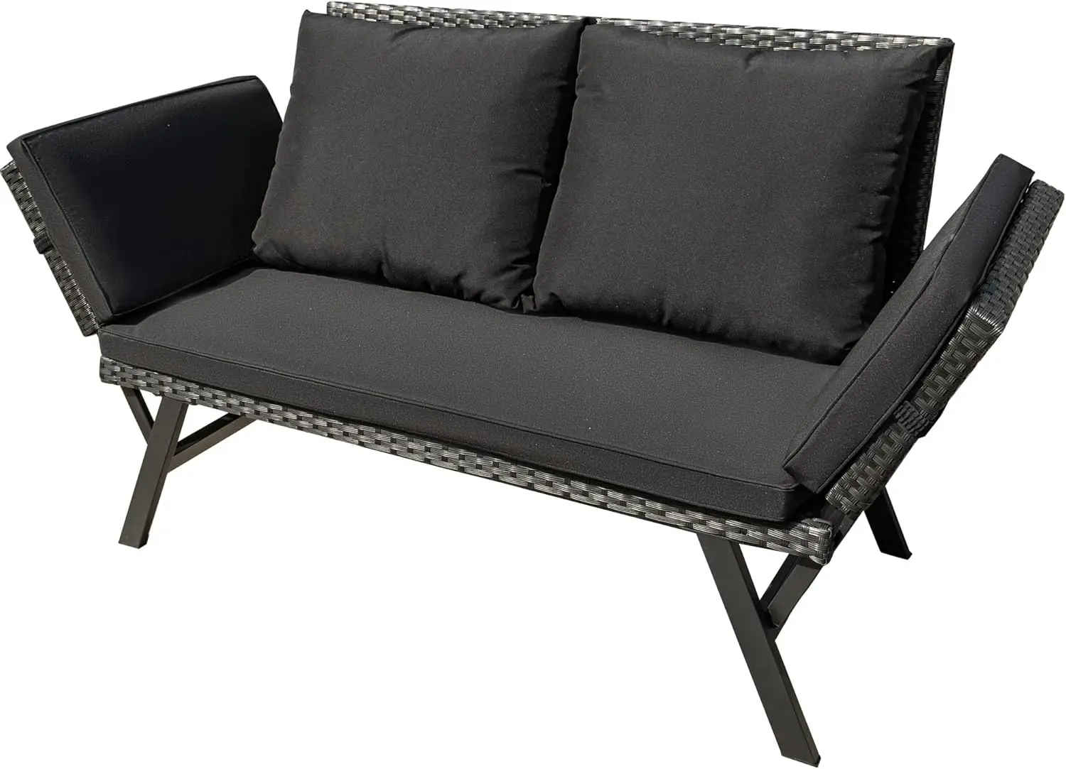
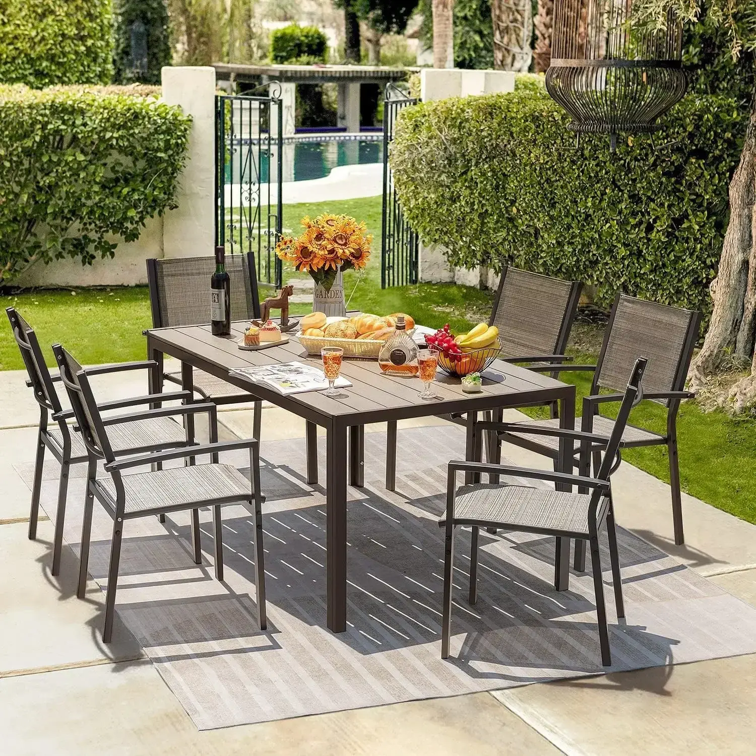
Padded Zero Gravity Lawn Chairs Set of 2 Foldable Patio Recliners Anti Gravity Lounge Chairs w/Pillow & Cup Holder Outdoor Camp
<div class="detailmodule_html"><div class="detail-desc-decorate-richtext"><div class="a-section a-spacing-large bucket" id="aplus"> </div>
<div class="a-section a-spacing-large bucket" id="aplus">
<div cel_widget_id="aplus" class="aplus-v2 desktop celwidget">
<div>
<div class="aplus-brandstory-pagination">
<h1 class="a-size-base-plus a-text-bold" style="box-sizing: border-box; padding: 0px 0px 4px; margin: 0px; text-rendering: optimizelegibility; font-weight: 700 !important; font-size: 1.25rem !important; line-height: 24px !important; color: rgb(15, 17, 17); font-family: "Amazon Ember" !important; font-style: normal; font-variant-ligatures: normal; font-variant-caps: normal; letter-spacing: normal; orphans: 2; text-align: start; text-indent: 0px; text-transform: none; widows: 2; word-spacing: 0px; -webkit-text-stroke-width: 0px; white-space: normal; background-color: rgb(255, 255, 255); text-decoration-thickness: initial; text-decoration-style: initial; text-decoration-color: initial;">About this item</h1>
<ul class="a-unordered-list a-vertical a-spacing-mini" style="box-sizing: border-box; margin: 0px 0px 0px 18px; color: rgb(15, 17, 17); padding: 0px; font-family: "Amazon Ember", Arial, sans-serif; font-size: 14px; font-style: normal; font-variant-ligatures: normal; font-variant-caps: normal; font-weight: 400; letter-spacing: normal; orphans: 2; text-align: start; text-indent: 0px; text-transform: none; widows: 2; word-spacing: 0px; -webkit-text-stroke-width: 0px; white-space: normal; background-color: rgb(255, 255, 255); text-decoration-thickness: initial; text-decoration-style: initial; text-decoration-color: initial;">
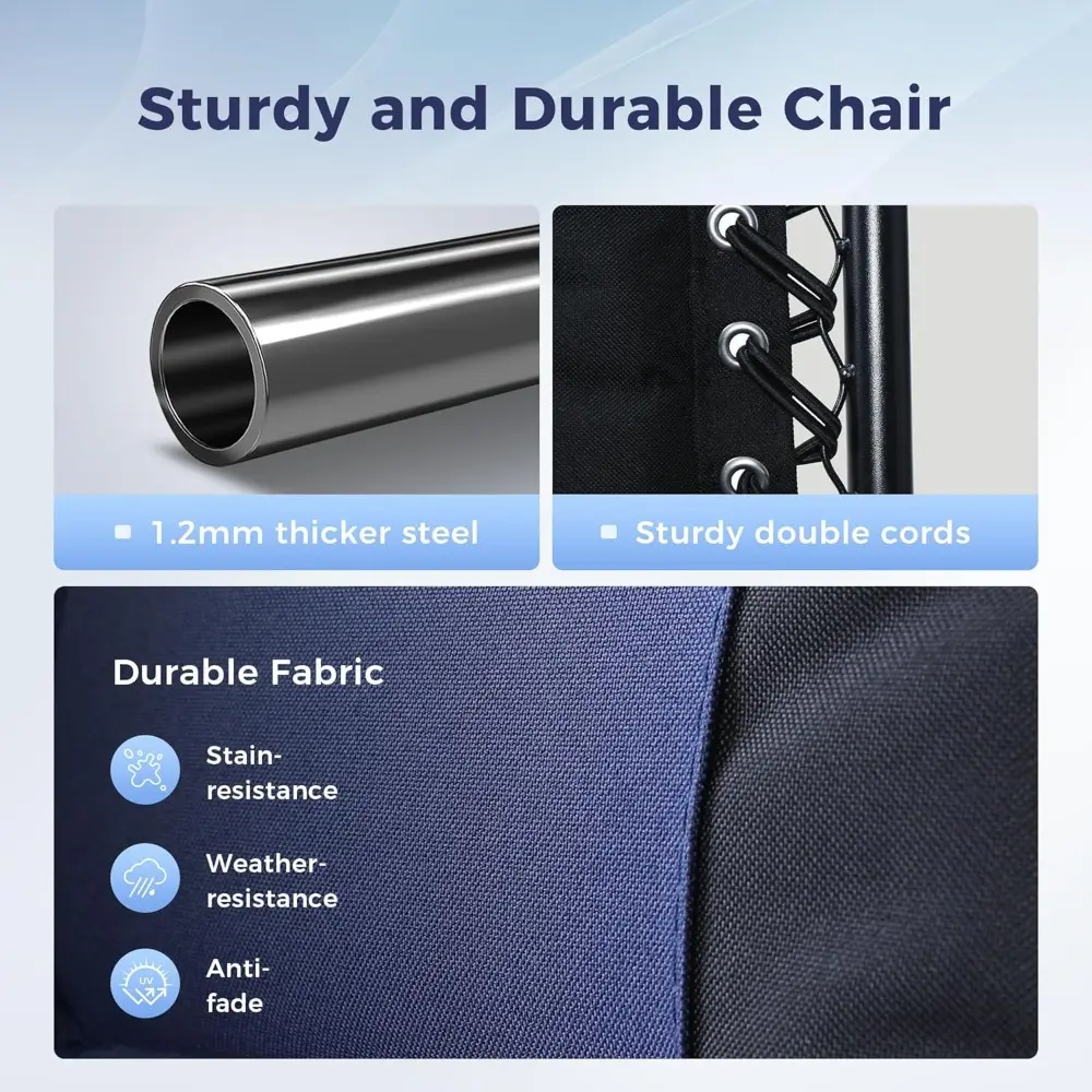
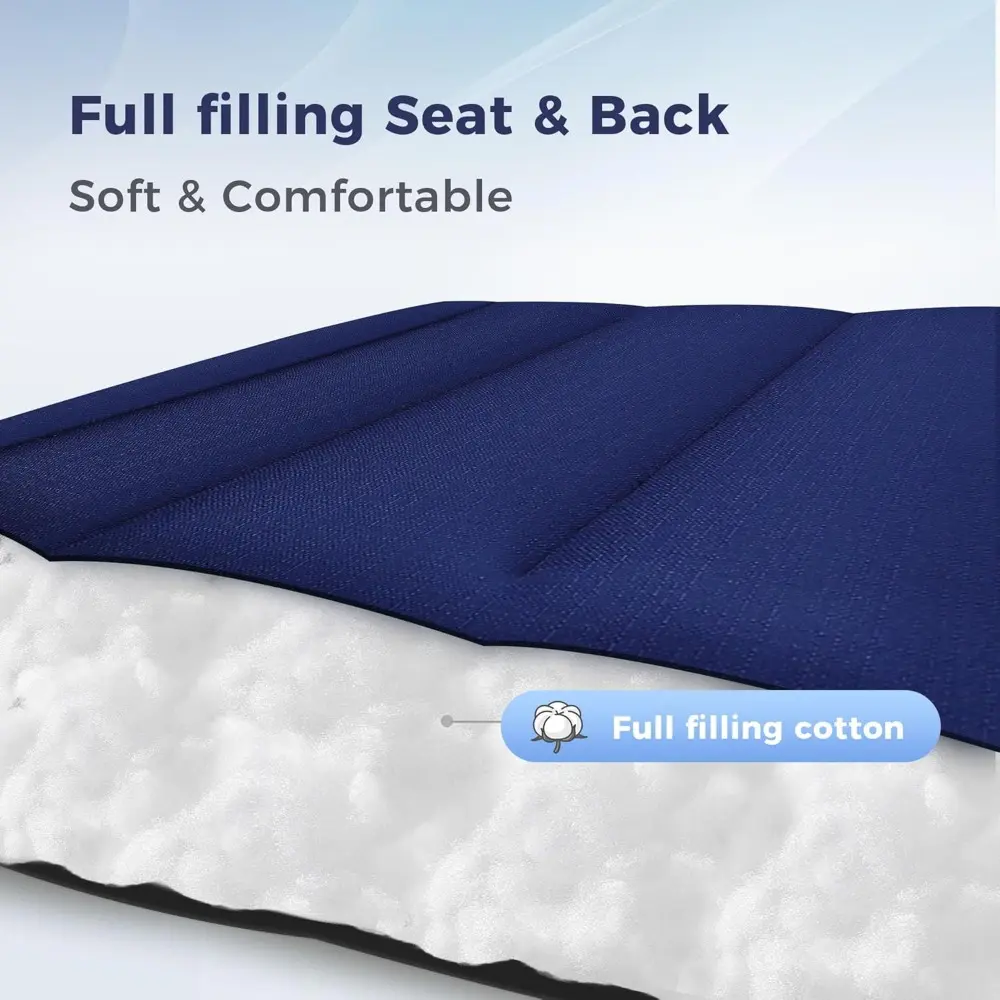
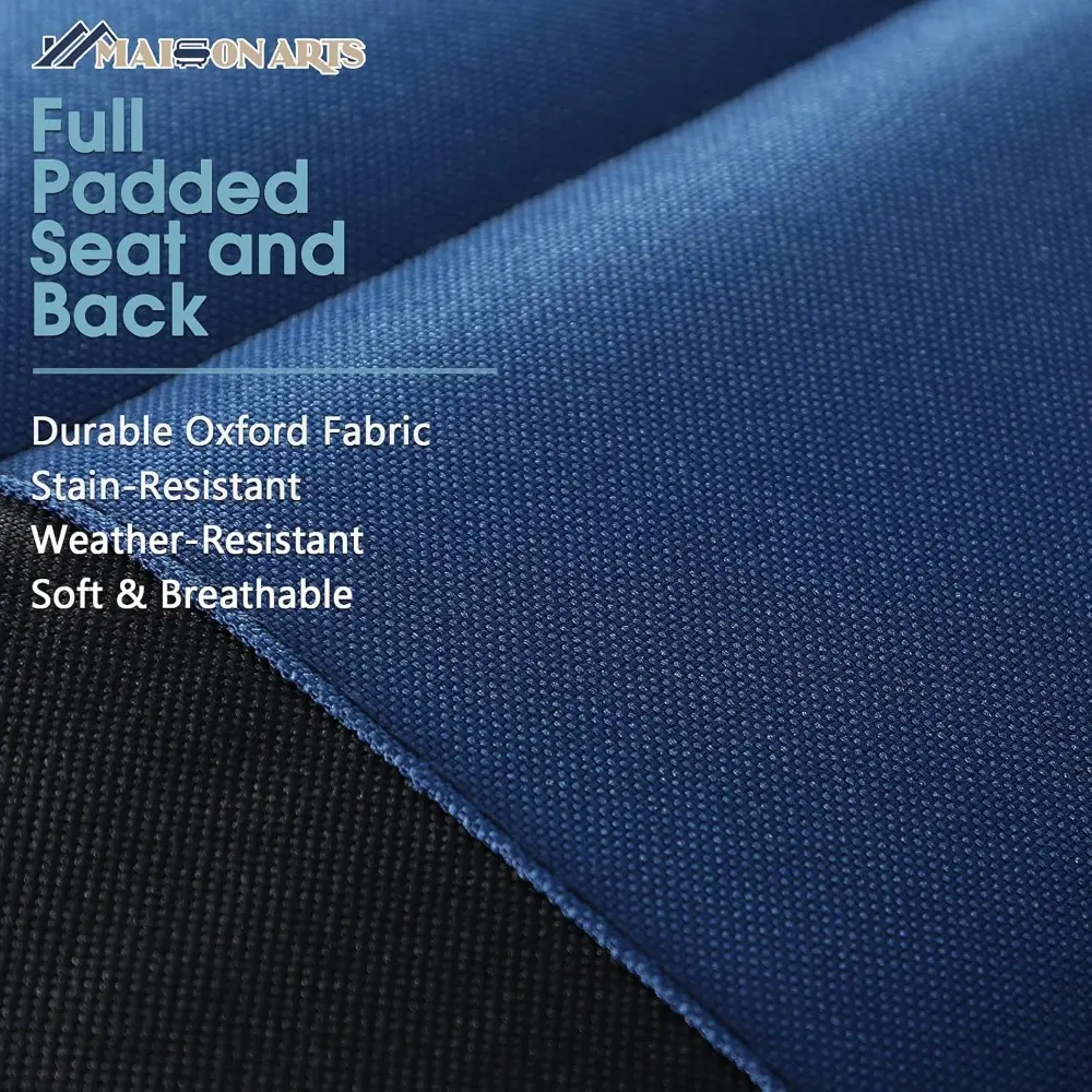
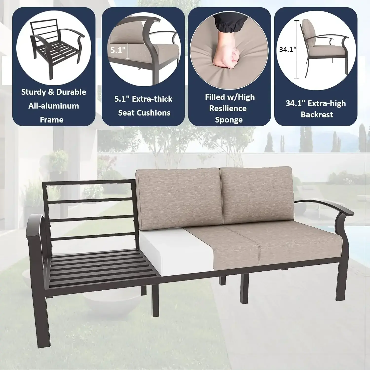
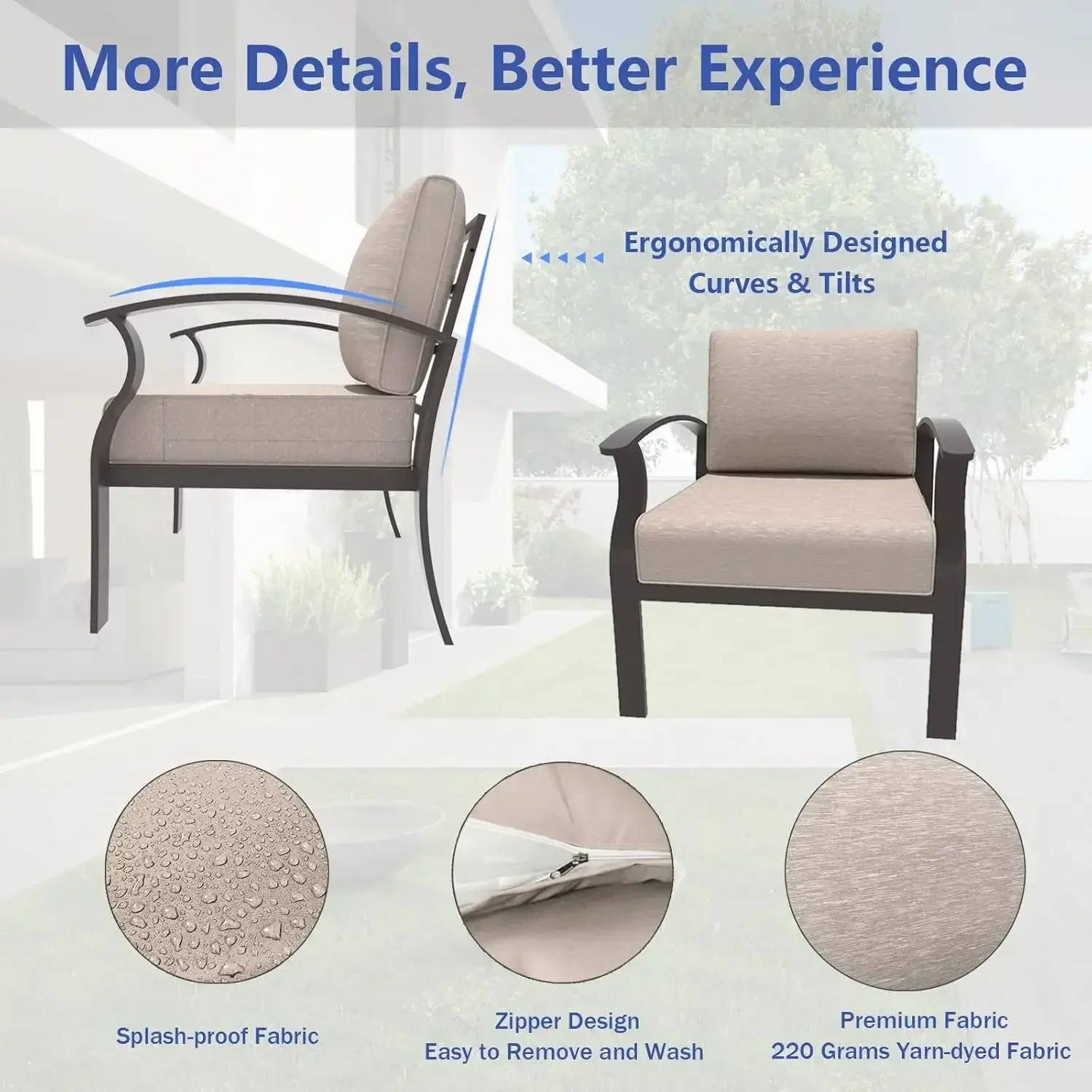
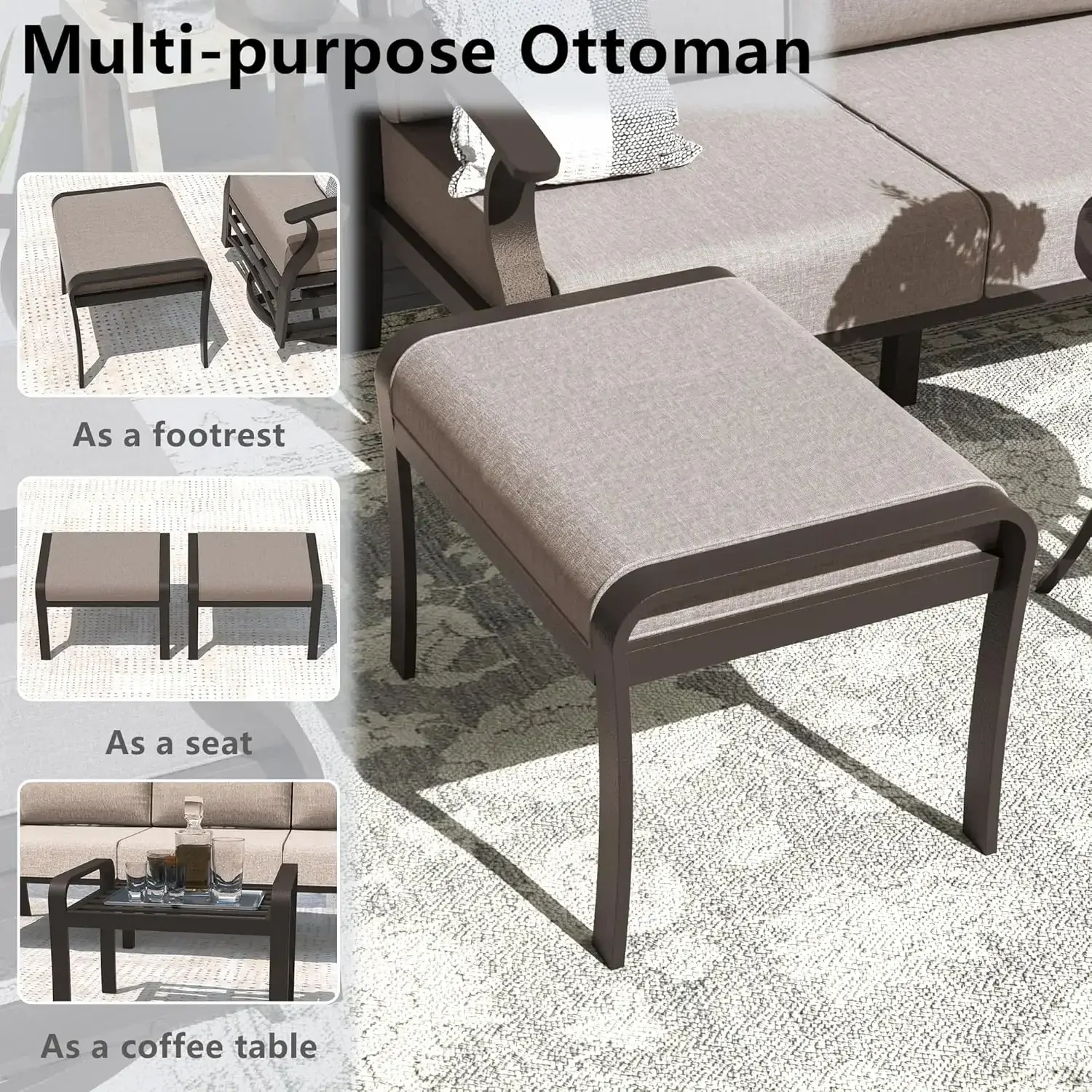
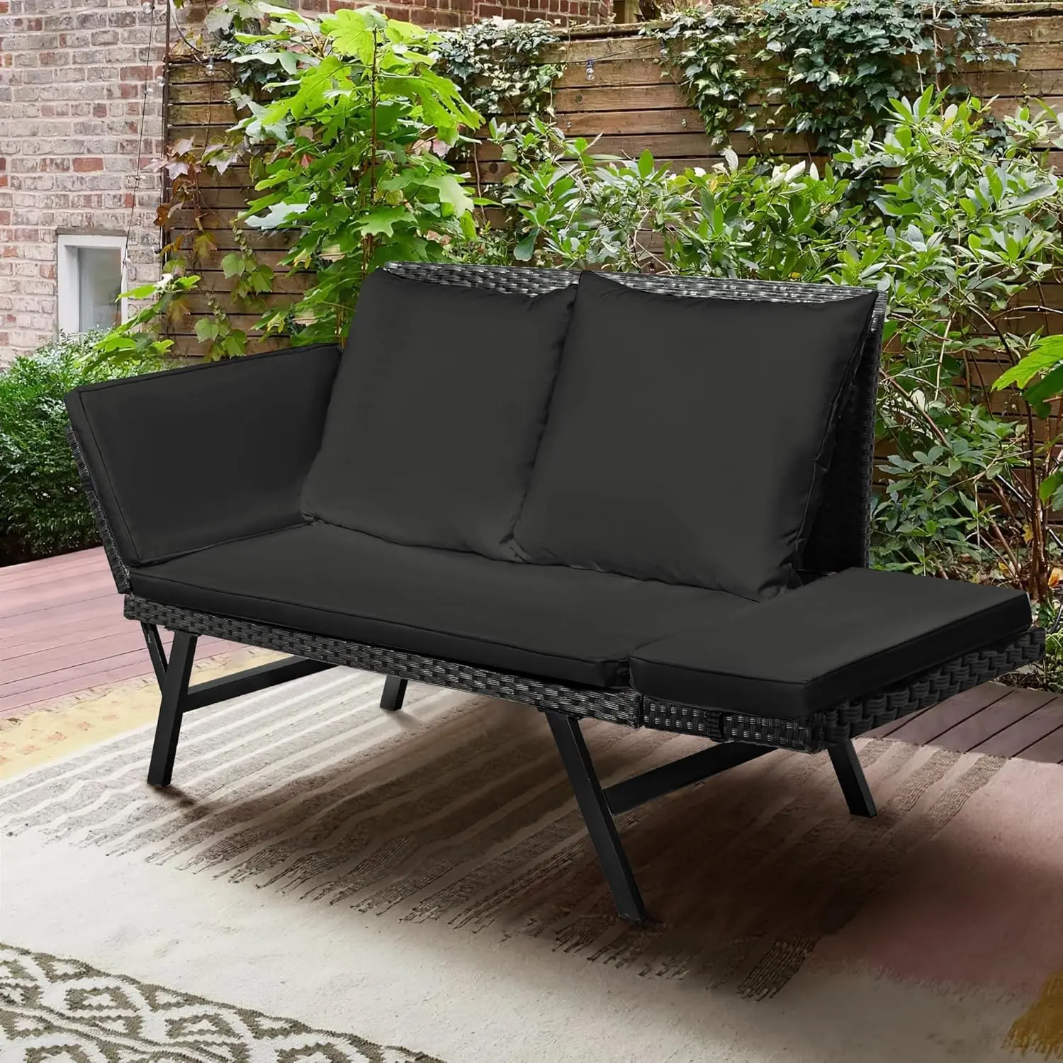
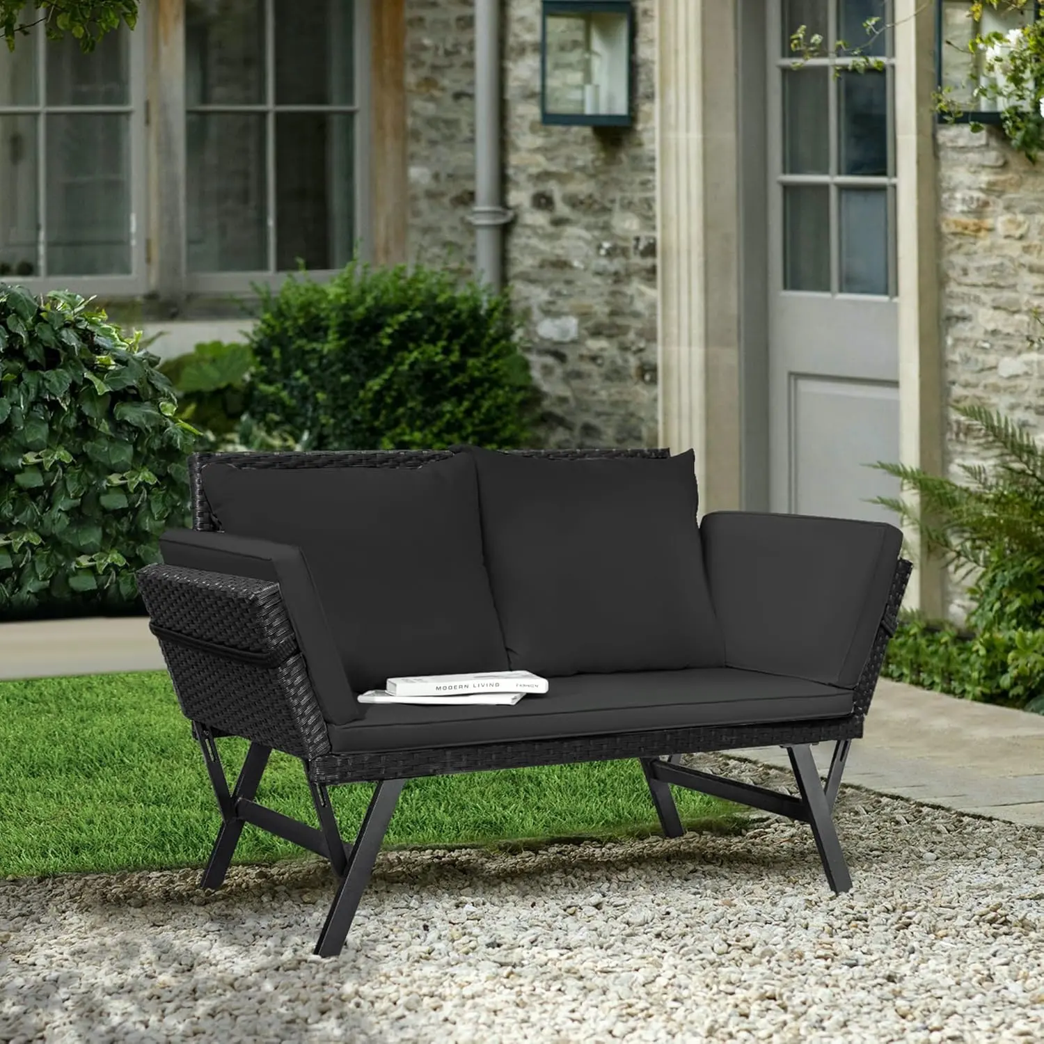
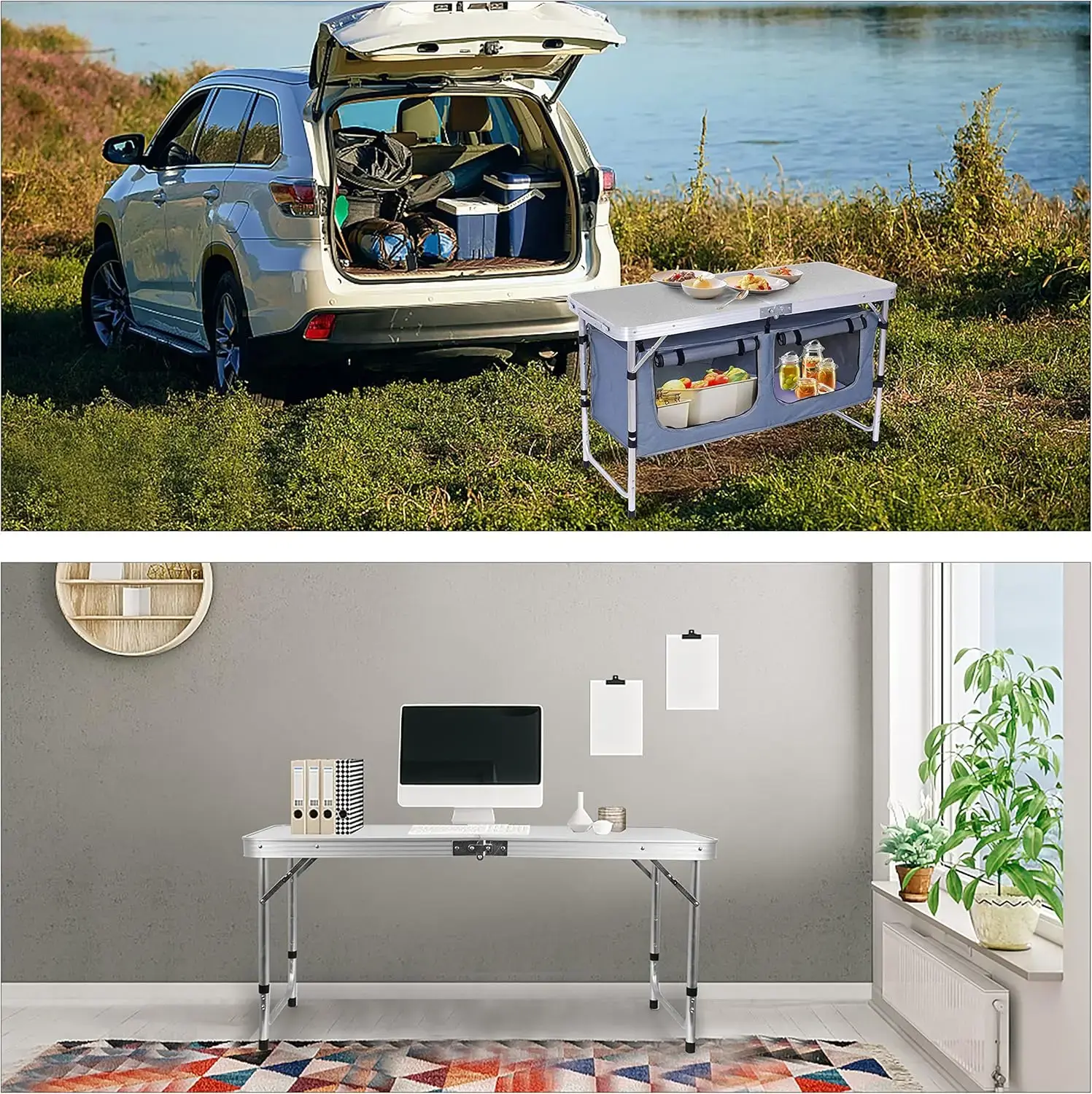
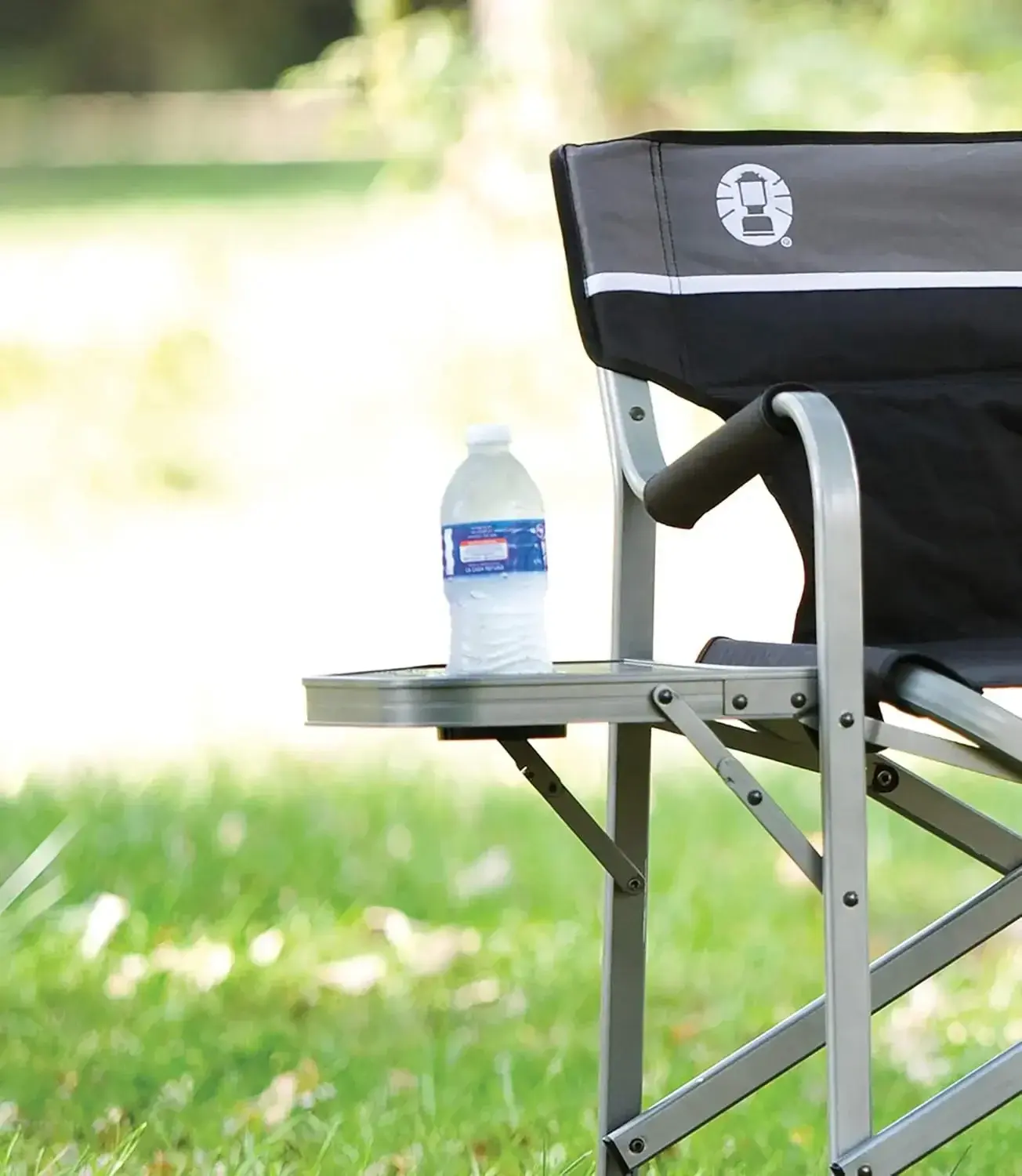
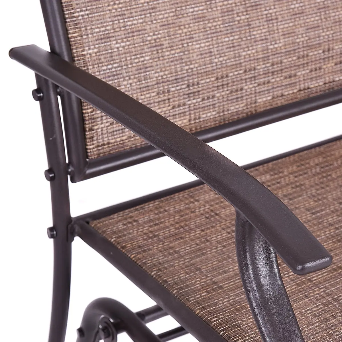
<li class="a-spacing-mini" style="box-sizing: border-box; list-style: disc; overflow-wrap: break-word; margin: 0px;"><span class="a-list-item" style="box-sizing: border-box; color: rgb(15, 17, 17);">【Padded Seat & Back Recliner】: Fully padded seat and back, adjustable padded pillow for both a headrest and lumbar support, provide you a more comfortable sitting experience. Cup tray is included for holding drinks or food</span></li>
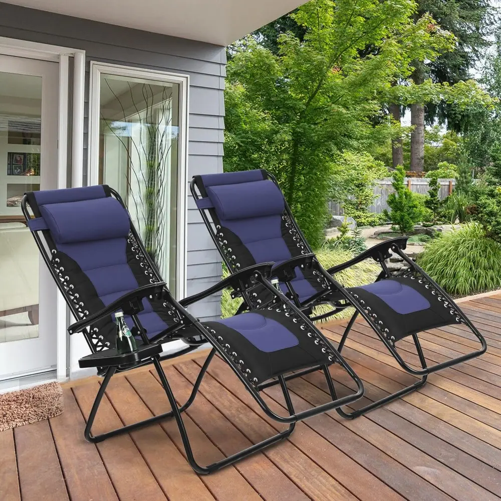
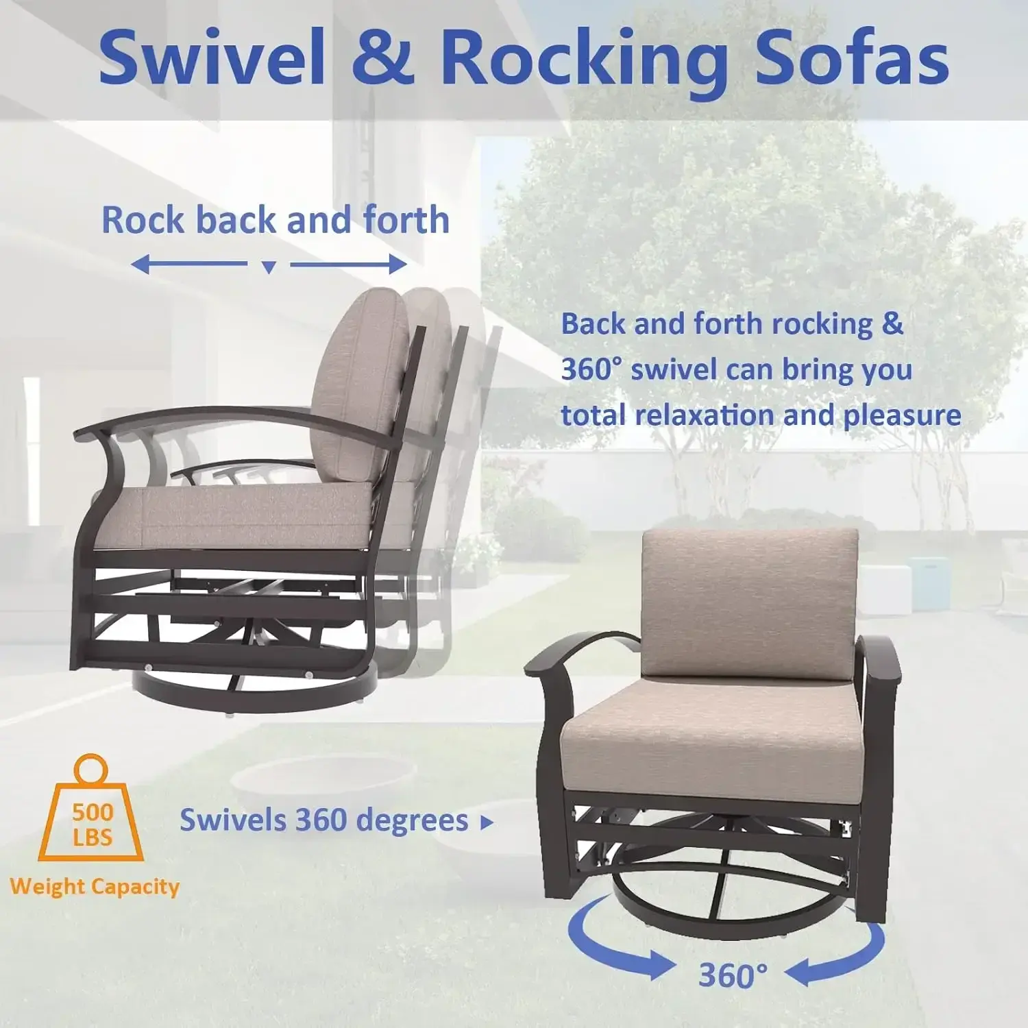
<li class="a-spacing-mini" style="box-sizing: border-box; list-style: disc; overflow-wrap: break-word; margin: 0px;"><span class="a-list-item" style="box-sizing: border-box; color: rgb(15, 17, 17);">【Comfortable Ergonomic Zero Gravity Chairs】: Our Zero Gravity Chairs maximum loading capacity is 350lbs, which is very comfortable for people who want to camp with motor house, take a vacation on the beach or rest beside the poolside. That would be a good choice for you to have a break with our Zero Gravity Chairs</span></li>
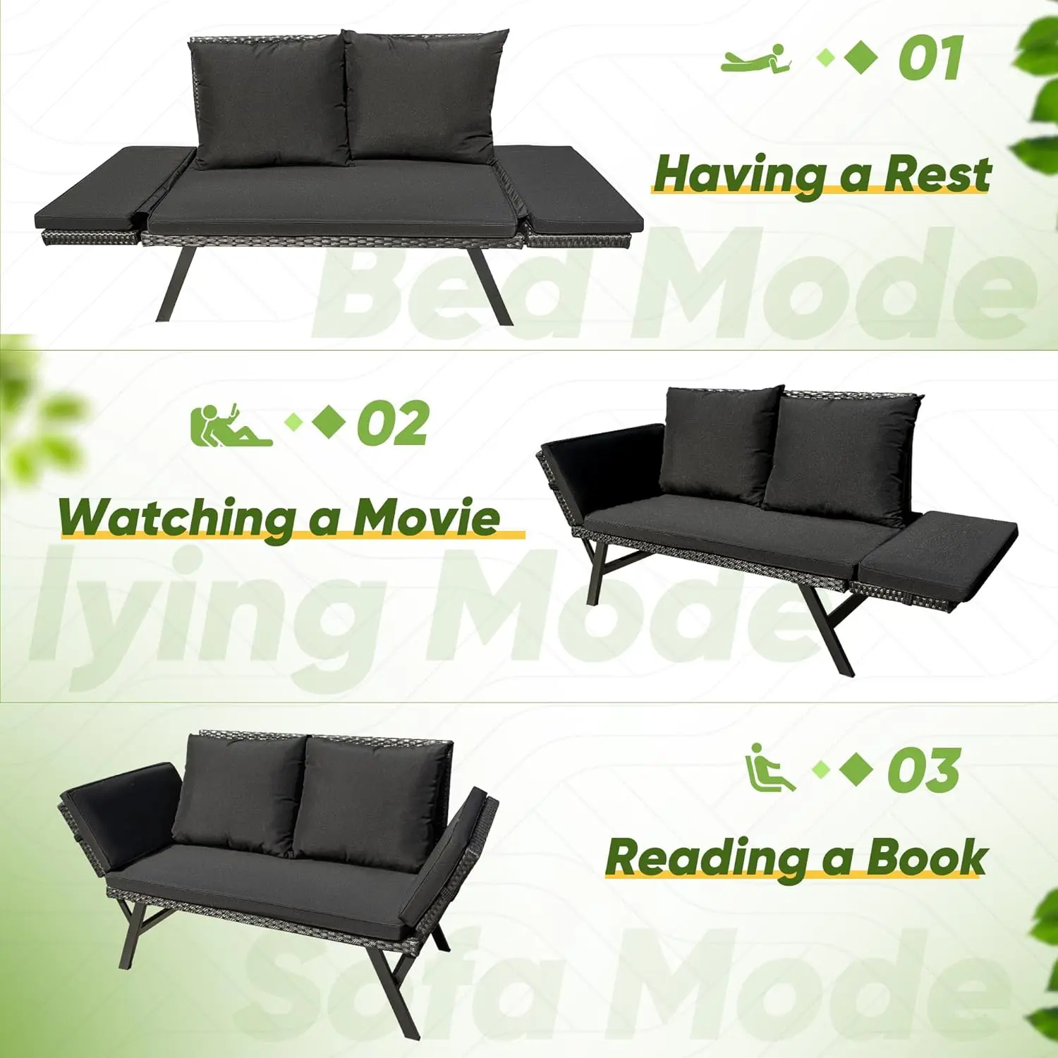
<li class="a-spacing-mini" style="box-sizing: border-box; list-style: disc; overflow-wrap: break-word; margin: 0px;"><span class="a-list-item" style="box-sizing: border-box; color: rgb(15, 17, 17);">【Lockable Reclining System Gravity Chairs】: The lock catch is more convenient to operate than twist knobs. Simply pull the clip back to lock and push the clip front to unlock. It can be adjusted at any angle from 0 to 168 degrees, smoothly glides to an ergonomic zero-gravity position</span></li>
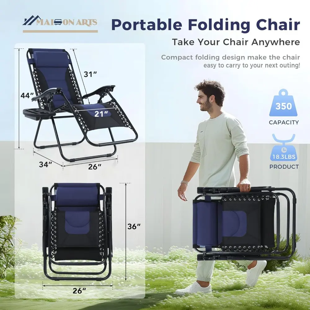
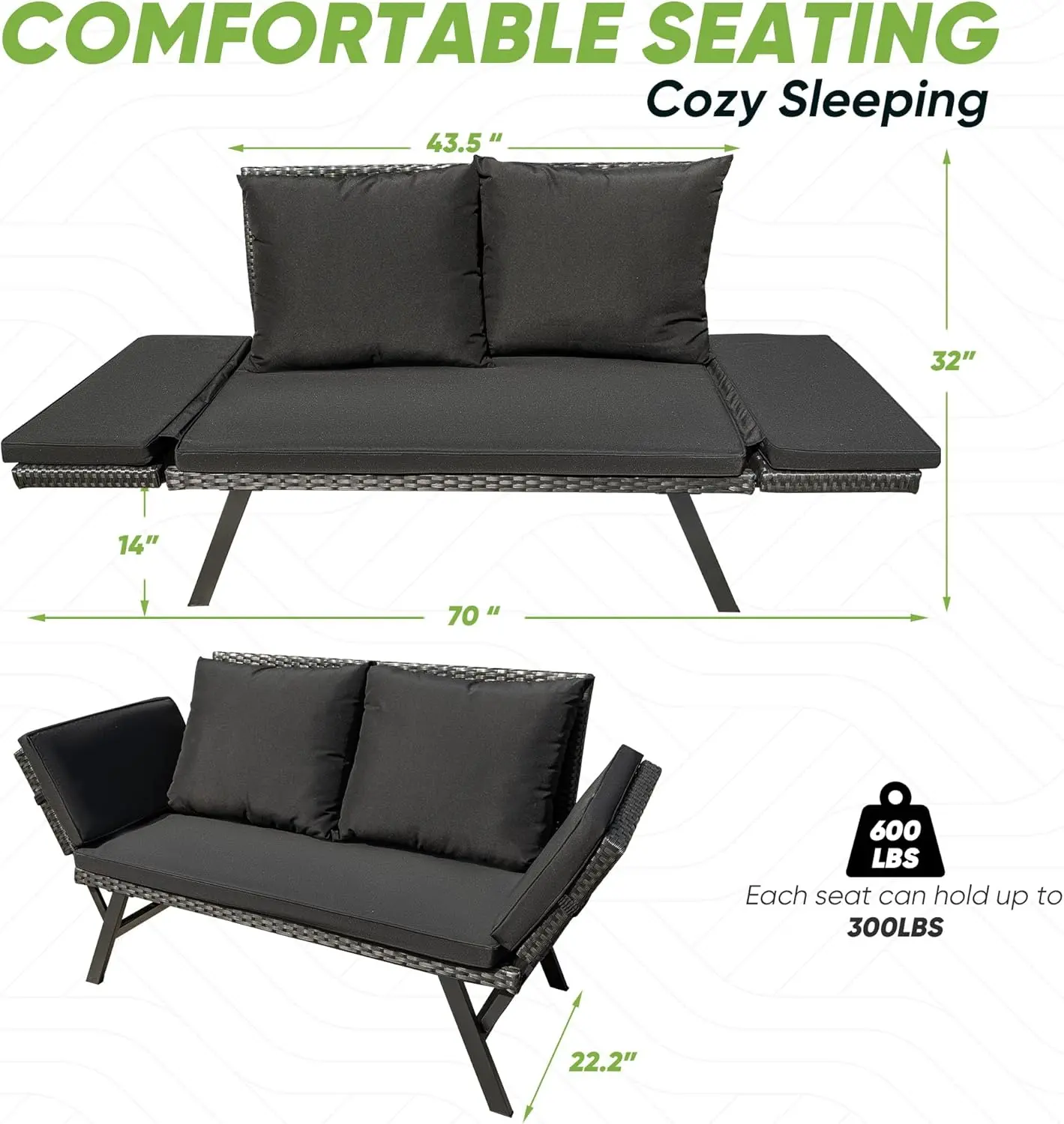
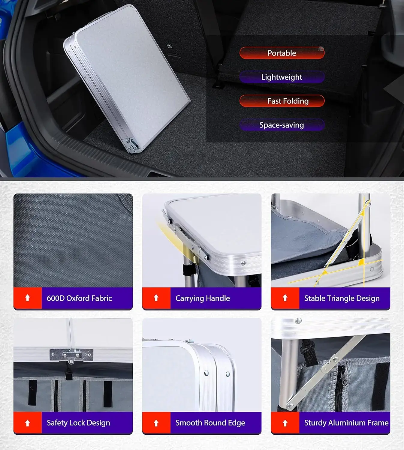
<li class="a-spacing-mini" style="box-sizing: border-box; list-style: disc; overflow-wrap: break-word; margin: 0px;"><span class="a-list-item" style="box-sizing: border-box; color: rgb(15, 17, 17);">【Portable Design Lounge Chairs】: Open dimension: 35 L x 26 W x 45 H. Height of Chairs back could be adjusted from 32 to 45. Folded dimension: 26 L x 6 W x 37 H. Product weight: 18.3 lbs. Easy storage and transport. Lightweight, foldable design makes the Chairs an easy addition to your next trip to the park, beach, or your childs next sporting event</span></li>
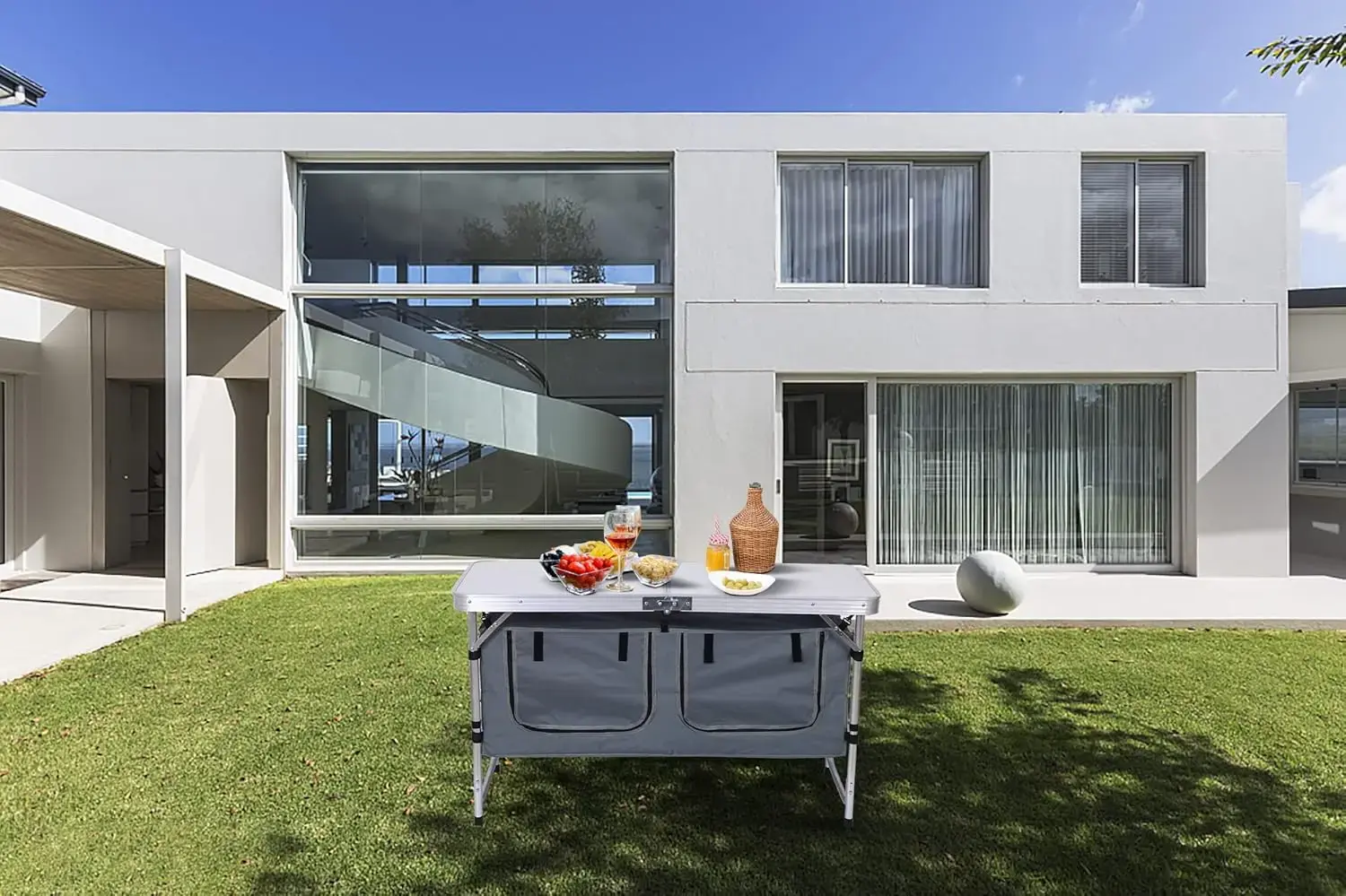
<li class="a-spacing-mini" style="box-sizing: border-box; list-style: disc; overflow-wrap: break-word; margin: 0px;"><span class="a-list-item" style="box-sizing: border-box; color: rgb(15, 17, 17);">【No Assembly Required Antigravity Chairs】: The zero gravity chairs come fully assembled, the only thing you need to do is to get the folded Chairs out of the package and have a nice nap. The easy folding and compact structure is suitable for any outdoor occasions, such as poolside, patio, backyard, garden, beach or balcony.It will bring you a more comfortable experience to have a rest at the leisure time</span></li>
</ul>
</div>
</div>
</div>
</div>
<style type="text/css">.aplus-v2 .container-with-background-image {
width: 100%;
height: 100%;
background-repeat: no-repeat;
background-size: cover;
}
</style>
<link href="https://images-na.ssl-images-amazon.com/images/I/01-HMB8SjSL.css?AUIClients/VSEPlayer" rel="stylesheet">
<link href="https://images-na.ssl-images-amazon.com/images/I/51NP-5Gx4JL._RC|11s4jq82GaL.css_.css?AUIClients/Brila" rel="stylesheet">
<style type="text/css">.aplus-v2 .container-with-background-image {
width: 100%;
height: 100%;
background-repeat: no-repeat;
background-size: cover;
}
</style>
<style type="text/css">.aplus-v2 .apm-brand-story-carousel-container {
position: relative;
}
.aplus-v2 .apm-brand-story-carousel-hero-container,
.aplus-v2 .apm-brand-story-carousel-hero-container > div {
position: absolute;
width: 100%;
}
</style>
<style type="text/css">/*
Ensuring the carousel takes only the space it needs.
The sizes need to be set again on the absolutely positioned elements so they can take up space.
*/
.aplus-v2 .apm-brand-story-carousel-container,
.aplus-v2 .apm-brand-story-carousel-hero-container {
height: 625px;
width: 100%;
max-width: 1464px;
margin-left: auto;
margin-right: auto;
overflow: hidden;
}
.aplus-v2 .apm-brand-story-carousel-hero-container,
.aplus-v2 .apm-brand-story-carousel-hero-container > div {
height: 625px;
}
</style>
<style type="text/css">.aplus-v2 .apm-brand-story-carousel.a-carousel-container {
padding: 0px;
}
/*
This centers the carousel vertically on top of the hero image container and after the logo area (125px).
Margin-top = (heroHeight - cardHeight - logoAreaHeight) / 2 + logoAreaHeight
*/
.aplus-v2 .apm-brand-story-carousel .a-carousel-row-inner {
margin-top: 149px;
}
/*
Cards need to have a width set, otherwise they default to 50px or so.
All cards must have the same width. The carousel will resize itself so all cards take the width of the largest card.
The left margin is for leaving a space between each card.
*/
.aplus-v2 .apm-brand-story-carousel .a-carousel-card {
width: 362px;
margin-left: 30px !important;
}
/* styling the navigation buttons so they are taller, flush with the sides, and have a clean white background */
.aplus-v2 .apm-brand-story-carousel .a-carousel-col.a-carousel-left,
.aplus-v2 .apm-brand-story-carousel .a-carousel-col.a-carousel-right {
padding: 0px;
}
.aplus-v2 .apm-brand-story-carousel .a-carousel-col.a-carousel-left .a-button-image,
.aplus-v2 .apm-brand-story-carousel .a-carousel-col.a-carousel-right .a-button-image {
border: none;
margin: 0px;
}
.aplus-v2 .apm-brand-story-carousel .a-carousel-col.a-carousel-left .a-button-image .a-button-inner,
.aplus-v2 .apm-brand-story-carousel .a-carousel-col.a-carousel-right .a-button-image .a-button-inner {
background: #fff;
padding: 20px 6px;
}
.aplus-v2 .apm-brand-story-carousel .a-carousel-col.a-carousel-left .a-button-image .a-button-inner {
border-radius: 0px 4px 4px 0px;
}
.aplus-v2 .apm-brand-story-carousel .a-carousel-col.a-carousel-right .a-button-image .a-button-inner {
border-radius: 4px 0px 0px 4px;
}
</style>
</div></div>
$540.275
$249.605
- Category : Furniture
- Brand : mkdk_select_cool_and_trendy_stores_store MKDK Select Cool And Trendy Stores Store
Colors
Sizes
-
+
<div class="detailmodule_html"><div class="detail-desc-decorate-richtext"><div class="a-section a-spacing-large bucket" id="aplus"> </div>
<div class="a-section a-spacing-large bucket" id="aplus">
<div cel_widget_id="aplus" class="aplus-v2 desktop celwidget">
<div>
<div class="aplus-brandstory-pagination">
<h1 class="a-size-base-plus a-text-bold" style="box-sizing: border-box; padding: 0px 0px 4px; margin: 0px; text-rendering: optimizelegibility; font-weight: 700 !important; font-size: 1.25rem !important; line-height: 24px !important; color: rgb(15, 17, 17); font-family: "Amazon Ember" !important; font-style: normal; font-variant-ligatures: normal; font-variant-caps: normal; letter-spacing: normal; orphans: 2; text-align: start; text-indent: 0px; text-transform: none; widows: 2; word-spacing: 0px; -webkit-text-stroke-width: 0px; white-space: normal; background-color: rgb(255, 255, 255); text-decoration-thickness: initial; text-decoration-style: initial; text-decoration-color: initial;">About this item</h1>
<ul class="a-unordered-list a-vertical a-spacing-mini" style="box-sizing: border-box; margin: 0px 0px 0px 18px; color: rgb(15, 17, 17); padding: 0px; font-family: "Amazon Ember", Arial, sans-serif; font-size: 14px; font-style: normal; font-variant-ligatures: normal; font-variant-caps: normal; font-weight: 400; letter-spacing: normal; orphans: 2; text-align: start; text-indent: 0px; text-transform: none; widows: 2; word-spacing: 0px; -webkit-text-stroke-width: 0px; white-space: normal; background-color: rgb(255, 255, 255); text-decoration-thickness: initial; text-decoration-style: initial; text-decoration-color: initial;">
<li class="a-spacing-mini" style="box-sizing: border-box; list-style: disc; overflow-wrap: break-word; margin: 0px;"><span class="a-list-item" style="box-sizing: border-box; color: rgb(15, 17, 17);">【Padded Seat & Back Recliner】: Fully padded seat and back, adjustable padded pillow for both a headrest and lumbar support, provide you a more comfortable sitting experience. Cup tray is included for holding drinks or food</span></li>
<li class="a-spacing-mini" style="box-sizing: border-box; list-style: disc; overflow-wrap: break-word; margin: 0px;"><span class="a-list-item" style="box-sizing: border-box; color: rgb(15, 17, 17);">【Comfortable Ergonomic Zero Gravity Chairs】: Our Zero Gravity Chairs maximum loading capacity is 350lbs, which is very comfortable for people who want to camp with motor house, take a vacation on the beach or rest beside the poolside. That would be a good choice for you to have a break with our Zero Gravity Chairs</span></li>
<li class="a-spacing-mini" style="box-sizing: border-box; list-style: disc; overflow-wrap: break-word; margin: 0px;"><span class="a-list-item" style="box-sizing: border-box; color: rgb(15, 17, 17);">【Lockable Reclining System Gravity Chairs】: The lock catch is more convenient to operate than twist knobs. Simply pull the clip back to lock and push the clip front to unlock. It can be adjusted at any angle from 0 to 168 degrees, smoothly glides to an ergonomic zero-gravity position</span></li>
<li class="a-spacing-mini" style="box-sizing: border-box; list-style: disc; overflow-wrap: break-word; margin: 0px;"><span class="a-list-item" style="box-sizing: border-box; color: rgb(15, 17, 17);">【Portable Design Lounge Chairs】: Open dimension: 35 L x 26 W x 45 H. Height of Chairs back could be adjusted from 32 to 45. Folded dimension: 26 L x 6 W x 37 H. Product weight: 18.3 lbs. Easy storage and transport. Lightweight, foldable design makes the Chairs an easy addition to your next trip to the park, beach, or your childs next sporting event</span></li>
<li class="a-spacing-mini" style="box-sizing: border-box; list-style: disc; overflow-wrap: break-word; margin: 0px;"><span class="a-list-item" style="box-sizing: border-box; color: rgb(15, 17, 17);">【No Assembly Required Antigravity Chairs】: The zero gravity chairs come fully assembled, the only thing you need to do is to get the folded Chairs out of the package and have a nice nap. The easy folding and compact structure is suitable for any outdoor occasions, such as poolside, patio, backyard, garden, beach or balcony.It will bring you a more comfortable experience to have a rest at the leisure time</span></li>
</ul>
</div>
</div>
</div>
</div>
<style type="text/css">.aplus-v2 .container-with-background-image {
width: 100%;
height: 100%;
background-repeat: no-repeat;
background-size: cover;
}
</style>
<link href="https://images-na.ssl-images-amazon.com/images/I/01-HMB8SjSL.css?AUIClients/VSEPlayer" rel="stylesheet">
<link href="https://images-na.ssl-images-amazon.com/images/I/51NP-5Gx4JL._RC|11s4jq82GaL.css_.css?AUIClients/Brila" rel="stylesheet">
<style type="text/css">.aplus-v2 .container-with-background-image {
width: 100%;
height: 100%;
background-repeat: no-repeat;
background-size: cover;
}
</style>
<style type="text/css">.aplus-v2 .apm-brand-story-carousel-container {
position: relative;
}
.aplus-v2 .apm-brand-story-carousel-hero-container,
.aplus-v2 .apm-brand-story-carousel-hero-container > div {
position: absolute;
width: 100%;
}
</style>
<style type="text/css">/*
Ensuring the carousel takes only the space it needs.
The sizes need to be set again on the absolutely positioned elements so they can take up space.
*/
.aplus-v2 .apm-brand-story-carousel-container,
.aplus-v2 .apm-brand-story-carousel-hero-container {
height: 625px;
width: 100%;
max-width: 1464px;
margin-left: auto;
margin-right: auto;
overflow: hidden;
}
.aplus-v2 .apm-brand-story-carousel-hero-container,
.aplus-v2 .apm-brand-story-carousel-hero-container > div {
height: 625px;
}
</style>
<style type="text/css">.aplus-v2 .apm-brand-story-carousel.a-carousel-container {
padding: 0px;
}
/*
This centers the carousel vertically on top of the hero image container and after the logo area (125px).
Margin-top = (heroHeight - cardHeight - logoAreaHeight) / 2 + logoAreaHeight
*/
.aplus-v2 .apm-brand-story-carousel .a-carousel-row-inner {
margin-top: 149px;
}
/*
Cards need to have a width set, otherwise they default to 50px or so.
All cards must have the same width. The carousel will resize itself so all cards take the width of the largest card.
The left margin is for leaving a space between each card.
*/
.aplus-v2 .apm-brand-story-carousel .a-carousel-card {
width: 362px;
margin-left: 30px !important;
}
/* styling the navigation buttons so they are taller, flush with the sides, and have a clean white background */
.aplus-v2 .apm-brand-story-carousel .a-carousel-col.a-carousel-left,
.aplus-v2 .apm-brand-story-carousel .a-carousel-col.a-carousel-right {
padding: 0px;
}
.aplus-v2 .apm-brand-story-carousel .a-carousel-col.a-carousel-left .a-button-image,
.aplus-v2 .apm-brand-story-carousel .a-carousel-col.a-carousel-right .a-button-image {
border: none;
margin: 0px;
}
.aplus-v2 .apm-brand-story-carousel .a-carousel-col.a-carousel-left .a-button-image .a-button-inner,
.aplus-v2 .apm-brand-story-carousel .a-carousel-col.a-carousel-right .a-button-image .a-button-inner {
background: #fff;
padding: 20px 6px;
}
.aplus-v2 .apm-brand-story-carousel .a-carousel-col.a-carousel-left .a-button-image .a-button-inner {
border-radius: 0px 4px 4px 0px;
}
.aplus-v2 .apm-brand-story-carousel .a-carousel-col.a-carousel-right .a-button-image .a-button-inner {
border-radius: 4px 0px 0px 4px;
}
</style>
</div></div>
Related Product
Browse The Collection of Top Products.

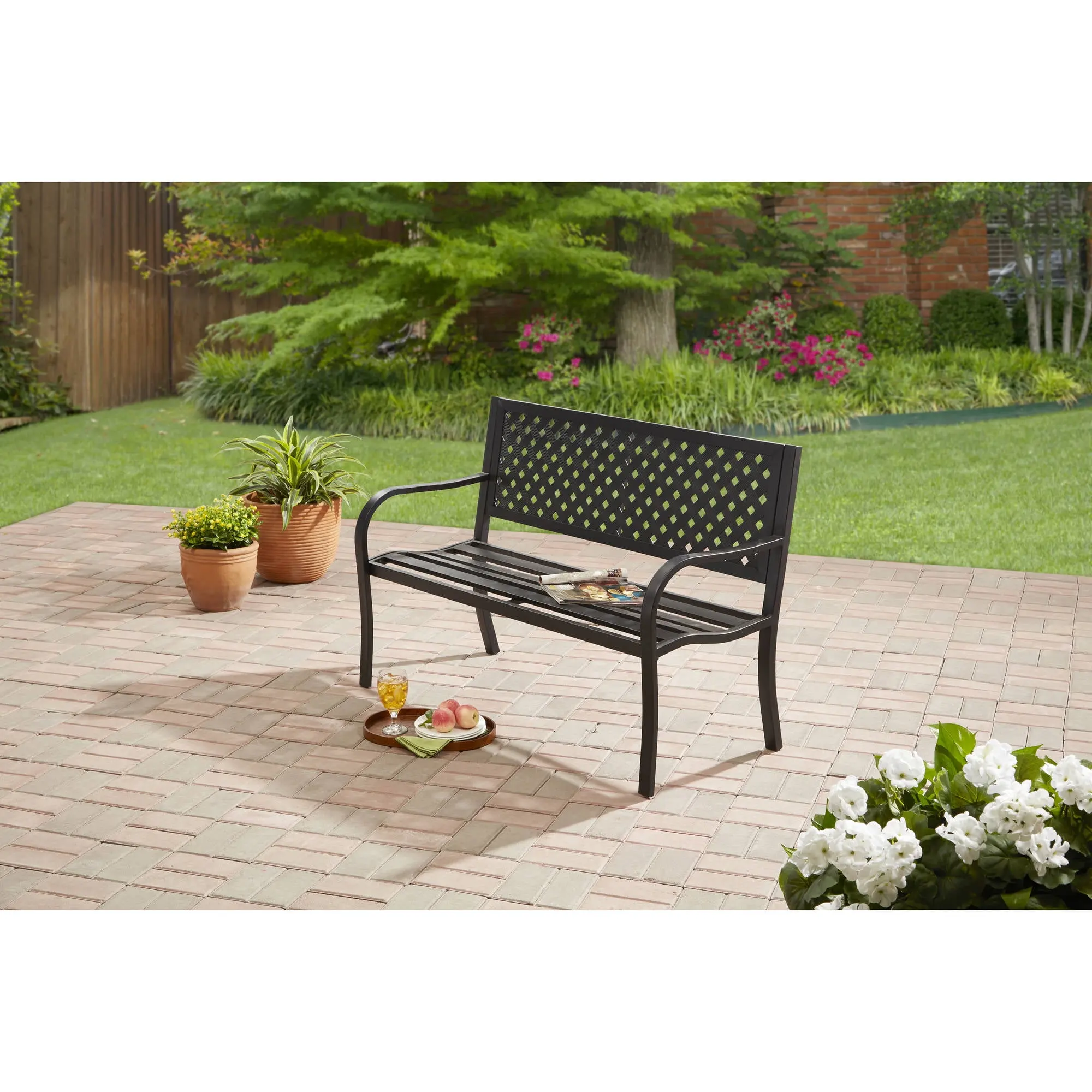
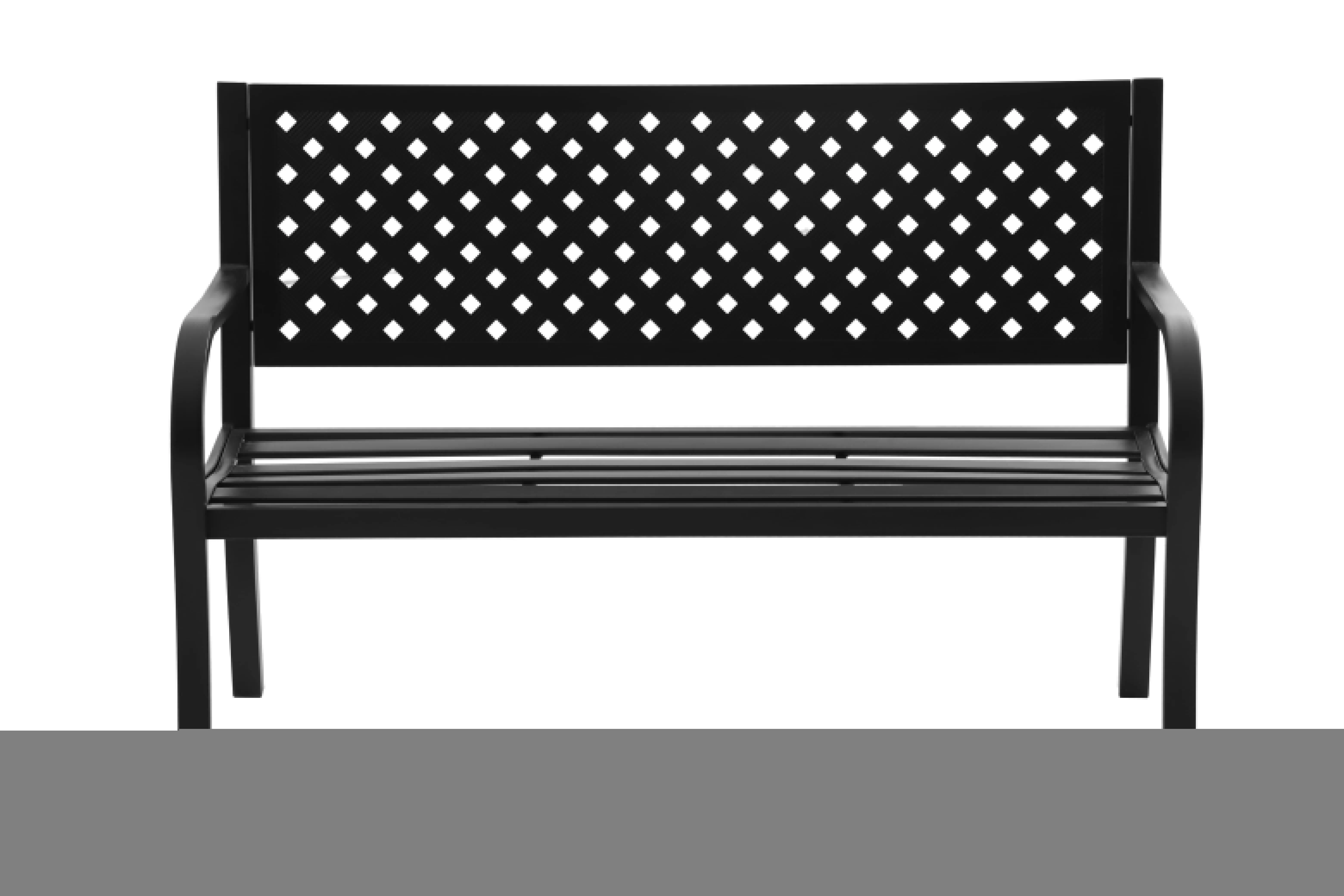


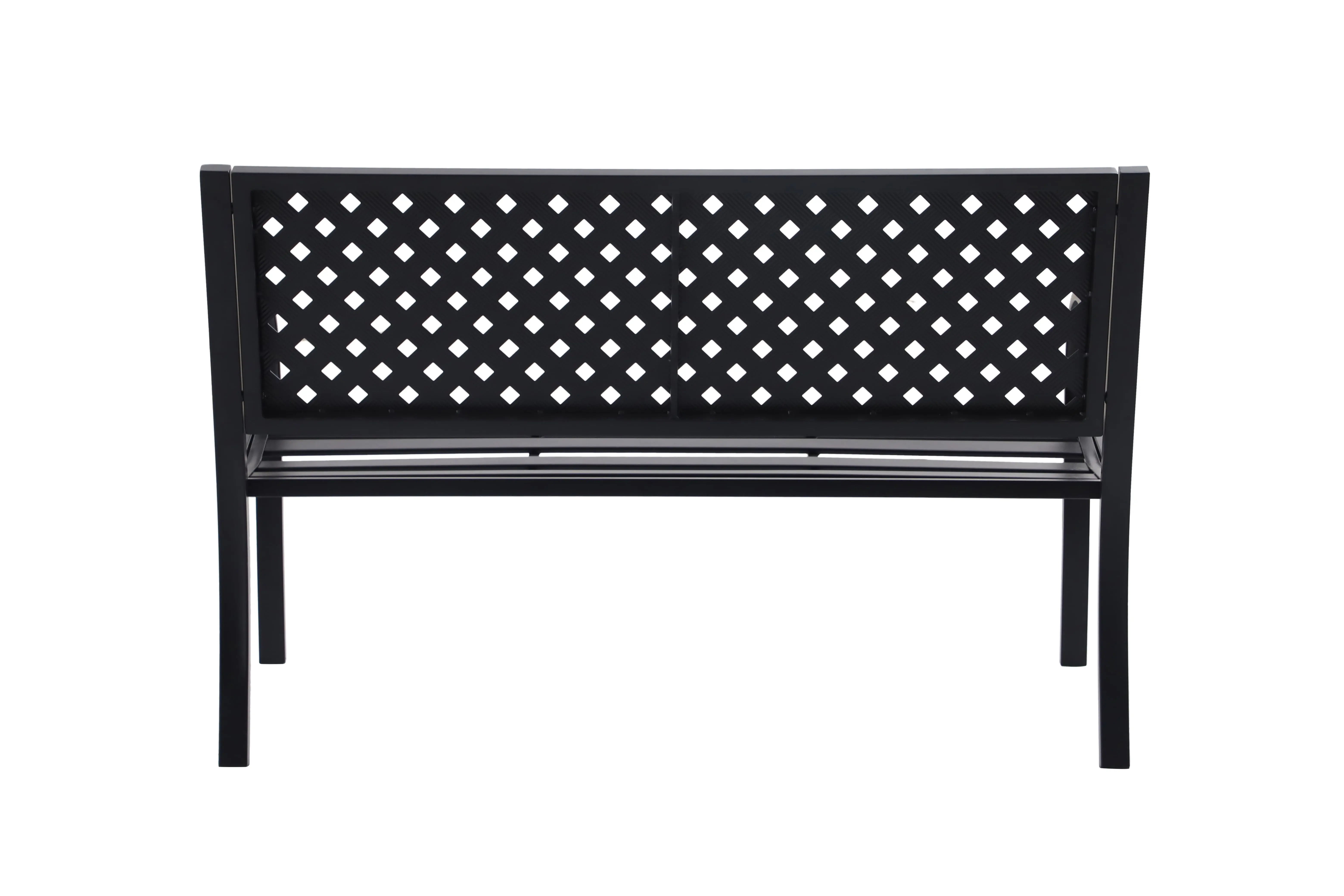
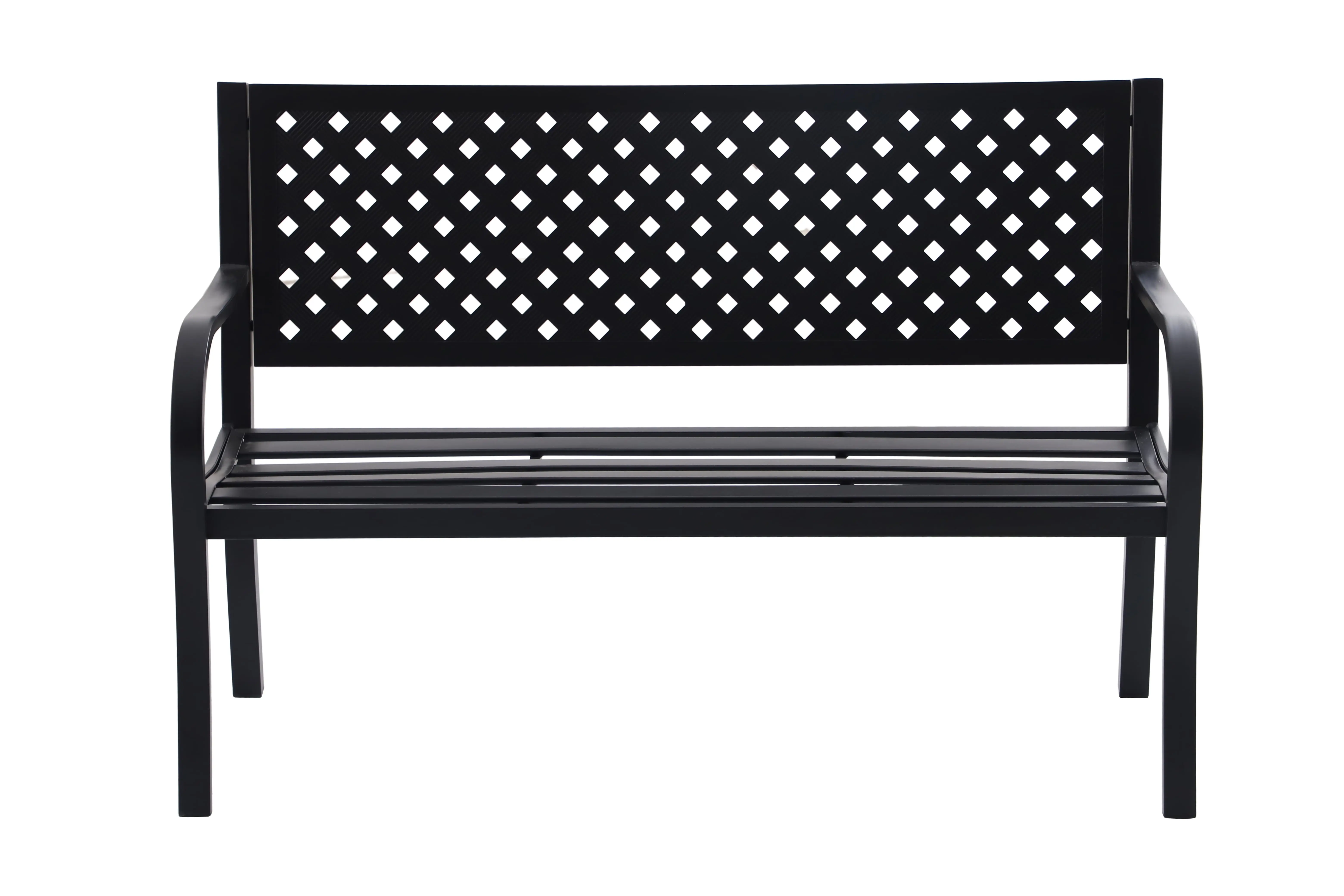
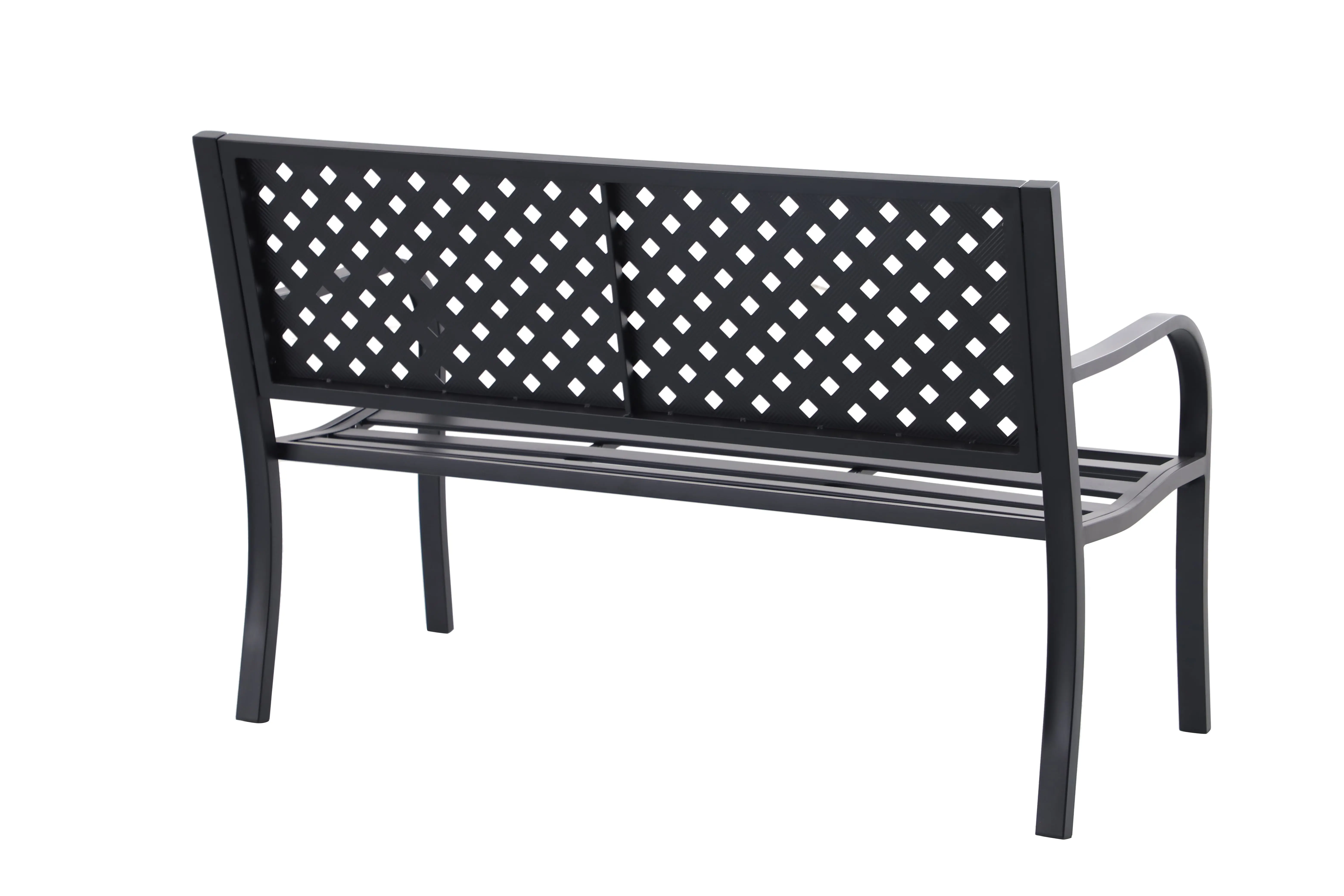
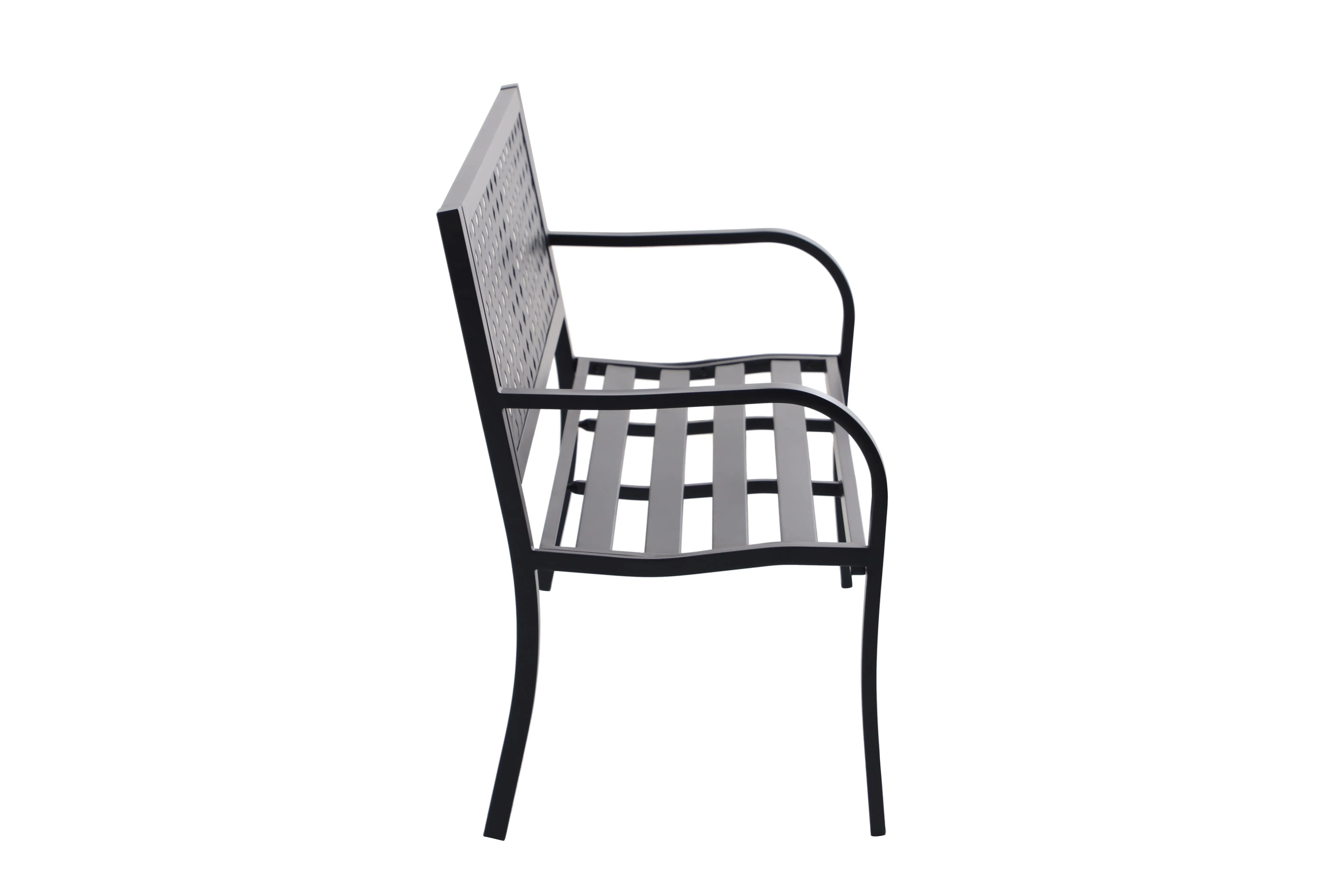
Lattice High Back Slat Seat Steel Outdoor Bench, Black - Seats 2
$83.03
$149.315


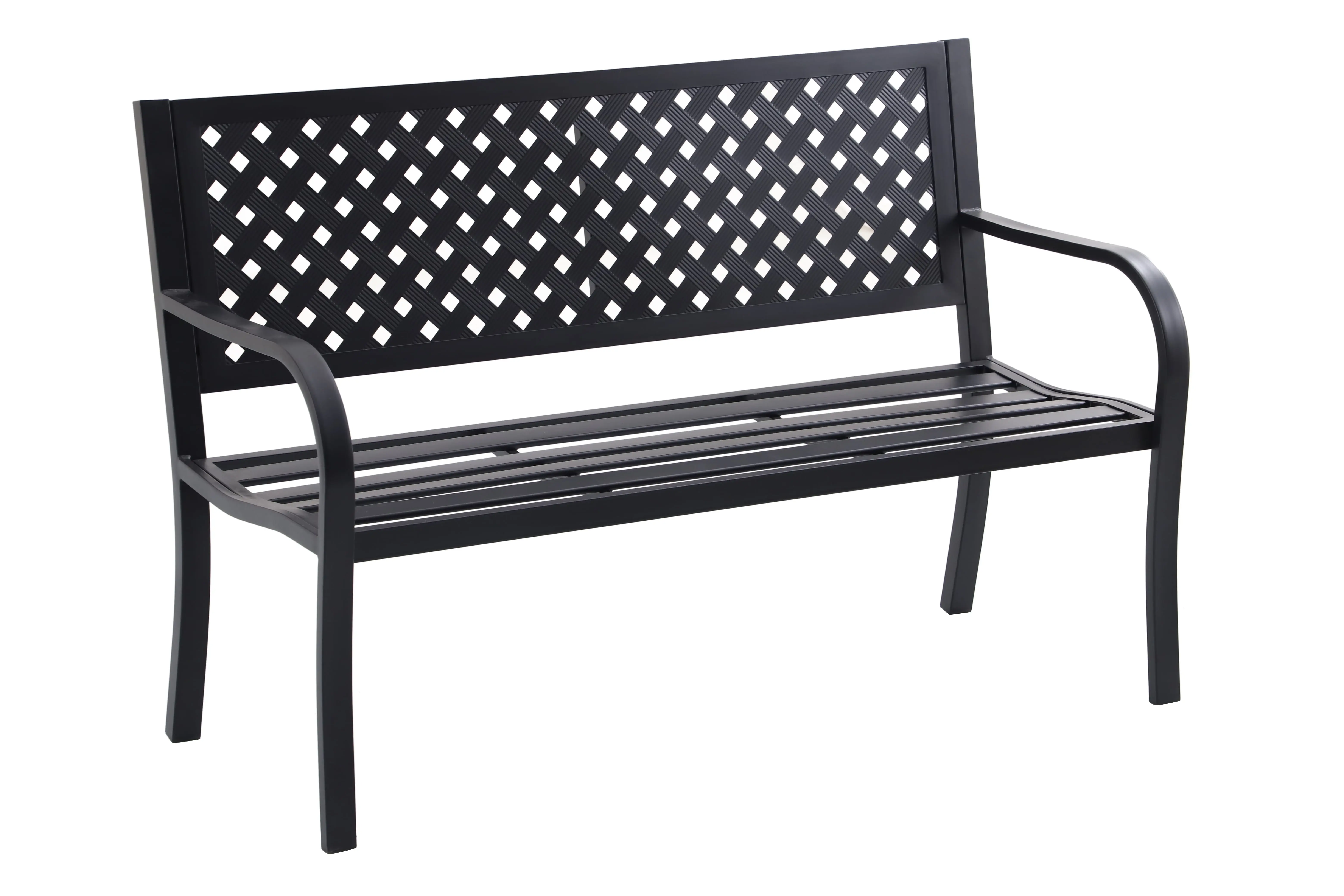
Lattice High Back Slat Seat Steel Outdoor Bench, Black - Seats 2
$90.455
$241.055