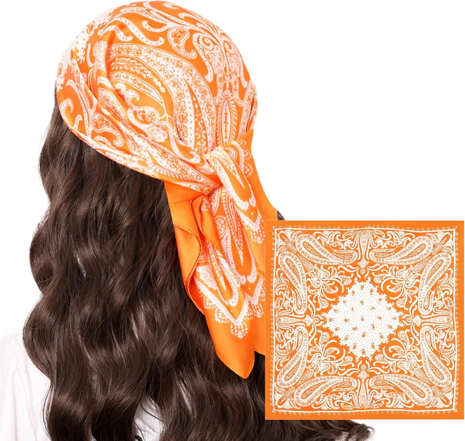
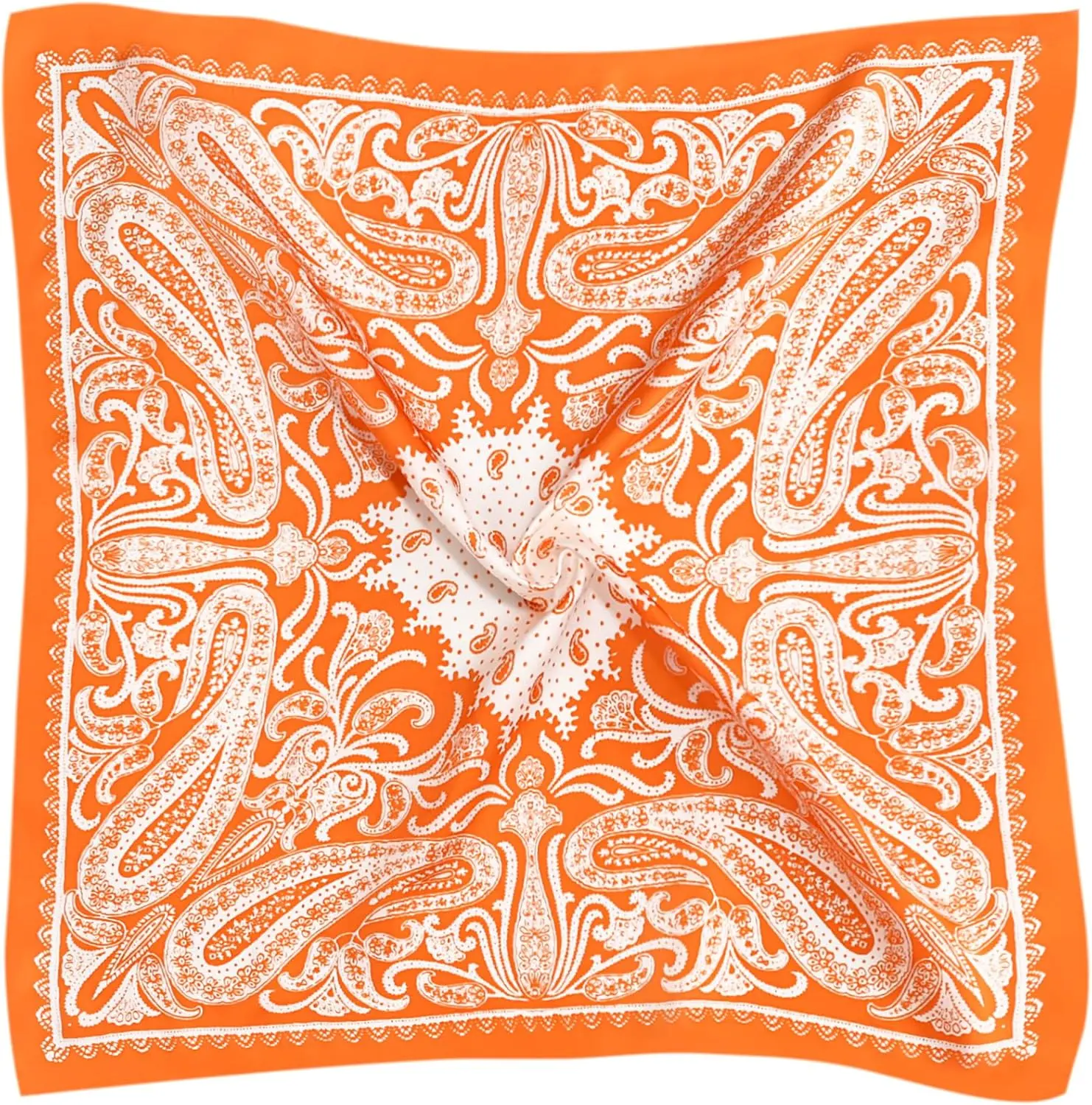
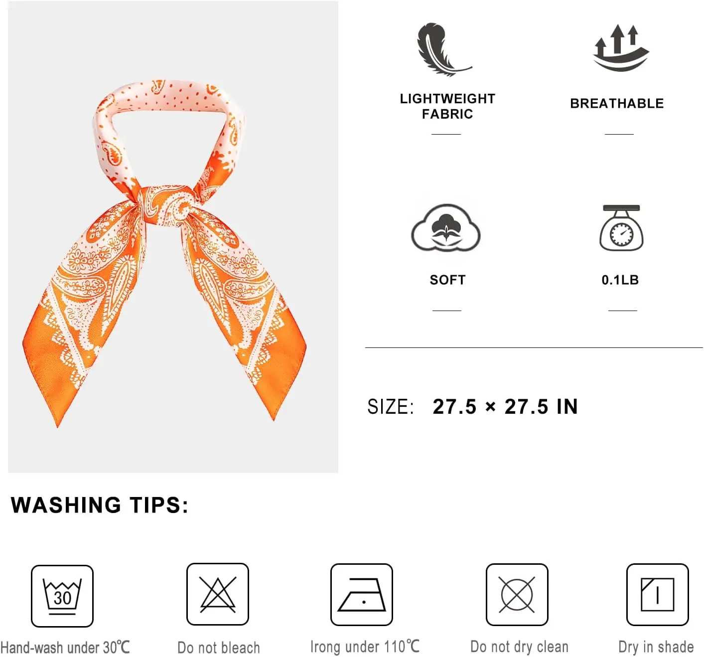
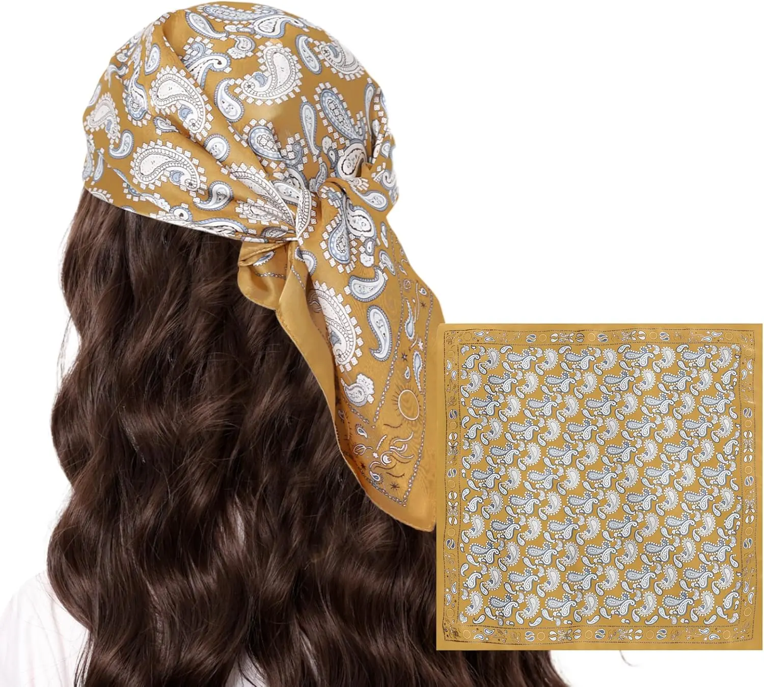
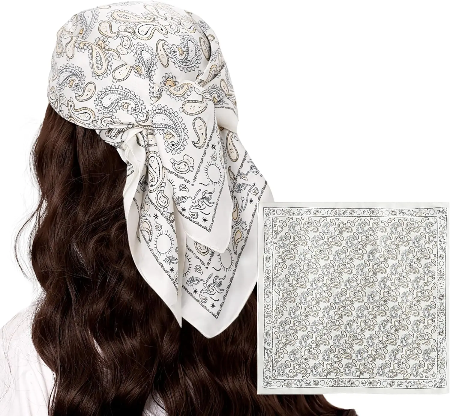
Paisley Satin Head Scarf for Women Men Versatile Silk-Like Hair Scarf Vintage Bandana Large Square Scarves 27.5"
<div class="detailmodule_html"><div class="detail-desc-decorate-richtext"><div class="a-section a-spacing-large bucket" id="aplus">
<div cel_widget_id="aplus" class="aplus-v2 desktop celwidget">
<div class="apm-brand-story-carousel-container">
<div class="apm-brand-story-carousel-hero-container">
<div aria-label="Featured content carousel" aria-roledescription="carousel" class="a-begin a-carousel-container a-carousel-static a-carousel-display-stretchyGoodness a-carousel-transition-slide apm-brand-story-carousel size-cards a-carousel-container" data-a-carousel-options="{"minimum_gutter_width":10,"show_partial_next":true,"name":"brand-story-carousel","single_page_align":"left","circular":false,"carousel_display_strategy":"single","currentGutter":10}" id="apm-brand-story-carousel" role="group">
<div class="a-row a-carousel-controls a-carousel-row a-carousel-has-buttons">
<div class="a-carousel-row-inner">
<div class="a-carousel-col a-carousel-center">
<div aria-roledescription="slide" class="a-carousel-viewport" role="group">
<div></div>
</div>
</div>
</div>
</div>
<span class="a-end aok-hidden"></span></div>
</div>
<div class="aplus-brandstory-pagination"> </div>
</div>
</div>
</div>
<style type="text/css">.aplus-v2 .container-with-background-image {
width: 100%;
height: 100%;
background-repeat: no-repeat;
background-size: cover;
}
</style>
<link href="https://images-na.ssl-images-amazon.com/images/I/01cUckQOW-L.css?AUIClients/VSEPlayer" rel="stylesheet" />
<link href="https://images-na.ssl-images-amazon.com/images/I/51NP-5Gx4JL._RC|11UTSuNrVnL.css_.css?AUIClients/Brila" rel="stylesheet" />
<style type="text/css">.aplus-v2 .container-with-background-image {
width: 100%;
height: 100%;
background-repeat: no-repeat;
background-size: cover;
}
</style>
<style type="text/css">.aplus-v2 .apm-brand-story-carousel-container {
position: relative;
}
.aplus-v2 .apm-brand-story-carousel-hero-container,
.aplus-v2 .apm-brand-story-carousel-hero-container > div {
position: absolute;
width: 100%;
}
</style>
<style type="text/css">/*
Ensuring the carousel takes only the space it needs.
The sizes need to be set again on the absolutely positioned elements so they can take up space.
*/
.aplus-v2 .apm-brand-story-carousel-container,
.aplus-v2 .apm-brand-story-carousel-hero-container {
height: 625px;
width: 100%;
max-width: 1464px;
margin-left: auto;
margin-right: auto;
overflow: hidden;
}
.aplus-v2 .apm-brand-story-carousel-hero-container,
.aplus-v2 .apm-brand-story-carousel-hero-container > div {
height: 625px;
}
</style>
<style type="text/css">.aplus-v2 .apm-brand-story-carousel.a-carousel-container {
padding: 0px;
}
/*
This centers the carousel vertically on top of the hero image container and after the logo area (125px).
Margin-top = (heroHeight - cardHeight - logoAreaHeight) / 2 + logoAreaHeight
*/
.aplus-v2 .apm-brand-story-carousel .a-carousel-row-inner {
margin-top: 149px;
}
/*
Cards need to have a width set, otherwise they default to 50px or so.
All cards must have the same width. The carousel will resize itself so all cards take the width of the largest card.
The left margin is for leaving a space between each card.
*/
.aplus-v2 .apm-brand-story-carousel .a-carousel-card {
width: 362px;
margin-left: 30px !important;
}
/* styling the navigation buttons so they are taller, flush with the sides, and have a clean white background */
.aplus-v2 .apm-brand-story-carousel .a-carousel-col.a-carousel-left,
.aplus-v2 .apm-brand-story-carousel .a-carousel-col.a-carousel-right {
padding: 0px;
}
.aplus-v2 .apm-brand-story-carousel .a-carousel-col.a-carousel-left .a-button-image,
.aplus-v2 .apm-brand-story-carousel .a-carousel-col.a-carousel-right .a-button-image {
border: none;
margin: 0px;
}
.aplus-v2 .apm-brand-story-carousel .a-carousel-col.a-carousel-left .a-button-image .a-button-inner,
.aplus-v2 .apm-brand-story-carousel .a-carousel-col.a-carousel-right .a-button-image .a-button-inner {
background: #fff;
padding: 20px 6px;
}
.aplus-v2 .apm-brand-story-carousel .a-carousel-col.a-carousel-left .a-button-image .a-button-inner {
border-radius: 0px 4px 4px 0px;
}
.aplus-v2 .apm-brand-story-carousel .a-carousel-col.a-carousel-right .a-button-image .a-button-inner {
border-radius: 4px 0px 0px 4px;
}
</style>
</div></div>
$11.27
$6.17
- Category : Apparel Accessories
- Brand : scarf_echarpe_store Scarf Echarpe Store
Colors
Sizes
-
+
<div class="detailmodule_html"><div class="detail-desc-decorate-richtext"><div class="a-section a-spacing-large bucket" id="aplus">
<div cel_widget_id="aplus" class="aplus-v2 desktop celwidget">
<div class="apm-brand-story-carousel-container">
<div class="apm-brand-story-carousel-hero-container">
<div aria-label="Featured content carousel" aria-roledescription="carousel" class="a-begin a-carousel-container a-carousel-static a-carousel-display-stretchyGoodness a-carousel-transition-slide apm-brand-story-carousel size-cards a-carousel-container" data-a-carousel-options="{"minimum_gutter_width":10,"show_partial_next":true,"name":"brand-story-carousel","single_page_align":"left","circular":false,"carousel_display_strategy":"single","currentGutter":10}" id="apm-brand-story-carousel" role="group">
<div class="a-row a-carousel-controls a-carousel-row a-carousel-has-buttons">
<div class="a-carousel-row-inner">
<div class="a-carousel-col a-carousel-center">
<div aria-roledescription="slide" class="a-carousel-viewport" role="group">
<div></div>
</div>
</div>
</div>
</div>
<span class="a-end aok-hidden"></span></div>
</div>
<div class="aplus-brandstory-pagination"> </div>
</div>
</div>
</div>
<style type="text/css">.aplus-v2 .container-with-background-image {
width: 100%;
height: 100%;
background-repeat: no-repeat;
background-size: cover;
}
</style>
<link href="https://images-na.ssl-images-amazon.com/images/I/01cUckQOW-L.css?AUIClients/VSEPlayer" rel="stylesheet" />
<link href="https://images-na.ssl-images-amazon.com/images/I/51NP-5Gx4JL._RC|11UTSuNrVnL.css_.css?AUIClients/Brila" rel="stylesheet" />
<style type="text/css">.aplus-v2 .container-with-background-image {
width: 100%;
height: 100%;
background-repeat: no-repeat;
background-size: cover;
}
</style>
<style type="text/css">.aplus-v2 .apm-brand-story-carousel-container {
position: relative;
}
.aplus-v2 .apm-brand-story-carousel-hero-container,
.aplus-v2 .apm-brand-story-carousel-hero-container > div {
position: absolute;
width: 100%;
}
</style>
<style type="text/css">/*
Ensuring the carousel takes only the space it needs.
The sizes need to be set again on the absolutely positioned elements so they can take up space.
*/
.aplus-v2 .apm-brand-story-carousel-container,
.aplus-v2 .apm-brand-story-carousel-hero-container {
height: 625px;
width: 100%;
max-width: 1464px;
margin-left: auto;
margin-right: auto;
overflow: hidden;
}
.aplus-v2 .apm-brand-story-carousel-hero-container,
.aplus-v2 .apm-brand-story-carousel-hero-container > div {
height: 625px;
}
</style>
<style type="text/css">.aplus-v2 .apm-brand-story-carousel.a-carousel-container {
padding: 0px;
}
/*
This centers the carousel vertically on top of the hero image container and after the logo area (125px).
Margin-top = (heroHeight - cardHeight - logoAreaHeight) / 2 + logoAreaHeight
*/
.aplus-v2 .apm-brand-story-carousel .a-carousel-row-inner {
margin-top: 149px;
}
/*
Cards need to have a width set, otherwise they default to 50px or so.
All cards must have the same width. The carousel will resize itself so all cards take the width of the largest card.
The left margin is for leaving a space between each card.
*/
.aplus-v2 .apm-brand-story-carousel .a-carousel-card {
width: 362px;
margin-left: 30px !important;
}
/* styling the navigation buttons so they are taller, flush with the sides, and have a clean white background */
.aplus-v2 .apm-brand-story-carousel .a-carousel-col.a-carousel-left,
.aplus-v2 .apm-brand-story-carousel .a-carousel-col.a-carousel-right {
padding: 0px;
}
.aplus-v2 .apm-brand-story-carousel .a-carousel-col.a-carousel-left .a-button-image,
.aplus-v2 .apm-brand-story-carousel .a-carousel-col.a-carousel-right .a-button-image {
border: none;
margin: 0px;
}
.aplus-v2 .apm-brand-story-carousel .a-carousel-col.a-carousel-left .a-button-image .a-button-inner,
.aplus-v2 .apm-brand-story-carousel .a-carousel-col.a-carousel-right .a-button-image .a-button-inner {
background: #fff;
padding: 20px 6px;
}
.aplus-v2 .apm-brand-story-carousel .a-carousel-col.a-carousel-left .a-button-image .a-button-inner {
border-radius: 0px 4px 4px 0px;
}
.aplus-v2 .apm-brand-story-carousel .a-carousel-col.a-carousel-right .a-button-image .a-button-inner {
border-radius: 4px 0px 0px 4px;
}
</style>
</div></div>