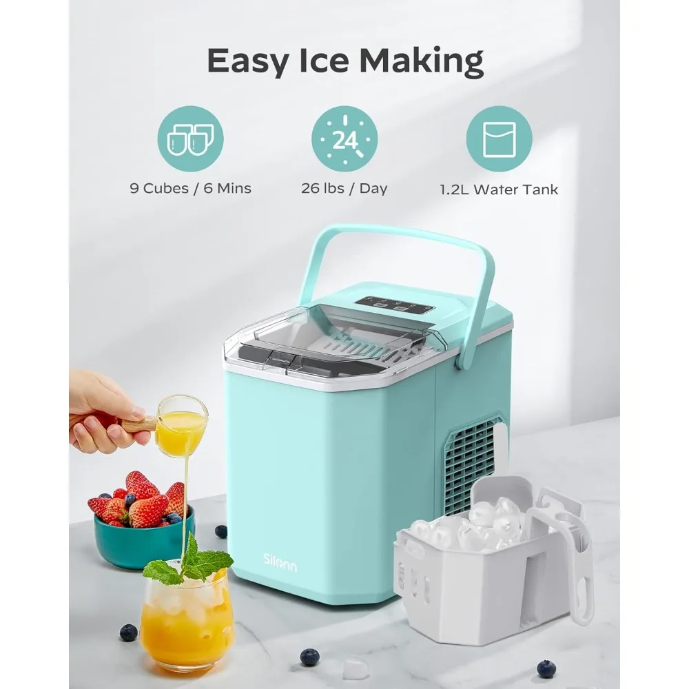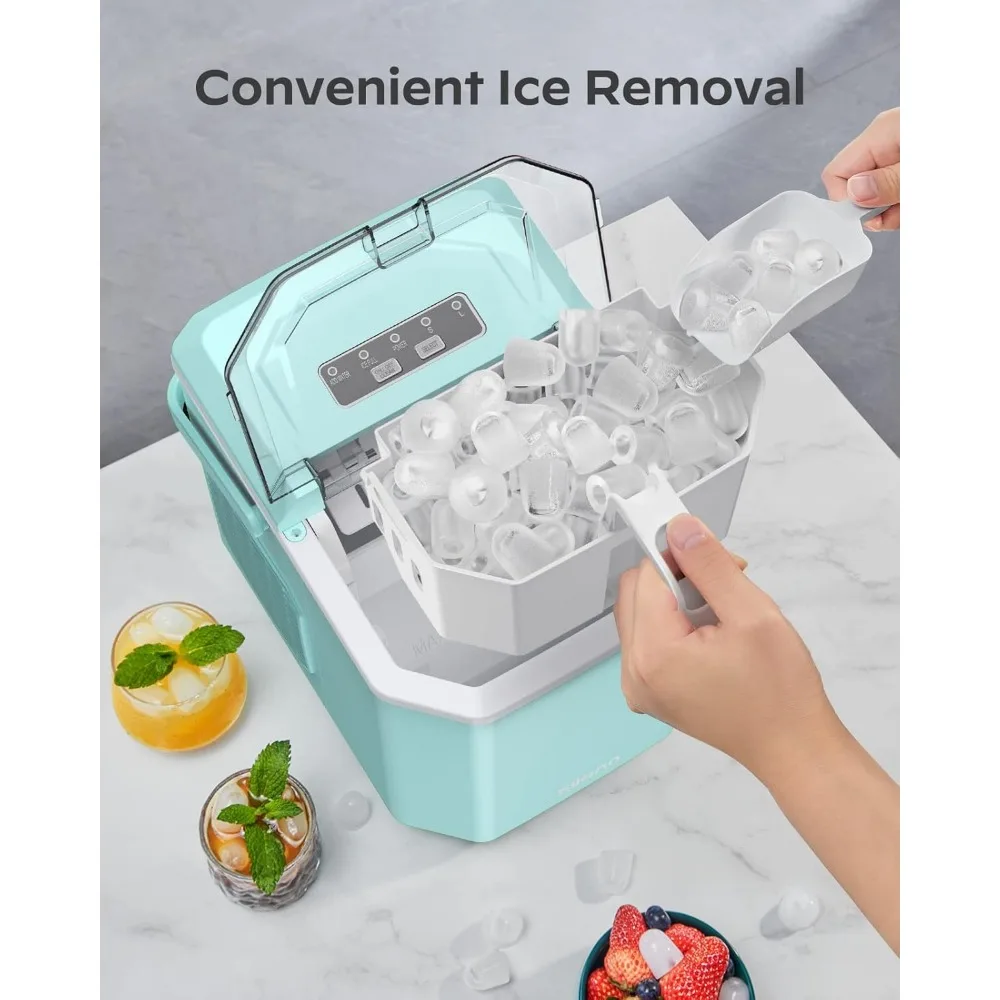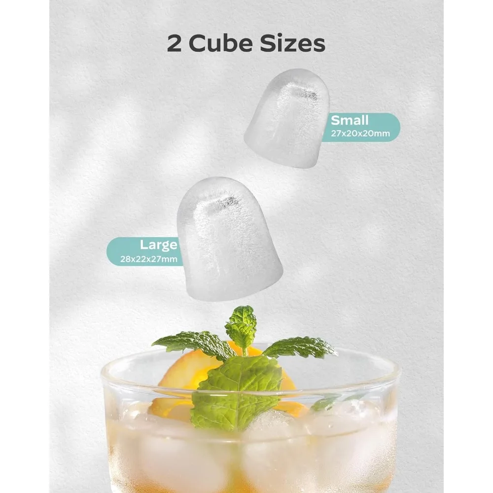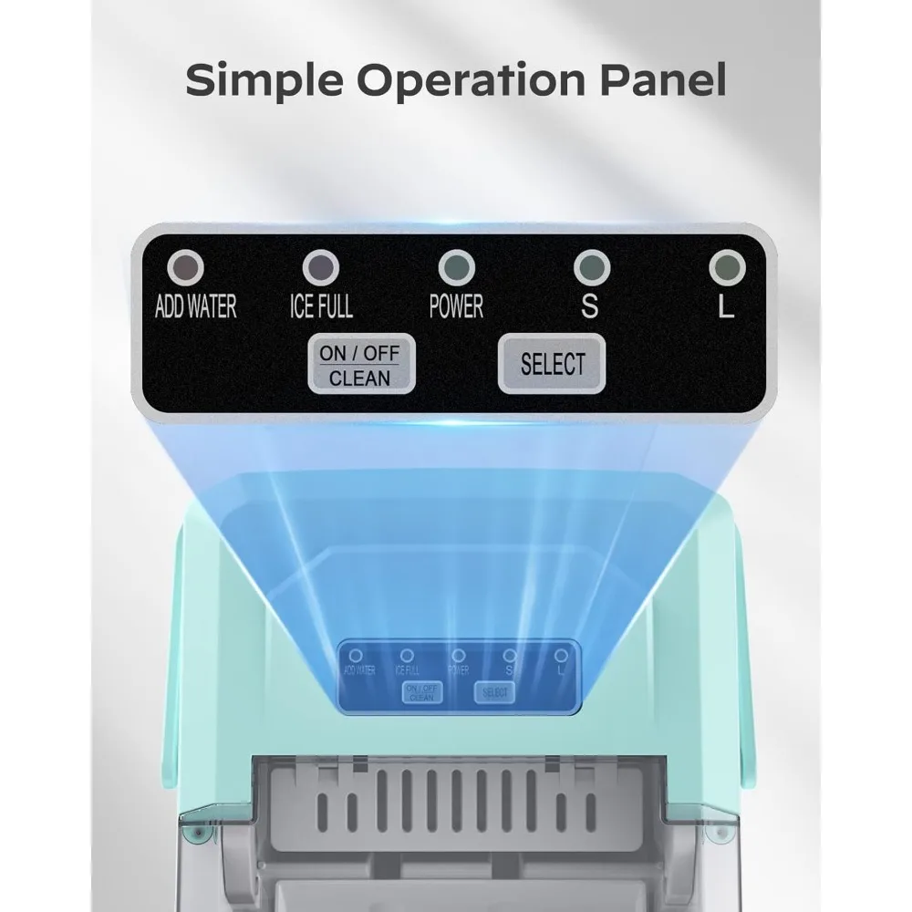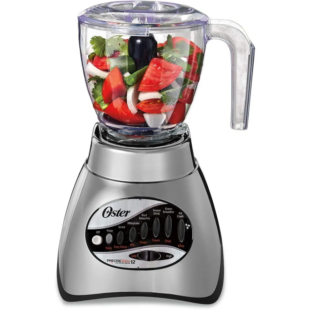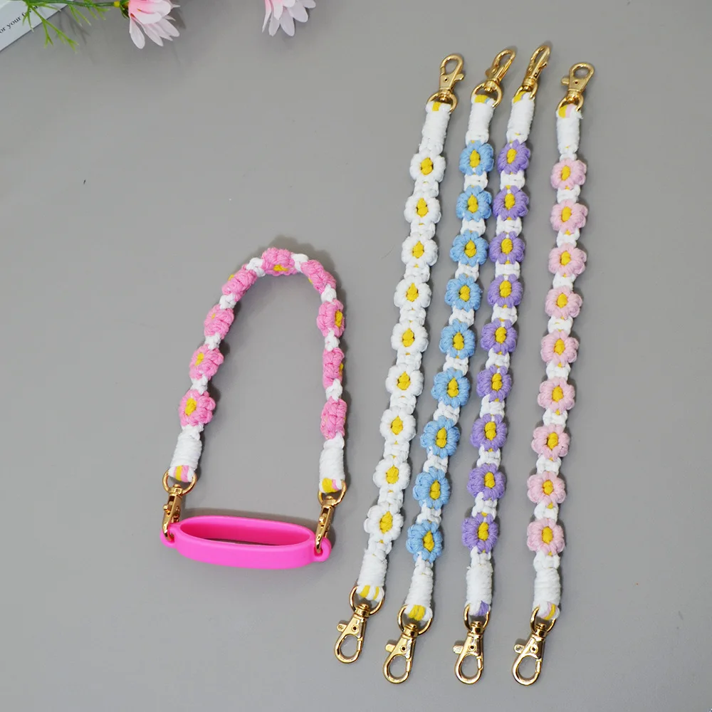
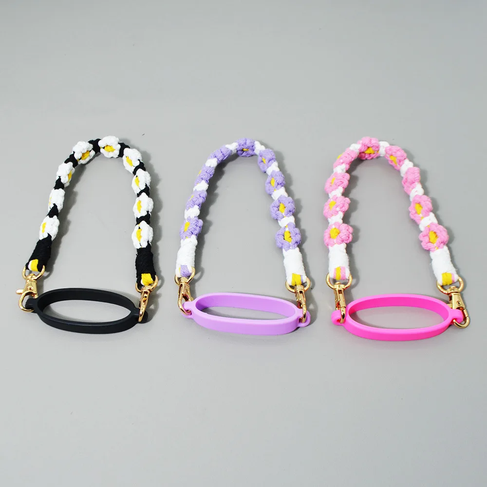
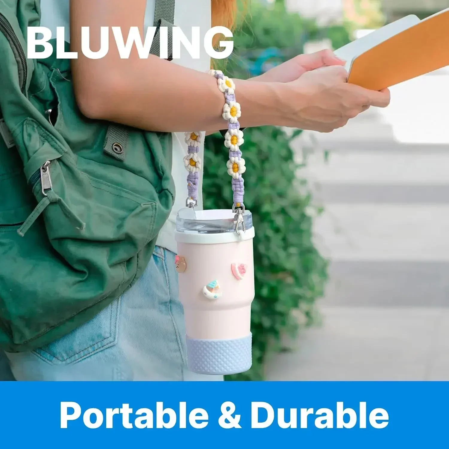
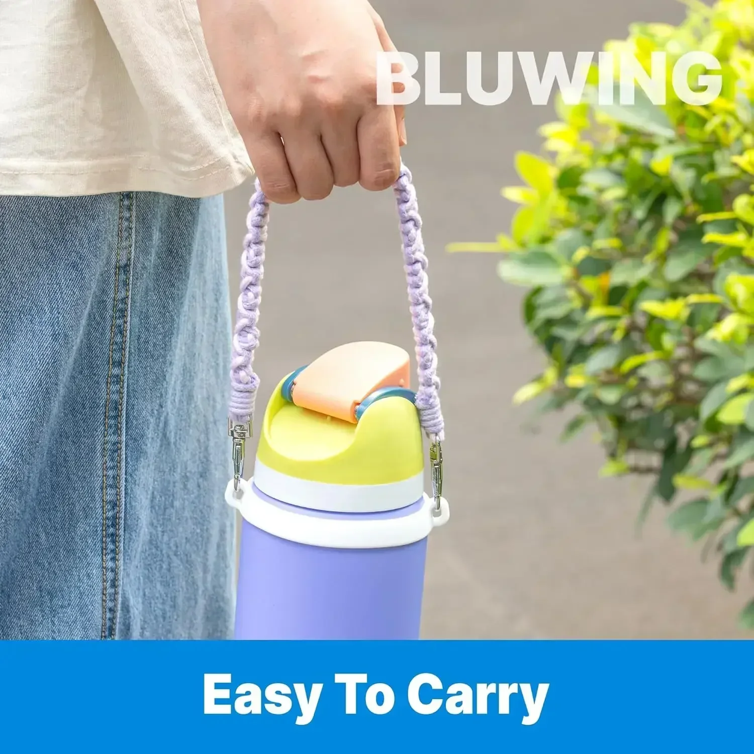
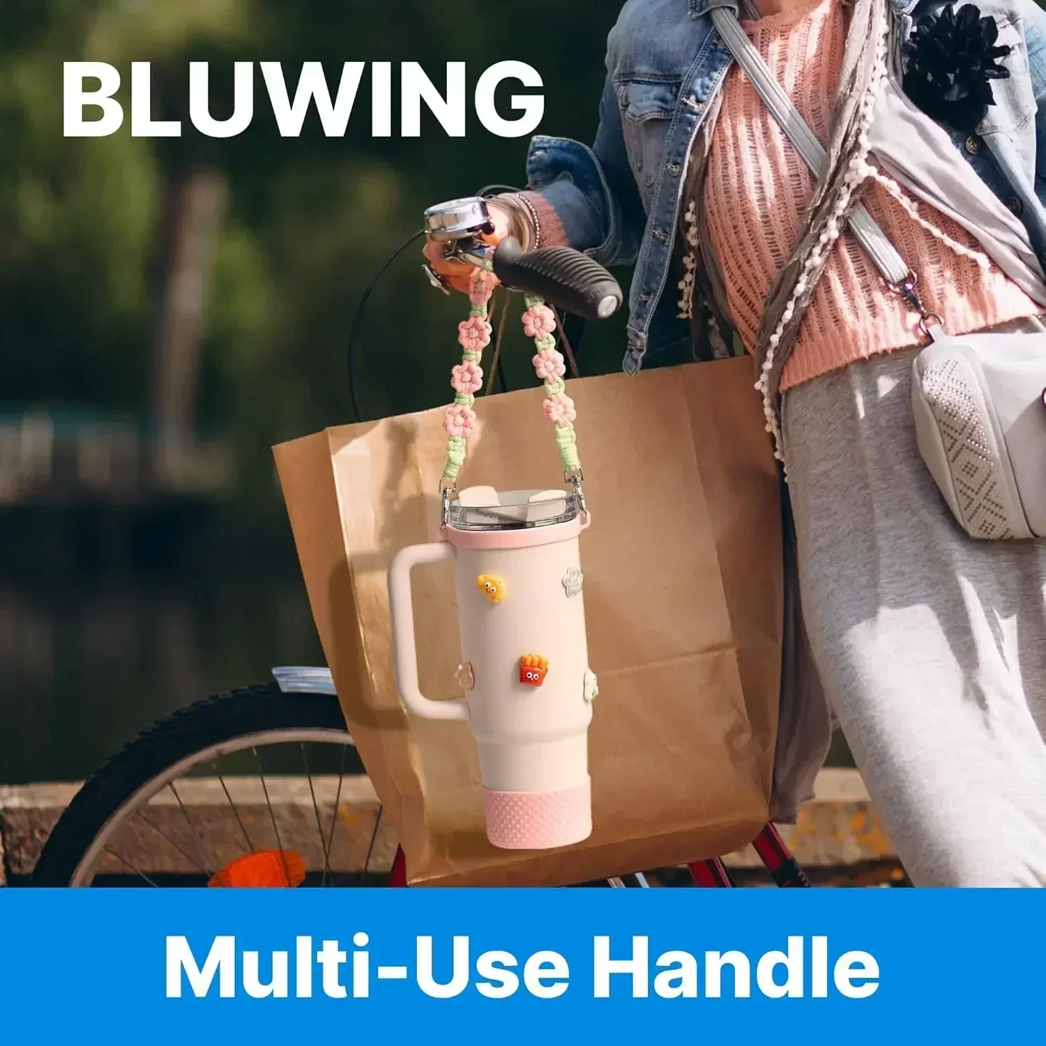
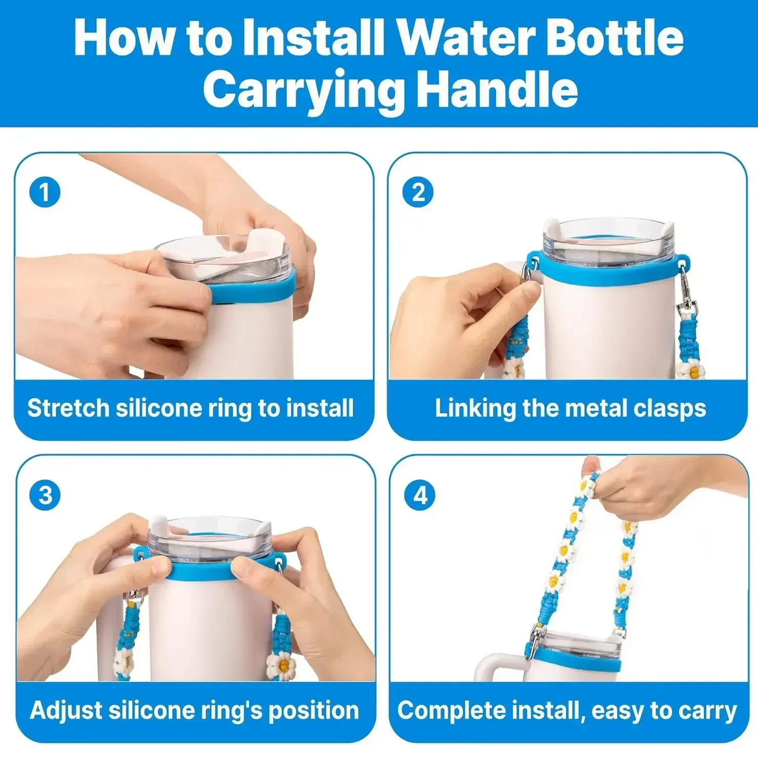
Portable Water Bottle Handle with Strap for Towels Leak proof Packaging Carrying Strap Coffee Milk Tea Cup For Hydro Flask
<div class="detailmodule_html"><div class="detail-desc-decorate-richtext"> <div id="aplus">
<div>
<div>
<div>
<div>
<div>
<div>
</div>
</div>
</div>
</div>
</div>
</div>
</div> <div id="aplus">
<div>
</div>
<div>
<div>
</div>
</div>
<div>
<div>
<div>
<div>
</div>
</div>
<div>
</div>
</div>
</div>
<div>
<div>
<div>
<div>
</div>
</div>
<div>
</div>
</div>
</div>
<div>
<div>
<div>
<div>
</div>
</div>
</div>
</div>
<div>
</div>
</div> <div>
.aplus-v2 .apm-brand-story-carousel-container {
<br /> position: relative;
<br /> }
<br />
<br /> .aplus-v2 .apm-brand-story-carousel-hero-container,
<br /> .aplus-v2 .apm-brand-story-carousel-hero-container > div {
<br /> position: absolute;
<br /> width: 100%;
<br /> }/*
<br /> Ensuring the carousel takes only the space it needs.
<br /> The sizes need to be set again on the absolutely positioned elements so they can take up space.
<br /> */
<br /> .aplus-v2 .apm-brand-story-carousel-container,
<br /> .aplus-v2 .apm-brand-story-carousel-hero-container {
<br /> height: 625px;
<br /> width: 100%;
<br /> max-width: 1464px;
<br /> margin-left: auto;
<br /> margin-right: auto;
<br /> overflow: hidden;
<br /> }
<br />
<br /> .aplus-v2 .apm-brand-story-carousel-hero-container,
<br /> .aplus-v2 .apm-brand-story-carousel-hero-container > div {
<br /> height: 625px;
<br /> }.aplus-v2 .apm-brand-story-carousel.a-carousel-container {
<br /> padding: 0px;
<br /> }
<br />
<br /> /*
<br /> This centers the carousel vertically on top of the hero image container and after the logo area (125px).
<br /> Margin-top = (heroHeight - cardHeight - logoAreaHeight) / 2 + logoAreaHeight
<br /> */
<br /> .aplus-v2 .apm-brand-story-carousel .a-carousel-row-inner {
<br /> margin-top: 149px;
<br /> }
<br />
<br /> /*
<br /> Cards need to have a width set, otherwise they default to 50px or so.
<br /> All cards must have the same width. The carousel will resize itself so all cards take the width of the largest card.
<br /> The left margin is for leaving a space between each card.
<br /> */
<br /> .aplus-v2 .apm-brand-story-carousel .a-carousel-card {
<br /> width: 362px;
<br /> margin-left: 30px !important;
<br /> }
<br />
<br /> /* styling the navigation buttons so they are taller, flush with the sides, and have a clean white background */
<br /> .aplus-v2 .apm-brand-story-carousel .a-carousel-col.a-carousel-left,
<br /> .aplus-v2 .apm-brand-story-carousel .a-carousel-col.a-carousel-right {
<br /> padding: 0px;
<br /> }
<br />
<br /> .aplus-v2 .apm-brand-story-carousel .a-carousel-col.a-carousel-left .a-button-image,
<br /> .aplus-v2 .apm-brand-story-carousel .a-carousel-col.a-carousel-right .a-button-image {
<br /> border: none;
<br /> margin: 0px;
<br /> }
<br />
<br /> .aplus-v2 .apm-brand-story-carousel .a-carousel-col.a-carousel-left .a-button-image .a-button-inner,
<br /> .aplus-v2 .apm-brand-story-carousel .a-carousel-col.a-carousel-right .a-button-image .a-button-inner {
<br /> background: #fff;
<br /> padding: 20px 6px;
<br /> }
<br />
<br /> .aplus-v2 .apm-brand-story-carousel .a-carousel-col.a-carousel-left .a-button-image .a-button-inner {
<br /> border-radius: 0px 4px 4px 0px;
<br /> }
<br />
<br /> .aplus-v2 .apm-brand-story-carousel .a-carousel-col.a-carousel-right .a-button-image .a-button-inner {
<br /> border-radius: 4px 0px 0px 4px;
<br /> }
</div> </div></div>
$12.56
$7.175
- Category : Home & Garden
- Brand : shop1103726898_store Shop1103726898 Store
Colors
Sizes
-
+
<div class="detailmodule_html"><div class="detail-desc-decorate-richtext"> <div id="aplus">
<div>
<div>
<div>
<div>
<div>
<div>
</div>
</div>
</div>
</div>
</div>
</div>
</div> <div id="aplus">
<div>
</div>
<div>
<div>
</div>
</div>
<div>
<div>
<div>
<div>
</div>
</div>
<div>
</div>
</div>
</div>
<div>
<div>
<div>
<div>
</div>
</div>
<div>
</div>
</div>
</div>
<div>
<div>
<div>
<div>
</div>
</div>
</div>
</div>
<div>
</div>
</div> <div>
.aplus-v2 .apm-brand-story-carousel-container {
<br /> position: relative;
<br /> }
<br />
<br /> .aplus-v2 .apm-brand-story-carousel-hero-container,
<br /> .aplus-v2 .apm-brand-story-carousel-hero-container > div {
<br /> position: absolute;
<br /> width: 100%;
<br /> }/*
<br /> Ensuring the carousel takes only the space it needs.
<br /> The sizes need to be set again on the absolutely positioned elements so they can take up space.
<br /> */
<br /> .aplus-v2 .apm-brand-story-carousel-container,
<br /> .aplus-v2 .apm-brand-story-carousel-hero-container {
<br /> height: 625px;
<br /> width: 100%;
<br /> max-width: 1464px;
<br /> margin-left: auto;
<br /> margin-right: auto;
<br /> overflow: hidden;
<br /> }
<br />
<br /> .aplus-v2 .apm-brand-story-carousel-hero-container,
<br /> .aplus-v2 .apm-brand-story-carousel-hero-container > div {
<br /> height: 625px;
<br /> }.aplus-v2 .apm-brand-story-carousel.a-carousel-container {
<br /> padding: 0px;
<br /> }
<br />
<br /> /*
<br /> This centers the carousel vertically on top of the hero image container and after the logo area (125px).
<br /> Margin-top = (heroHeight - cardHeight - logoAreaHeight) / 2 + logoAreaHeight
<br /> */
<br /> .aplus-v2 .apm-brand-story-carousel .a-carousel-row-inner {
<br /> margin-top: 149px;
<br /> }
<br />
<br /> /*
<br /> Cards need to have a width set, otherwise they default to 50px or so.
<br /> All cards must have the same width. The carousel will resize itself so all cards take the width of the largest card.
<br /> The left margin is for leaving a space between each card.
<br /> */
<br /> .aplus-v2 .apm-brand-story-carousel .a-carousel-card {
<br /> width: 362px;
<br /> margin-left: 30px !important;
<br /> }
<br />
<br /> /* styling the navigation buttons so they are taller, flush with the sides, and have a clean white background */
<br /> .aplus-v2 .apm-brand-story-carousel .a-carousel-col.a-carousel-left,
<br /> .aplus-v2 .apm-brand-story-carousel .a-carousel-col.a-carousel-right {
<br /> padding: 0px;
<br /> }
<br />
<br /> .aplus-v2 .apm-brand-story-carousel .a-carousel-col.a-carousel-left .a-button-image,
<br /> .aplus-v2 .apm-brand-story-carousel .a-carousel-col.a-carousel-right .a-button-image {
<br /> border: none;
<br /> margin: 0px;
<br /> }
<br />
<br /> .aplus-v2 .apm-brand-story-carousel .a-carousel-col.a-carousel-left .a-button-image .a-button-inner,
<br /> .aplus-v2 .apm-brand-story-carousel .a-carousel-col.a-carousel-right .a-button-image .a-button-inner {
<br /> background: #fff;
<br /> padding: 20px 6px;
<br /> }
<br />
<br /> .aplus-v2 .apm-brand-story-carousel .a-carousel-col.a-carousel-left .a-button-image .a-button-inner {
<br /> border-radius: 0px 4px 4px 0px;
<br /> }
<br />
<br /> .aplus-v2 .apm-brand-story-carousel .a-carousel-col.a-carousel-right .a-button-image .a-button-inner {
<br /> border-radius: 4px 0px 0px 4px;
<br /> }
</div> </div></div>
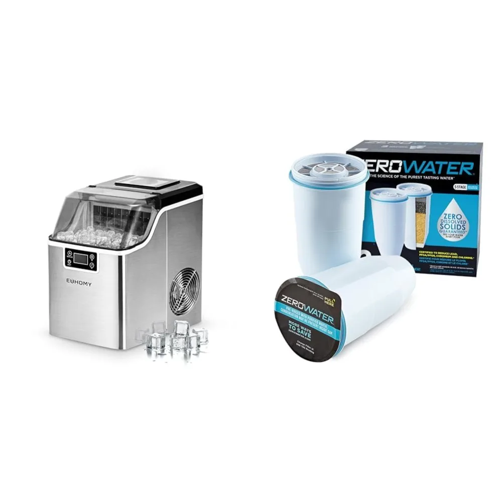
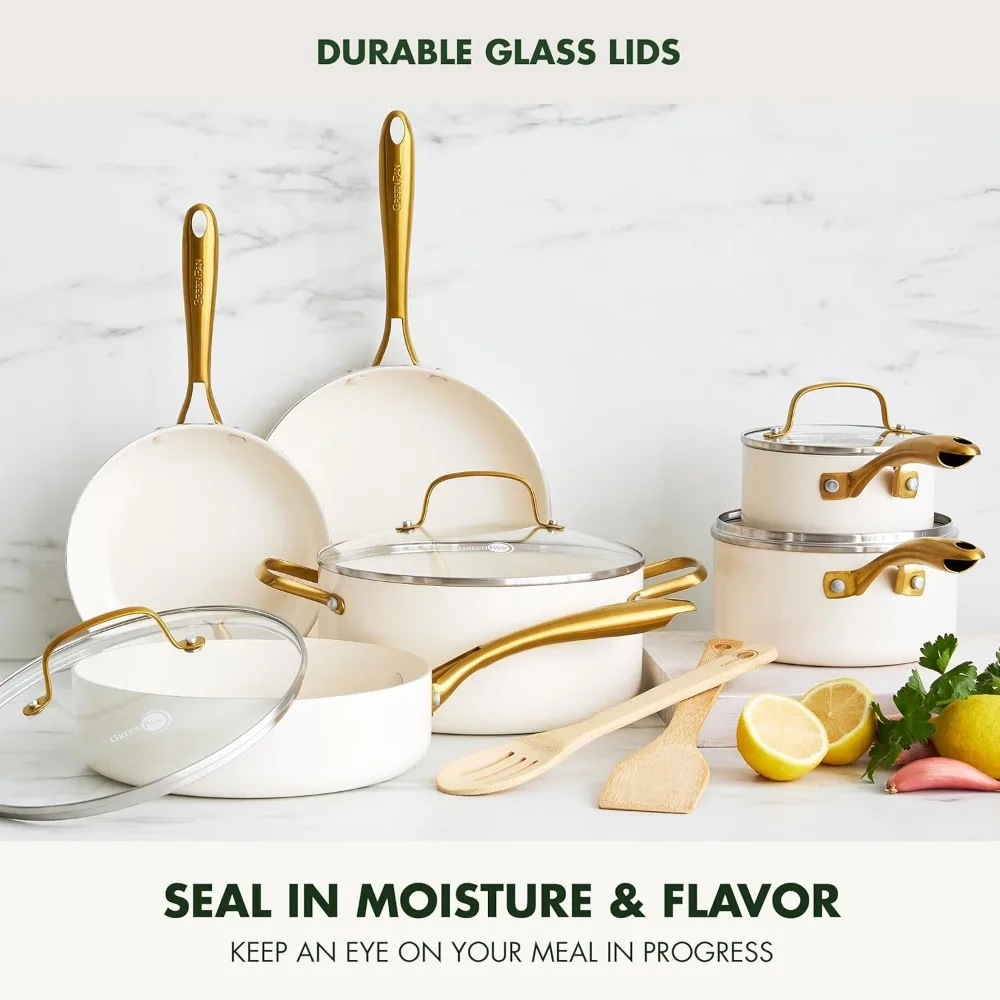
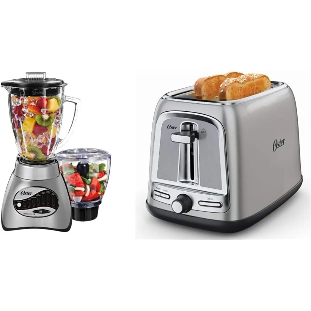
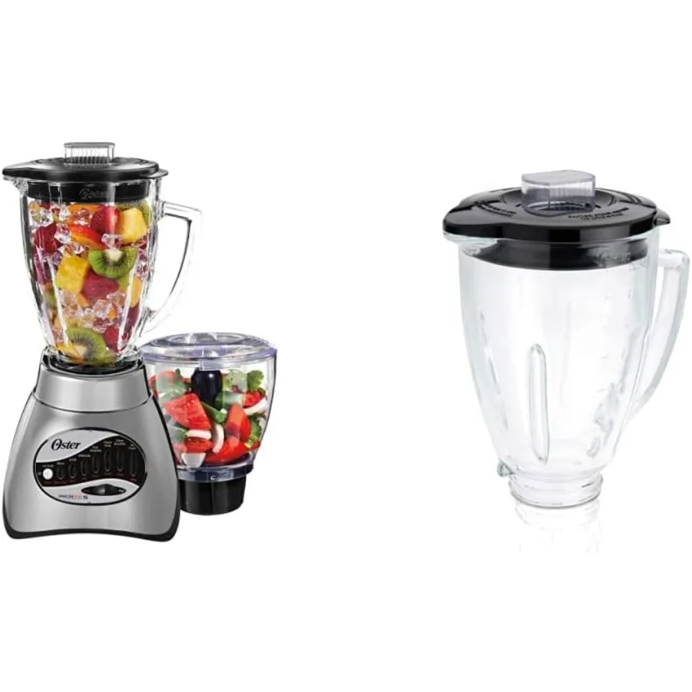
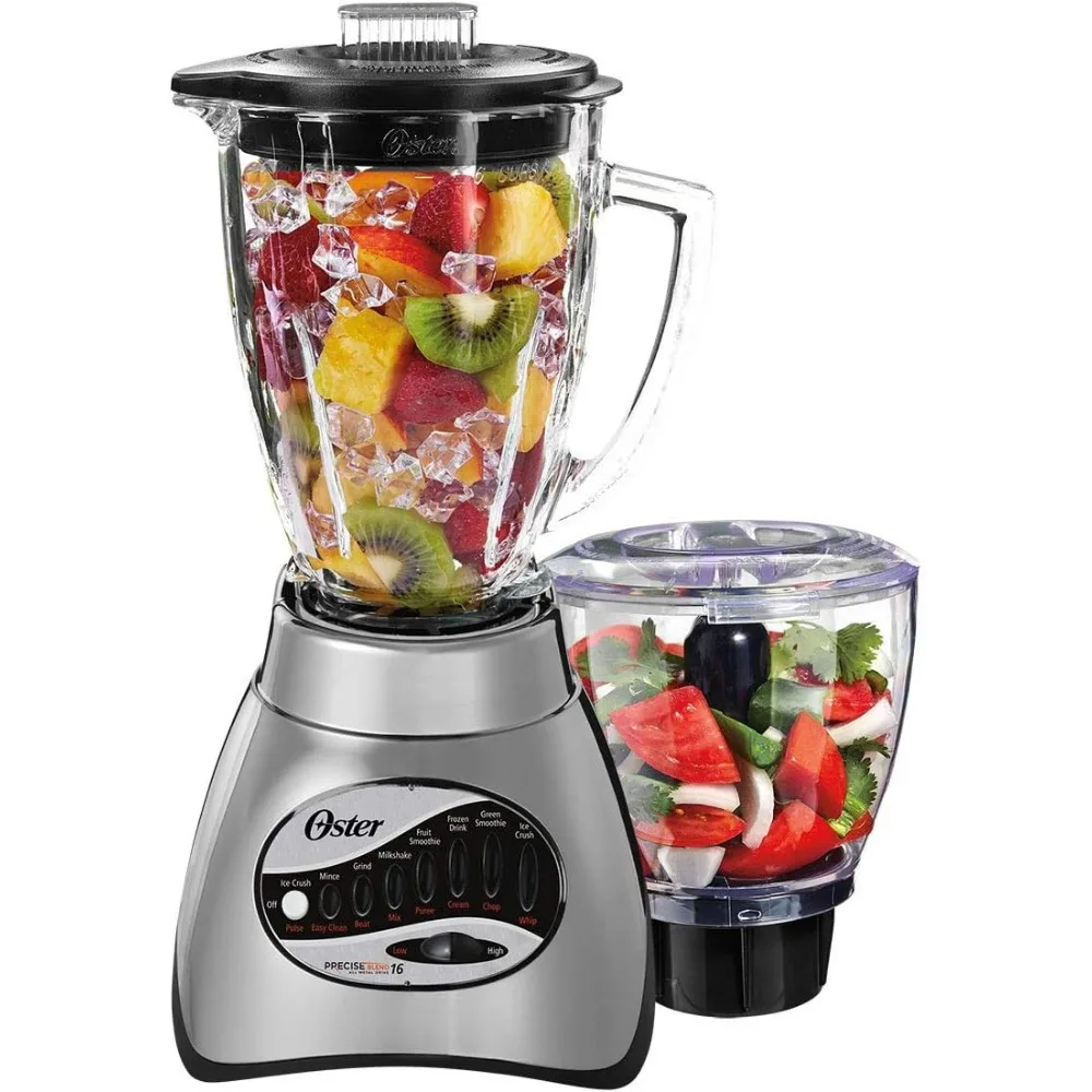
Related Product
Browse The Collection of Top Products.